Reading Reflection – Week 5

The reading on “Computer Vision for Artists and Designers” discusses how computer vision is becoming more accessible to students/artists due to easier-to-use software and open-source communities. Out of the many projects showcased, I was really impressed (and slightly creeped out) by Rafael Lozano-Hemmer’s installation Standards and Double Standards (2004), where belts were controlled by a computer vision-based tracking system, causing the buckles to rotate automatically to follow the public. It was really interesting to see this type of interaction that, in a way, isn’t intentional, direct, or digital. However, when it came to the project Suicide Box by the Bureau of Inverse Technology (1996), where a motion-detection video system was utilized to record real data of suicides, I found that ethically concerning. You don’t need to record such events to store data; yet, on the other side, it might serve as a security measure for people who have presumably been missing. It is a pretty controversial project, to say the least.

Field of view comparison of a conventional and Telecentric Lens. Note the conventional lens’s angular field of view and the Telecentric Lens’s zero angle field of view.

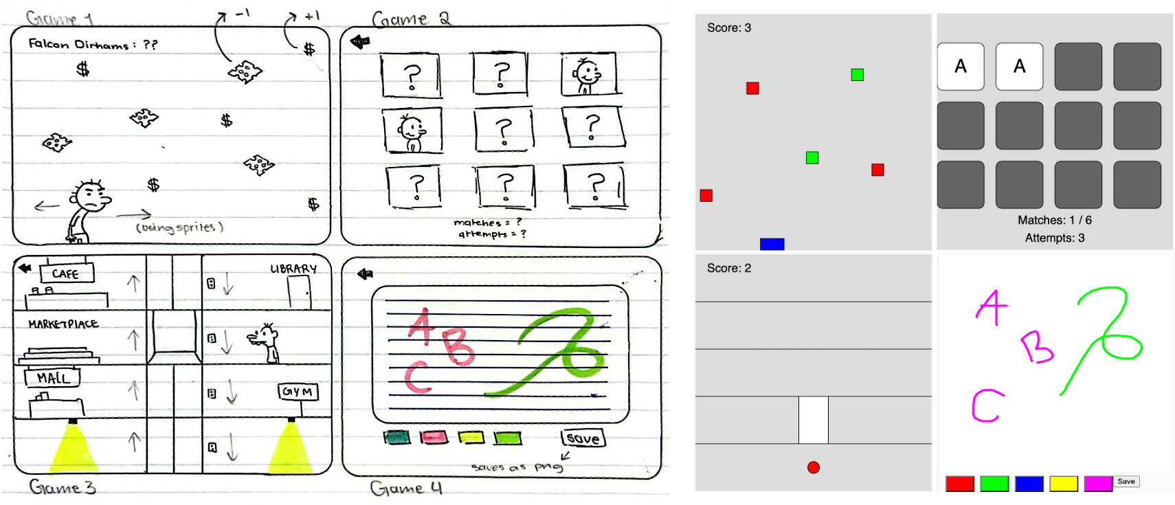
Furthermore, the reading discussed the different kinds of problems that vision algorithms have been developed to address, and their basic mechanisms of operation, such as detecting motion, detecting presence, object tracking, and basic interactions. All of which the designers of C2’s doors should have taken into account. Moreover, something new I have come across is the term “Telecentric lenses,” which are lenses used to improve object recognition by maintaining constant magnification regardless of distance. Yet, I came to find out that it is high in cost, large in size, and heavy in weight, in addition to causing some distortion issues. So, I wonder when it is appropriate to use it or if it is smart to do so to begin with. All in all, this was a very interesting read that showed me that interaction can be more than just key or computer-based; rather, it’s more about innovative ways to bridge the two different worlds we live in! Last but not least, I wonder where the line is drawn when it comes to privacy and motion/facial detection. Have we as a society come to accept that we are being watched & listened to all the time, whether it’s your phone’s facial recognition or the immediate response after “Hey Siri!” ?

Midterm Progress – Sara Al Mehairi

Concept

The game I am planning to create will take inspiration from “Diary of a Wimpy Kid,” but with a twist of our university’s culture. That said, I titled it “Diary of an NYUAD Kid,” with each game representing a struggle or something we, students, relate to. At first, the player will be introduced to a menu screen with options to play. To avoid simplicity, I decided to gather a group of games, 4 to be specific (or 3.5, as one of them is a doodling notepad), and implement them to provide users with a variety of choices. All games will be single-player.

Design & Implementation

  1. The first game is a simple game of trying to avoid “the cheese touch,” referenced from the movie. If you failed to avoid the cheese touch, you lose points, but if you succeed, you gain points. The goal here is to gather as many falcon points as possible.
  2. The second game is a memory game titled “Have We Met?” It aims to depict the struggle of being new to campus and meeting so many people, with each card representing a character.
  3. The third game is an elevator game, which I’m planning to title “Rush Hour” or “Elevator Rush.” The goal is to get as many students in the elevator as possible to prevent them from being late to class, inspired by the slow elevators on our campus, specifically C2.
  4. Finally, the fourth semi-game is a student’s notebook where you can sketch or take notes, and then save your sketch as a PNG to your laptop. With the vision set & the base code established, my next step is to digitally design the game aesthetics.

CHALLENGES

Although I have the base code designed for most of the games (with many bugs), I believe it will be a challenge to implement them all perfectly without errors. My goal is to complete all four games, which I know is ambitious, yet I have faith. Another challenge I expect is trying consistency while trying to recreate the same aesthetic as the sketches in the original “Diary of a Wimpy Kid,” but with time and effort, I believe it is possible.

Reading Reflection – Week 4

The following will be an overview of the points I have gathered throughout the reading, and with these points, I have come to criticize our campus design—or more specifically, campus doors.

Chapter 1 begins by reflecting on how a simple concept or thing like a door could be so confusing. We know that the design of a door should indicate how to operate it without any need for signs, certainly without any need for trial and error (Page 7). Norman emphasizes on page 3 that the two most important characteristics of good design are discoverability and understanding, something the C2 building doors don’t seem to have. Although equipped with sensors, these so-called ‘automatic’ doors require more strength and patience than any regular door. There have been many instances where people have gotten ‘squished’ or ‘trapped’ trying to walk through them. Additionally, the sensors installed above the doors are not precise at all; they are intended to sense motion straightforwardly facing the palms, yet people tend to approach from either the left or right, rarely from the center, so that’s another issue. That being said, and in Norman’s definitions, I would say that NYUAD doors have failed in industrial design, interaction design, and experience design (Page 5). Hence, we say that when designs are done badly, it leads to frustration and irritation (Page 5), and the reason behind that, I believe, is that engineers are trained to think logically (Page 6). They don’t really take into account the possibilities of how people other than themselves would interact with a product, in other words, user testing. Because at the end of the day, design presents an interplay of technology and psychology, and designers must understand both (Page 7).

Further, Norman introduces HCD or human-centered design, which is an approach that puts human needs and capabilities first, then designs to accommodate those needs (Page 8); something I stand by, especially in terms of accommodating people of determination in their day-to-day activities like battling D2 doors. So, in line with HCD’s philosophy, it is important to start with a good understanding of people and the needs that the design is intended to meet (Page 9). Moreover, the chapter “The Psychopathology of Everyday Emotions” highlights the importance of affordance (Page 11), defining what actions are possible, and signifiers, specifying how people discover the made possibilities (Page 12). In line with the author’s statement, I believe that signifiers are of far more importance to designers than affordance (Page 19). In addition, Norman mentions how it’s important to give feedback to users because how else would I know that something worked? So, it is important to provide confirmation & immediate feedback, but not too much feedback (Page 23).

Overall, I believe that the reading contains many of the most fundamental things a designer must know. I have come across these topics through other classes I’ve taken, such as UX Design and Wayfinding, so this book covers a great intersection and gives a proper overview of key points. With proper design comes a great product, and with great products comes happy customers; it can be done, says Norman (Page 36). However, in the eye of the campus designers, it’s a different story.

Assignment 4 – “On My Nerves” by Sara Al Mehairi

Overview

Neurons Affected by Epilepsy Identified
Sourced from Genetic Engineering and Biotechnology News

The concept for this assignment came about after some self-reflection on the “workings of my mind” throughout past semesters. From those moments when deadlines approach to when things get on my nerves, I had hoped to capture this chaos visually, but not through random lines because we have come to an agreement that randomness is our biggest enemy, rather through nerve cells (cells that send messages all over your body to allow you to do everything from breathing to talking, eating, walking, and thinking). With that, my goal was to depict my genuine experiences, to the best of my capability. That’s when the idea came to utilize my actual Notion to-do lists, which have been my go-to resource since my first semester during freshman year.

Data Visualization

let courses = [
  { name: "Discrete Mathematics", tasks: { Assignment: 4, Quiz: 3, Other: 2 } },
  { name: "Intro to Computer Science", tasks: { Assignment: 6, Other: 2 } },
  { name: "Pre-Calculus", tasks: { Assignment: 14, Other: 4 } },
  { name: "Wayfinding", tasks: { Assignment: 9, Other: 2 } },
  { name: "Calculus", tasks: { Assignment: 15, Other: 2 } },
  { name: "Stereotyping", tasks: { Assignment: 9, Other: 4 } },
  { name: "FYWS", tasks: { Assignment: 17, Other: 2 } },
  { name: "UX Design", tasks: { Assignment: 12, Other: 2 } },
  { name: "Inequality", tasks: { Assignment: 5, Other: 8 } },
  { name: "Communications Lab", tasks: { Assignment: 18, Other: 4 } },
  { name: "Data Structures", tasks: { Assignment: 16, Quiz: 4, Other: 2 } },
  { name: "Techniques for Safety & Production", tasks: { Assignment: 2, Quiz: 2 } },
  { name: "Space Diplomacy", tasks: { Assignment: 7, Other: 2 } }
];

Each color within the visualization represents a course I’ve taken up until fall 2023, while the size of the circles correlates directly with the workload associated with each course (categorized into assignments, quizzes, and other tasks from my actual to-do list). The lines, aimed to create a nerve system-like structure, are meant to connect circles of the same color/course to illustrate the connections. Additionally, the back-and-forth motion that results from touching the edges was intended to mimic the beat of a human heart (so did the oscillating opacity), with the hope of adding a human touch to the art piece.

Challenges & REFLECTION

One of the challenges was trying to make the piece look like something from the human body. Although I didn’t perfect it, I tried drawing inspiration from images of what nerves would look like in our body. Another challenge was deciding the colors. Initially, I wanted to symbolize stress and complexity, so I started with reds and warm tones. However, they ended up looking more like a calm sunset, which led to the idea of using cool tones to oppose the idea of “nervousness” and “perplexity“, hence being “cool” and “relaxed.” Another challenge was definitely implementing the code. I had to use many of the things we had done in class and had a lot of debugging throughout. Many of the things you see happened by accident, but I’m happy with it. Through this attempt, I hope to give you a glimpse into my academic journey – the ups, the downs, everything in between, and more specifically, the things that got on my nerves. Pun intended.

Reading Reflection – Week 3

First and foremost, I completely agree with Crawford when he said that “the term interactivity is overused and under understood.” I believe it becomes under-understood because it has been made a universal term when in reality it can be interpreted in many ways, thus becoming subjective, as discussed on page 6. That’s something I don’t necessarily like, especially considering the word “Interactive” in our university’s “Interactive Media” program. In this sense, it has been underestimated and has affected many opportunities for students, including myself. To be more specific, the term has been underestimated in many ways. When people hear “Interactive Media,” they often disregard “interactive” because it’s an adjective and then proceed with “oh, so like media, like social media” or “oh yeah, like TV hosts and stuff.” I find that very frustrating because what we do is much more. With that, I have a love-hate relationship with the term “Interactive Media.”

Furthermore, on page 11, the author states,Interactivity designers do not deny the hard-won lessons of the past; they seek to incorporate them in a wider perspective, which, in turn, requires some rearrangement.” He follows by saying that incorporating the wisdom of older fields plays an important role in this so-called “rearrangement.” I wonder what exactly he means by rearrangement, and to what extent should we apply it. In addition, on page 12, the author says,Once interactivity becomes established in our culture, the academic will get a hold of it, and then you’ll have more ‘high-quality’ definitions than you ever thought you needed.” But what about the non-experts in the field who tend to have authority in recruiting? Will they ever understand what “interactivity” is, or more specifically, what “interactive media” is? Overall, I’d say it was an interesting read, but I had a lot of contrary ideas, part of the reason being that I will be carrying that name with me throughout my academic career.

Assignment 3 – “The Other World” by Sara Al Mehairi

Overview

As a starting point, I decided to experiment with our class codes and test color palettes, and through that, I stumbled upon shades of blue and pink that immediately reminded me of a scene from the famous movie “Coraline.” With that in mind, I decided to recreate, or at least attempt to, the tunnel to the other world. In the movie, when Coraline is trying to escape the Other World, she notices that the tunnel feels longer each time she uses it, and steeper. That was my goal for this assignment, and using functions helped me achieve it.

Highlight

class RotatingPolygon {
  constructor(centerX, centerY, x, y) { 
    this.centerX = centerX; //center x coordinate
    this.centerY = centerY; //center y coordinate
    this.x = x; //starting x coordinate
    this.y = y; //starting y coordinate
    this.angle = atan2(this.y - this.centerY, this.x - this.centerX); //calculate initial angle
    this.speed = random(0.01, 0.03); //set random rotation speed
    this.radius = dist(centerX-300, centerY-100, x+20, y-20); //calculate radius
    this.sides = int(random(5, 10)); //randomize number of sides for each polygon
  }

An aspect of the code that I take pride in is the usage of cosine, sine, tangent, and pi, along with the radius; they were very useful. Something new I learned was that atan() gives an angle value between -90 & 90, whereas atan2() gives an angle value between -180 & 180. I am also proud of how easy it has become to change the outcome with a simple adjustment, given that I have created a class for rotating polygons (I initially had circles/ellipses but that wasn’t accurate enough). Though I must admit that many of the elements have been the result of trial and error, and I am still exploring this very interesting idea of using OOP in creating graphics.

Reflection

Attempting to replicate the colors from the original scene was definitely challenging, especially since I had already included transparency/opacity components. I believe there is room for improvement in that aspect. In addition, it took some time to understand where and how to position all the shapes accordingly and in line with the original scene. Overall, I believe that I’ve created something worth sharing!

Reading Reflection – Week 2


Reas’ collaborative artwork with Ben Fry visualizing biology data from MIT.

The first thing about Casey Reas’ speech that caught my attention was his collaboration with Ben Fry, which focused on visualizing biology data from MIT and the way that proteins communicate back and forth – positive or negative signals within a cancer cell (randomness was used but in a slight manner). This example proved to me that an artwork truly becomes a piece of art when it is shaped by the story it holds, something to which we can relate.

Reas’ creation of conceptual vehicles influenced by anatomist Valentino Braitenberg.

Another project I found interesting was his creation of conceptual vehicles and software, each color-coded based on their wiring, which was influenced by anatomist Valentino Braitenberg’s hypothetical vehicles, whether inverse or positive, straight connection or cross-connection. A quote that then stood out to me was “a little bit of randomness and a lot of decision-making” (11:43), which showed the complexity in art that many see as “simple.”

Further in the video, the reference to random graphics reminded me of Skip Lists in Data Structures where the reliance is on a 50/50 chance serves as a technique to ensure efficient performance. This validates the deep integration of math, computer science, and physics in art. Further, Reas broke down the barriers between these disciplines, emphasizing how randomness, far from being blind, is a planned element that adds an unexpected dimension to the artistic output, an argument with which I completely agree!

Personally, this speech has solidified my belief in the interdisciplinary nature of art. The combination of several distinct disciplines showcased in the work Reas displayed challenged preconceptions that even I had about the simplicity of digital art. That being said, the speech left a question surrounding the impact of technological advancements on art: Is there ever a line to be drawn as to the art is no longer by the artist but rather a computer, and have we reached that age yet, especially with AI generative art, although different from the work displayed in the video?


Assignment 2 – “Random Squares” by Sara Al Mehairi

RECREATION & CONCEPTUALIZATION

This picture is of the original art piece, Random Squares.

For this assignment, my goal was to recreate Herbert Franke’s artwork, “Random Square” from COMPUTER GRAPHICS AND ART May1976 (page 6), using p5.js as accurately as possible. Inspired by Franke’s collaboration with Georg Färber, where Färber utilized computer systems at the University of Munich to generate intricate plots based on dates provided by the artist, my goal was to capture the nature of the original piece by utilizing loops based on random coordinates within a specific range.

Code Highlight

function checkOverlap(x, y, rectangles) {
  for (let i = 0; i < rectangles.length; i++) {
    let { x: rectX, y: rectY, w: rectW, h: rectH } = rectangles[i];
    if (dist(x, y, rectX, rectY) < (rectW + rectH) / 2) {
      return true; //this means overlapping
    }
  }
  return false; //this means not overlapping
}

One aspect of the code that I take pride in is the implementation of a function that checks for (coordinate) overlaps using boolean statements. Initially, the large black rectangles were overlapping, which, to me, was distracting and not aesthetically pleasing, as they are naturally the first thing you see. This function is triggered every time the screen is clicked, causing the rectangles, both large and small, to rearrange themselves according to the specified conditions.

Challenges & Reflection

Initially, I generated black squares of different sizes at randomized locations, relying solely on the provided PDF link. However, with further research about the art piece, I realized it wasn’t a black & white piece but rather a colorful one, resembling the colors of a Starburst in my opinion! Once I came to the realization, I used the colors yellow, pink, and black and played with the opacity of the pink squares to achieve a similar effect when overlapped with yellow. Also, as I was randomizing the size of each square, I later noticed that each color had a specific size, with pink being the smallest and black the largest. You could see that every time I thought I was done, I noticed a slight detail that I had missed.

At first glance, the artwork didn’t seem to have much depth; it appeared like random squares on the screen. However, after looking into the artist’s background and understanding the process behind the artwork, I realized the significant time investment required to create such a piece. One aspect I would like to improve or explore in the next iteration of my attempt is to move away from the literal randomization of coordinates. Instead, I would like to make them dependent on meaningful factors such as dates, NETids, or other elements that can add more meaning.


Assignment 1 – “Self-Portrait” by Sara Al Mehairi

Overview

For this assignment, I initially had a bit of uncertainty about the theme involved with creating a self-portrait using JavaScript. Stick figures seemed like a starting point, but I decided to draw inspiration from the cartoon TV show Gravity Falls. My goal was to capture the same facial structure that made the show so memorable from my childhood, appreciating its cool graphics. So, let me introduce you to Sara, the new character on Gravity Falls!

Challenges

Drawing inspiration from Gravity Falls presented several challenges, particularly in replicating the facial structures of the original characters using only ellipses, rectangles, and triangles. Coordinating the shapes, especially the triangles, definitely tested my patience. Gladly & after several attempts, I sought assistance from Desmos (advanced graphing calculator) to recreate and visualize my canvas in terms of coordinates, I found that pretty helpful!

reflection

My initial intention was to animate multiple objects on the screen, including the sun transforming into a darker color against an ombre background to symbolize sunset (ideally, user-controlled). However, I underestimated the time required for the graphic design itself & hope to implement animations in future projects. While I consider myself familiar with other languages, I wouldn’t claim that p5.js is my expertise. Overall, I found great enjoyment in this project and am proud of the results, particularly the implementation of a simple animation for the “Mukhawar” or Emirati traditional wear. If anyone is interested in the code, you can find it below!

// Welcome to the behind-the-scenes of Sara's self-portrait!

function setup() {
  createCanvas(500, 600);
  frameRate(10);
}

function draw() {
  background(153, 175, 191);
  
  // sun
  noStroke();
  fill(242, 209, 44);
  ellipse(0, 0, 300, 300);
  
  // clouds
  noStroke();
  fill(240);
  
  ellipse(100, 200, 60, 50);
  ellipse(60, 200, 60, 50);
  ellipse(20, 200, 60, 50);
  ellipse(75, 180, 60, 50);
  ellipse(45, 180, 60, 50);
 
  ellipse(500, 170, 70, 60);
  ellipse(460, 170, 70, 60);
  ellipse(420, 170, 70, 60);
  ellipse(485, 140, 70, 60);
  ellipse(445, 140, 70, 60);
  
  ellipse(300, 80, 70, 60);
  ellipse(260, 80, 70, 60);
  ellipse(220, 80, 70, 60);
  ellipse(280, 60, 70, 60);
  ellipse(245, 60, 70, 60);
  
  // ground
  fill(54, 99, 57);
  rect(0, 500, 500, 100);
  
  // neck
  fill(138, 98, 134);
  rect(190, 295, 130, 100);
  
  // hijab
  noStroke();
  fill(138, 98, 134);
  ellipse(245, 300, 190, 140);
  rect(165,180,175,120)
  triangle(325, 158, 410, 480, 300, 680);
   
  // face
  noStroke();
  fill(214, 176, 150);
  ellipse(240, 295, 160, 120);
  rect(175,180,145,120)
  
  //eyelashes
  push();
  stroke(0);
  strokeWeight(2)
  line(160, 240, 200, 255);
  line(170, 230, 200, 255);
  line(295, 240, 200, 255);
  line(285, 230, 200, 255);
  pop();
  
  // eyes
  fill(255);
  stroke(0)
  ellipse(200, 250, 60, 60);
  ellipse(255, 250, 60, 60);
  
  fill(0);
  ellipse(200, 245, 7, 7);
  ellipse(255, 245, 7, 7);
   
  // hair
  noStroke();
  fill(38, 20, 2);
  push();
  rotate(PI/9);
  rect(280, 45, 98, 50);
  rotate(PI/-6);
  rect(135, 200, 80, 30);
  pop();
  
  // hijab 2 (top part)
  fill(138, 98, 134);
  arc(253, 180, 175, 100, PI, TWO_PI);
  rect(165, 185, 10, 30);
  
  // hair 2
  fill(38, 20, 2);
  arc(250, 185, 155, 60, PI, TWO_PI);
  
  // mouth
  fill(255);
  stroke(0);
  arc(230, 305, 60, 37, 0, PI, CHORD);
  
  // hijab 3
  fill(138, 98, 134);
  noStroke();
  rect(166, 177, 9, 30);
  rect(320, 170, 17, 60);

  // eyebrows
  push();
  stroke(21, 19, 19);
  strokeWeight(2);
  noFill();
  arc(195, 215, 35, 10, PI, TWO_PI, OPEN);
  arc(255, 215, 35, 10, PI, TWO_PI, OPEN);
  pop();
  
  // body
  fill(163, 106, 145);
  rect(130, 385, 240, 255, 20, 15, 10, 5);
  push();
  rotate(PI/14);
  rect(210, 343, 65, 225, 20, 15, 10, 5);
  rotate(PI/-9);
  rect(260, 427 , 65, 220, 20, 15, 10, 5);
  pop();
  
  // sleeves
  fill(138, 98, 134);
  triangle(330,440,350,600,340,600);
  triangle(165,440,140,600,130,600);
  
  // dress
  fill(50, 46, 82);
  rect(210, 390, 65, 220, 20, 15, 10, 5);

  // crystal animation
  // inspired by https://editor.p5js.org/nanou/sketches/rJ-EMpxa
  var spot = {
  x:50,
  y: 25,
  };

  var col = {
      r:255,
      g:0,
      b:0,
  };
  
  spot.x= random (215, 270);
  spot.y= random (390, 480);

  noStroke();
  col.r = random (100, 255);
  col.g = (0);
  col.b = random (100, 200);
    
  fill (col.r, col.g, col.b, 120);
  ellipse (spot.x, spot.y, 10, 10);
  
  // neckline
  fill(138, 98, 134);
  arc(240, 384, 100, 80, 0, PI, CHORD);
  
  // mark
  fill(0,95);
  ellipse(280,290,2,2);
  
  // nose
  fill(214, 176, 150);
  stroke(0);
  arc(228, 279, 15, 25, 0, PI/3 + PI);
  
}

// Thank you so much!