Week 8 – BubbleSweeper

BubbleSweeper

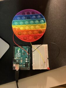
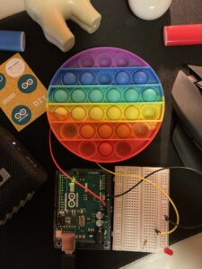
While exploring various methods for devising an inventive switch, I transitioned from the concept of utilizing a door to open and close a switch to envisioning a scenario where a frisbee, upon striking a target, completes the circuit and illuminates a bulb. My mind was brimming with numerous concepts, yet the one that particularly delighted me was the idea of crafting a game. After contemplating various potential game options, I settled on Minesweeper, a universally recognized game that can be enjoyed by individuals or groups. The optimal platform for realizing this game, in my view, is a bubble fidget toy, which features numerous bubbles resembling the grid of squares in a traditional Minesweeper game. One bubble is equipped with two wires, and when this bubble is pressed during the game, it connects both wires, thereby closing the circuit and activating the light resembling a bomb.


below is the image of the project (thought of making it look a bit commercial :p )


anyways, here’s the demo:

VIDEO

I wanted to feature two people play the game to show how it’s a blast for a pair of players, but you get the idea. It was a bit of a tough nut to crack at the beginning, Getting those wires in the right spots and dealing with that stubborn tape not sticking properly to the rubbery toy body made things way trickier than they should’ve been. But you know what? After a few trial-and-error sessions, I finally got those wires snug and secure.

Week 8 – Reflection

The human tendency to prioritize appearance when evaluating various aspects of life is undeniable. Whether it’s people, cars, clothing, destinations, smartphones, or even cuisine, visual appeal plays a prominent role in our judgments. Strikingly, aesthetics have overshadowed the intrinsic value of things in some cases, particularly in the world of business. For instance, a product, identical in functionality, can attract a different customer base based solely on how it is presented – be it in a practical or luxurious manner. This phenomenon has extended the age-old adage, “Don’t judge a book by its cover,” beyond books themselves. It now applies to both human beings and machines. Regardless of our reluctance to admit it, appearances wield immense influence, often shaping the initial and most crucial impression we form. This truth underscores the significance of visual aesthetics in our lives, as they continue to guide our choices and perceptions. The article “ Emotion & Design: Attractive Things Work Better” by Donald Arthur the American professor discuss this phenomenon and took the argument to a new level of analyzing why this is the case. He provides examples that highlight how our emotions influence decision-making, such as the contrast between happy and tense individuals when completing tasks. This analysis not only reveals the impact of emotions on decision-making but also emphasizes the importance of aesthetics and emotional appeal in the functionality of objects and systems.

MID TERM – Metaportal

MIDTERM

Metaportal : The brain spa


Concept

The Metaportal stands out as more than just your average project – it’s a creative endeavor that goes far beyond merely combining different artworks. This undertaking pays meticulous attention to every single component, ensuring that no detail is left to chance. From the welcoming and user-friendly interface to the delightful surprises cleverly hidden within each project, it’s clear that this is a labor of love.

Imagine it as a portal, leading you into a fresh realm of art, focus, and entertainment. As you explore, you’ll find yourself captivated by the fusion of creativity and functionality, where every aspect has been carefully tailored to enhance your experience. So, it’s not just a project; it’s a journey into an entirely new dimension of artistic expression, concentration, and sheer enjoyment.

The project’s concept revolved around the creation of an immersive gateway to showcase various distinct visual designs. It all began with the development of numerous visual art pieces employing tools like sine, cosine, angles, orbitControl, rotateX, and rotateY. After a prolific phase of crafting diverse visual designs, the objective shifted towards elevating the presentation. The aim was to construct a unified platform where each artwork could be elegantly exhibited, much like individual pieces of art.

the work of art

After extensive brainstorming and numerous iterations, I devised a captivating and aesthetic solution: a dynamically rotating “space” themed background, which I chose as the project’s main page. With the background in place, my next challenge was to create the entry points or “buttons” for users to explore and view the different art pieces. Given the uniqueness of each artwork, a conventional side-by-side display was not suitable. Instead, I opted to craft distinct 3D spherical structures using the same elements as the background. This choice lent a cohesive and consistent appearance to the main page. Notably, there were no previews of the artwork; instead, I incorporated question marks within these spheres, which, upon clicking, would transition users to the respective art pieces, enticing users to delve further into the virtual space.

After successfully creating the main page and investing countless hours in debugging, the next step was to introduce audio to the project. I decided to use a no-copyright interstellar-themed instrumental track to complement the visuals. The real challenge arose when I aimed to link the spheres with question marks to other art pieces, each presenting its own unique set of visuals. It was a daunting task, and I spent hours searching for a suitable function within p5.js that would allow me to create hyperlinks for transitioning between these projects. While I did find the “CreateA” function, which was helpful for establishing links from the main page to the intended sketch, I encountered a significant roadblock: p5.js did not support the ability to navigate back to the main page seamlessly. This limitation posed a considerable obstacle, particularly because I had opted not to use separate pages due to the project’s rendering-intensive nature. Combining all the visual projects in a single file was not a viable solution, as it would overwhelm p5.js and result in crashes. After enduring hours of stress and frustration, I finally discovered that the only viable approach was to circumvent the p5.js terminal entirely. In a determined effort to overcome this challenge, I downloaded all the p5.js project files I had and imported them into Visual Studio Code. While I continued to work with the p5.js language, I was no longer reliant on their terminal. In this new environment, I successfully managed to establish the desired interconnections between all the projects.

Afterwards, I focused on incorporating audio into the visual art pieces, which added an even more artistic dimension to the project. Given the uniqueness of each artwork, it necessitated selecting audio that harmonized with the colors, tempo, and patterns of each piece. As someone who enjoys instrumental music, particularly the saxophone, I began exploring a variety of non-copyrighted pieces for use in the project. Once I had gathered a selection, I aimed not only to create a visually appealing and aesthetically pleasing experience for users but also to infuse a bit of my personality into it, making it truly my own. To achieve this, I handpicked a few songs that I personally love, such as “Sway” by Michael Bublé and some tracks by Amr Diab, like “Tamally Maak,” in their instrumental versions. I opted for this approach to ensure that users could be fully immersed in the experience, regardless of their familiarity with the songs being played. For those who recognized the selected pieces, it would also serve as a delightful easter egg! Since I found the visual art to be highly enjoyable and calming, I also incorporated some lofi music into a few of my projects for the user to relax and have it as a background music.

The Main page – (p5 Incomplete)

click this link to open the p5 project on github

https://zuett.github.io/Intro-midterm/


Reflection

I’m thrilled about the prospect of advancing this project, as I envision it evolving into a captivating immersive visual experience. The idea is to create an application that users can seamlessly run in the background on a secondary screen, enabling them to enhance their focus on work and find moments to unwind in the midst of their daily tasks.

Imagine users being able to effortlessly integrate this immersive experience into their work environment. As they navigate their tasks and responsibilities on their primary screen, this secondary visual journey would serve as a calming and engaging companion. It will not only elevate their concentration but also provide an escape into a world of soothing illusions, offering a mental retreat right at their fingertips. This concept is a fusion of work and relaxation, a unique blend of productivity and serenity. Users can toggle their attention between their primary work and this immersive backdrop as needed, seamlessly transitioning from deep concentration to brief mental respites. It’s all about creating a harmonious balance, where work and relaxation coexist in perfect synergy. As I continue working on this project, the goal is to develop an extensive array of visually captivating scenes and experiences, each carefully designed to induce a sense of calm, creativity, and inspiration. These scenes will be more than just eye candy; they will be crafted to promote mental well-being, helping users recharge and refocus whenever they need it. In essence, this immersive background experience is not just a tool but a companion, a portal to a world of tranquility and aesthetic delight, ready to aid users on their journey towards enhanced productivity and a balanced, focused mind.

Midterm progress – 2

 Lucid Dream  –  a world of illusions

This week, I began refining the main page of my project. I introduced a new element called “Balls,” which are three-dimensional spheres composed of points that blend with the background. I strategically positioned these balls, situating some within the largest sphere and others around a smaller central sphere nested within the larger one.

Following the creation of these balls, which serve as links to different pages with distinct visual designs, I added a question mark inside each of them. This was done to pique the user’s curiosity and encourage them to explore each ball and its associated art design.

After meticulously arranging all the elements on the main page, I encountered a performance issue. The program struggled to smoothly render the constantly changing positions of the thousands of points on the canvas. To address this, I dedicated some time to optimizing the code for better processing with p5, successfully resolving this performance challenge.

However, another issue arose. The continuous rotation of the visual space made it challenging for users to select a specific ball of interest. To enhance user-friendliness and reduce stress, I modified the code to halt the orbital rotation and display the sphere in the correct orientation once the mouse entered the large circle.

Finally, after completing these aforementioned steps, I incorporated sound into the project and set it to loop. I chose a non-copyrighted audio piece reminiscent of the Interstellar theme song to infuse the project with a sense of grandeur and enhance its immersive quality.

Reflection and future plans

The main page is nearly finished, and my next step involves connecting the balls to various pages, each showcasing different art pieces. Additionally, I plan to incorporate audio into these individual art pieces to enhance the overall experience.


Midterm progress

 Lucid Dream  –  a world of illusions

In recent weeks, I’ve been completely engrossed in the realm of illustrations and visual designs. I couldn’t resist delving deeper into this world of boundless possibilities. I embarked on a creative streak, aiming to produce as many distinct visual effects as I could. With each creation, I learnt something new. My goal is to establish a platform that showcases these diverse illustrations in a unique and aesthetic way. The journey has been quite lengthy, so allow me to share it with you.

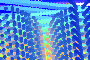
To kick things off, I took more time studying the patterns I could generate, particularly by integrating sine and cosine functions to craft these visual effects. Below, you’ll find a selection of the artistic pieces I’ve crafted. Please note that these are experimental representations of different potential patterns and not the final designs.


Yeah and this one too (EXTRA COLORS!)…
(you can see the version as the title of each artwork) 😉

Then i started to look at different approaches to create the background of the main page. I wanted it to look something close to the night sky with stars, so this is one of my draft ideas.

But…. This isn’t doing justice to the other art piece, it may look simple which might compliment the “complexity” of the other pieces, But thats not what I’m looking for. I started to look at different functions in p5, until is stumbled upon orbitControl. ummm… this is too interesting to be left alone. I started looking at the different possibilities with it, i started watching videos explaining how to create a 3D object using x,y, and z axis, along with sin, cos, phi, and theta. It was time to Create a new fresh file, and put all the stuff i learnt from the previous projects as well as video tutorials.

and this is how it went..


Initially, the 3D design was static, requiring user agency to click and interact with it ( go ahead and try 😛 ). However, I aimed to make it dynamic, allowing it to move and rotate like my other projects. The challenge lay in achieving a linear movement for every point, and I didn’t have a clear solution for that at the time. Instead, I devised an alternative approach: I manipulated the “camera” using rotateX and rotateY to create the illusion of a linear visual rotation.

But…. I still haven’t figured out the initial star background. but this design has the potential to look like a night sky.

lets do this..

and here we GO!

Reflection and future plans

These were my initial concepts for the upcoming project, but I have numerous additional features in the pipeline. These include the ability to download the final static art piece, granting users more agency and a personalized experience. Additionally, there will be a main page that will serve as the home for all these art pieces.


Week 5 response

Computer Vision X interactive Arts

After diving into week 3’s  paper that tackled the concept of “interactivity,” I couldn’t help but be intrigued by how this idea was put into practice in our current reading. It was like uncovering a hidden dimension of technology and its impact on our daily lives.

What really blew my mind was the revelation that the very first virtual reality (VR) environment came into existence roughly half a century ago. Imagine that, 50 years ago, someone was already dreaming up immersive digital worlds! This historical tidbit adds a layer of perspective to our modern, high-tech world and reminds us of how far we’ve come.

As the author sifted through various projects in their analysis, it became evident that there was a noticeable surge in the variety and scope of projects in the early 2000s. This period seems to have been a turning point where technology started enabling a broader range of interactive experiences, and that’s a testament to the rapid evolution of our digital landscape.

What truly captured my imagination, though, was the way computer vision revolutionized interactive art and computer-based interactions, which the reading explained through numerous real-world examples. It’s fascinating to witness how technology, particularly computer vision, has transformed the way we engage with both art and machines. The reading was like a window into a world where the boundaries between humans and technology blur, opening up exciting possibilities for creativity and innovation.

In essence, these insights not only highlight the evolving nature of technology but also underscore its profound impact on our lives, from the way we define interactivity to the immersive experiences we now take for granted in the digital age.

Assignment 4: 676 Wonder Hues

676 Wonder Hues

For this project, I needed to use data visualization, but instead of portraying it in a graph or a static image, I was striving to make it look dynamic while also giving agency to people to have a personalized experience. To start with, I began looking for different sets of data, but none of them were as customizable to each person as much as their names. However, there are millions of names, and it would not be possible to link all those names in a CSV file. Hence, there was an alternative way, getting a smaller sample of names and counting the number of names associated with each alphabet. To begin, I was able to get 7000 different male and female names, then using Excel I counted the number of names that starts with each alphabet. Next, I imported the Excel to my project in p5. After hours of brainstorming , I was able to modify a previous code of mine to give different visual illusions. By using only the initial of each name, I am only limited to 26 different combinations. However, by using the person’s first and last name initials, I am able to bump it to 676 different visual illustrations and hence the project name “676 wonder hues”.

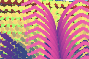
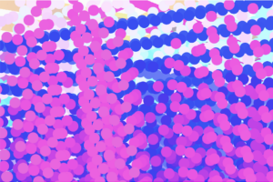
Below are a few patterns to different initials.

Initials: “PM”

Initials: “DS”

Part of the code

function setup() {
  createCanvas(600, 600);

  let alphabet = names.getColumn("alphabet");
  let frequency = names.getColumn("freq");

  sampleName = "P,M";

  let splitString = split(sampleName, ",");

  alpha1 = splitString[0];
  alpha2 = splitString[1];

}
function getValue(targetAlphabet) {
  let alphabet = names.getColumn("alphabet");
  let frequency = names.getColumn("freq");
  let rowNum = names.getRowCount();

  for (let i = 0; i < rowNum; i++) {
    if (alphabet[i] === targetAlphabet) {
      return frequency[i];
    }
  }
}

Reflections and improvement

In the future I want to add a section on the screen for the user to input their initials.I also look forward to add more color combinations to increase the customizability of the visual illustration.


The Design of Everyday Things – Response

In my opinion, Donald A. Norman’s insights in the first chapter of “The Design of Everyday Things” are incredibly relevant and thought-provoking. He raises a crucial point about the role of design in our daily lives and the impact it has on our experiences.

Norman’s concept of “the psychopathology of everyday things” is something we can all relate to. How often have we struggled with a poorly designed door handle or a confusing remote control? It can be incredibly frustrating, and Norman rightly shifts the blame from the users to the design itself. The idea that design should prioritize the needs and convenience of regular people, rather than serving as a showcase for designers’ creativity, resonates with me. Good design, in my view, should indeed be about simplifying and enhancing our lives, not adding unnecessary complexity. I appreciate Norman’s emphasis on Human-Centered Design, which underscores the importance of considering how people actually use things in their daily lives. It’s a reminder that designers should be creating products and interfaces that make our lives easier, not more complicated.

Moreover, I also agree with the author about how design should be approached as a deliberate subject rather than relying solely on intuition. It’s not a straightforward task, especially when considering the diverse ways people across the globe understand things based on their cultural and environmental contexts. What may seem logical in one culture or region may not be the same in another. For instance, a common design for doors in America might not apply universally in a place like Egypt. This highlights the need for a universal design approach that transcends individual logic and cultural differences. Designers must strive to create solutions that can be understood and used effectively by a broad spectrum of users, acknowledging that their own logic may not align with the users’ perspectives and expectations.

Ultimately, Norman’s message serves as a valuable reminder that when things are hard to use, it’s not our fault. It’s a call to action for designers to prioritize usability and user experience in their creations, and I wholeheartedly agree with that sentiment.

Assignment 3

The Infinite Canvas

Concept

This project came about by chance. Initially, my goal was to design two color-changing balls. While I was exploring ways to enhance the project, I stumbled upon the idea of removing the background function. This allowed the ball from the previous frame to remain on the screen. I eliminated the stroke and implemented a color gradient transition, which produced a visually pleasing effect. To expand on this concept, I decided to create multiple duplicates of both balls, aligning them with the “mother” ball. Then, I began experimenting with adjusting the hardcoded bounce variables. Each time I increased the value by 0.1, it resulted in a distinct pattern, sometimes even yielding unique “art pieces” that had an appealing element of randomness.

The “random” Art pieces


Furthermore, I developed different versions of this project. The first version functions as a standard screensaver-like visual effect. By tweaking the bounce function variables, users can generate their own one-of-a-kind art pieces. In the second version, I introduced user interaction. Initially, the screen displays two beams, and when a user clicks on it, an additional beam appears, leaving a trace on the screen. The beam stops when the user releases the mouse button. This change opens up endless possibilities for creating an unlimited number of distinctive patterns.

Version ONE

Version two

Code that i’m proud of

//Ball colors
var r = map(sin(frameCount), -1, 1, 50, 255);
var g = map(cos(frameCount / 2), -1, 1, 50, 255);
var b = map(sin(frameCount / 9), -1, 1, 50, 255);
fill(r, g, b);

//creating ball/ ellipse
ellipse(this.x, this.y, 24, 24);

//adding second beam on click
let count = 0;
if(mouseIsPressed)
{
count += 24
}
for (let i = 0; i < 12 + count; i += 24) {
ellipse(this.x + i/4 , this.y + i * 2, 24, 24);
}
}

Reflection and IMPROVEments

In the future I would love to add a feature that enables the user to pause the moving beams and save the sketch.


The Art of Interactive Design

The way the author explains interactivity is quite interesting. What caught my attention was when the author talked about a falling tree branch in the woods, and how what happens next is a reaction, not a true interaction. The author was able to present a well-structured step-by-step approach to defining interactivity. He started by discussing communication and the roles of different actors, then went on to propose the idea of categorizing interactivity into two levels: low and high, and explained how to tell them apart.

Chris’s viewpoint on interactivity is really unique and got me thinking that we might need a new word to describe what He’s talking about, especially since the term “interactivity” has been used incorrectly so often. This also brings up the question of how we decide if a digital artwork or project is interactive or not. On the flip side, it seems like he is mostly focused on human interaction (communication) as the main type, comparing computer limitations to human communication and interactions which might be insufficient to create a strong argument. This might mean they’re missing out on considering other forms of interactivity that don’t involve humans.

Furthermore, the author gave good examples to differentiate between an interaction and a reaction. For instance, he spoke about a reader reading a book where they only react to what they read rather than “interact” with it. Even though I believe these examples are prevalent, they were essential in explaining the difference between both terms. However, if we refer back to the initial examples presented in the beginning of the paper, such as the image of a child playing on an “interactable” rug, it could indeed be considered a form of interaction if it provides distinct feedback to the child based on the specific actions they take.

In general, the author has made a compelling case and touched upon a subject that could be relevant to various contemporary buzzwords we employ nowadays. Take, for instance, the phrase “Immersive experience.” Lately, numerous businesses have adopted this term to describe their offerings as immersive, even when they fall far short of delivering a high-quality, enjoyable experience for the user.