Week 8: Arduino Project | Don’t open the diary!

IMG_9625

(You can watch the video here)

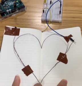
When the diary is closed, it will complete an electrical circuit, allowing current to flow, and turning the switch “on.”  The yellow
LED light should be on when the diary is closed because usually, we should not read someone’s diary. So, in this project, I am using a diary as a privacy indicator. When the diary is closed, a tiny LED on its cover lights up, signaling that it’s off-limits and private. The light is a visual reminder to respect personal boundaries and not read someone’s personal thoughts. It’s a straightforward way to encourage privacy and uphold the tradition of keeping diaries safe from prying eyes.

During the project, there were some challenges. Attaching jumper wires to the diary’s pages was a bit tricky, and electric tape was used to help keep the copper wire in place, even though it may not look very clean. Another challenge was dealing with the copper wire – its insulation had to be removed to ensure the electrical circuit worked. Sometimes, the LED didn’t light up consistently when the diary was closed, likely due to difficulties in securing the copper wire in the notebook. Despite these challenges, the project successfully turned a diary into a privacy reminder.

Mid-Term Project 3: What A Waste


https://editor.p5js.org/Minjae0216/sketches/hPYFgGfht

Concept of The Game:

“What A Waste” operates as an engaging educational game with a clear mission: to educate students about the crucial importance of proper waste segregation. It addresses a pressing issue in the United Arab Emirates (UAE) where recycling rates have fallen below 10%, primarily due to a lack of awareness and insufficient segregation infrastructure. The government’s sustainability goals for 2030 aim to divert 75% of waste from landfills, making proper waste segregation imperative. The game simulates real-life scenarios, such as students mistakenly placing non-recyclable items in recycling bins. Players must correctly sort recyclable items to prevent contamination in the recycling stream. By doing so, they learn the adverse consequences of unsorted waste, which not only hinder recycling but also increase the workload for recycling centers and waste management companies. “What A Waste” fosters a sense of responsibility and equips students with the knowledge and habits needed to contribute to recycling efforts, supporting the UAE’s sustainability goals and promoting a cleaner environment.

How the game works:

The game’s design incorporates a simple yet effective concept. Players click the start button, and trash items begin to fall from the screen. The challenge lies in catching and correctly placing plastic waste into the plastic recycling bin, earning 2 points for each correct placement. Catching the wrong trash, like dirty plastic plates or paper boxes, leads to a loss of life. This format tests players’ knowledge of proper recycling while making waste sorting and segregation engaging and interactive. The game’s mechanics align with its educational purpose, reinforcing the importance of correct waste management practices. It’s a game where entertainment meets education, allowing players to win by accumulating 15 points and, in turn, contributing to a more sustainable future.

Codes I am proud of:

class Basket {
  constructor() {
    this.x = width / 2; // Initialize the basket's x-position at the center of the canvas.
    this.y = height - 100; // Initialize the basket's y-position near the bottom of the canvas.
    this.width = 110; // Set the width of the basket.
    this.height = 110; // Set the height of the basket.
  }

  // Renders the basket on the canvas.
  display() {
    // Use the image() function to display the basket image at the specified position and dimensions.
    image(basketImage, this.x - this.width / 2, this.y - this.height / 2, this.width, this.height);
  }

  //control the horizontal movement of the basket using arrow keys.
  move() {
    if (keyIsDown(LEFT_ARROW) && this.x > this.width / 2) {
      this.x -= basketSpeed;
    }
    if (keyIsDown(RIGHT_ARROW) && this.x < width - this.width / 2) {
      this.x += basketSpeed;
    }
  }
}

/// objects that fall from the top of the screen in the game.
class FallingObject {
  constructor() {
    this.x = random(width); // Initialize a random horizontal position for the falling object.
    this.y = 0; // Set the initial vertical position at the top of the canvas.
    this.radius = random(50, 70); // Set the size (radius) of the falling object.
    this.speed = random(objectSpeedMin, objectSpeedMax); // Set the falling speed.
    this.image = random(trashImages); // Randomly select an image for the falling object
    
    // Check if the selected trash image is recyclable (true) or not (false).
    this.isRecyclable = this.image === trashImages[0] || this.image === trashImages[1] || this.image === trashImages[2]; // Check if the trash is recyclable
  }


  display() {
    // Use the image() function to display the object's image at its current position and size.
    image(this.image, this.x - this.radius / 5, this.y - this.radius / 5, this.radius, this.radius);
  }

  
 // updates the vertical position, causing the object to fall down the screen.
  fall() {
    this.y += this.speed;
  }

“FallingObject” is my favorite part of the code because it is the heart of the game’s dynamic and unpredictable nature. The FallingObject class is responsible for creating the diverse objects that rain down on the player. Its uncertainty lies in the use of randomization, ensuring that no two objects are alike in terms of position, size, and speed. This randomness adds an element of excitement and surprise to the game, making it more engaging for players.

What’s truly remarkable is how this part of my code logically manages the recyclability aspect. By checking and categorizing the objects as recyclable or not, it directly ties into the game’s core mechanics. Thus, this coding structure effectively integrates both fun and educational elements. Furthermore, the smooth movement of these falling objects enhances the gameplay’s fluidity, which is another reason I take pride in this code section. In essence, the FallingObject class is one of the standout features in my project.

Areas for Improvement:

During the development process, some challenges were encountered, such as refining the game’s difficulty curve and maintaining a balance between fun and education. I can implement adaptive difficulty levels that adjust based on the player’s performance for the next project. If a player consistently performs well, increase the challenge. If they struggle, offer easier levels or hints. Developing adaptive difficulty will make the game remain engaging for players of different skill levels. Moreover, the accessibility of the game, especially for younger players, was one of the considerations. Ensuring that the game is both fun and easy to understand for its target audience presented a significant design challenge. Despite these challenges, I believe my project successfully aligns entertainment with educational objectives, creating a promising tool for waste segregation awareness and fostering eco-conscious habits among students.

Mid-Term Project Report 2: What A Waste

Concept: 

“WHAT A WASTE” is an educational game aimed at educating students about the importance of proper waste segregation. Nowadays, the recycling rate in the UAE drops below 10%, mainly due to a lack of awareness and segregation infrastructure, while the government’s sustainable agenda for 2030 aims to divert 75% of the waste produced in the UAE from landfills. Inspired by real-life scenarios, such as students inadvertently placing non-recyclable items like half-full Coca-Cola bottles into recycling bins, the game’s core objective is to prevent contamination in recycling bins. Players are tasked with identifying and sorting recyclable items correctly to avoid contaminating the recycling stream. By doing so, they learn that unsorted waste not only hinders the recycling process but also increases the workload for recycling centers and waste management companies. Through engaging gameplay and practical examples, “WHAT A WASTE” seeks to equip students with the knowledge and habits needed to contribute effectively to recycling efforts, supporting the UAE’s sustainability goals and promoting a cleaner environment.

Rule of the game:

In the “WHAT A WASTE” game, players click the start button to begin. As they do, a variety of trash items will start falling down from the screen. The first crucial step is to catch the plastic waste and place it in the plastic recycling bin. When players successfully catch clean plastic trash, they earn 2 points. However, if they fail to catch any trash, their score remains at zero. The challenge intensifies when players accidentally catch the wrong trash, such as dirty plastic plates or paper boxes, as this causes them to lose one of their remaining lives. This game format not only tests players’ knowledge of proper recycling but also provides an engaging and interactive way to reinforce the importance of correct waste sorting and segregation. When the player accumulates 15 points, they win the game.

Things to Improve:

The first thing I want to improve is the PNG that I use for the waste. Since it is a large size PNG, it is very easy to lose the game. I need to change the size and add more photos of the waste.

Secondly, I need to add design and songs on the start and end pages and also include the instructions on the start page.

Lastly, I would like to update my code to include a restart button and make the game restart after I win or lose the game.


Week 5: Mid-term Idea

Concept:

The basic concept of this game is a simple catching game where players control a basket at the bottom of the screen, moving it left and right using arrow keys, to catch objects falling from the top. The objective is to catch these falling objects to accumulate a score, with the goal of reaching a target score of 55. Once the player achieves or surpasses this score, the game concludes with a “You won!” message, testing the player’s hand-eye coordination and timing skills in the process.


Purpose of the Game:

Through this basic basket game, I would like to promote sustainability and environmental awareness. I will change the stick to a recycle bin and the falling objects to different kinds of garbage. The purpose of this recycling game is to offer an interactive platform to educate players about responsible waste management and recycling, emphasizing the positive impact of individual actions on preserving the environment. By collecting garbage with a recycling bin, the game can encourage players to adopt eco-friendly practices and underscores the significance of recycling as a means to reduce waste and conserve resources. This concept aligns with the goal of inspiring players to take real-world steps towards a cleaner and more sustainable planet.


Improvement:

To enhance my recycling game, I should consider implementing the following improvements:

Firstly, I should enrich the game’s visual experience with polished graphics and animations, along with a thematic background to reinforce sustainability. Secondly, I might incorporate sound effects and music for immersion. And gradually increase difficulty levels and introduce diverse recyclable items and challenges. For example, I can add power-ups, bonuses, and obstacles to make gameplay more engaging.  I would like to ensure responsiveness across devices and optimize code for smooth performance, accounting for accessibility features. Finally, I will consider localization to reach a wider audience. These enhancements can elevate the game’s impact and educational value while making it more enjoyable for my players.

Week 5: Reading Response

The democratization of computer vision represents a remarkable shift in the accessibility and applicability of this technology. In the past, computer vision was often seen as a highly specialized field reserved for experts in signal processing and artificial intelligence. Its applications were largely confined to military and law enforcement. However, the recent developments outlined in the article have broken down these barriers and opened up a world of possibilities.

One of the most exciting aspects of this transformation is the creative renaissance it has sparked. Artists, designers, and novice programmers can now explore and experiment with computer vision to create interactive, visually captivating experiences. This democratization aligns with the broader trend of technology becoming more user-friendly and accessible, empowering individuals to harness the power of advanced technologies for artistic expression and innovation.

The example of “LimboTime” is a testament to the ingenuity that emerges when individuals are given the tools and knowledge to work with computer vision. It’s not just about the technology itself but also about the ideas and artistic visions that can be brought to life. This democratization allows for a diverse range of voices and perspectives to contribute to the development of computer vision applications, enriching the field with fresh insights and innovative approaches.

Furthermore, the article’s emphasis on the synergy between physical environment design and software development is particularly insightful. It reminds me that successful computer vision applications often require a thoughtful integration of the digital and physical worlds. This holistic approach encourages creators to consider the real-world context in which their applications will operate, leading to more effective and imaginative solutions.

As the availability of computer vision tools continues to expand and improve, I can anticipate even more exciting developments in art, gaming, and beyond. The fusion of computer vision with other emerging technologies, such as augmented reality and virtual reality, holds the promise of creating entirely new modes of artistic expression and interactive storytelling. It’s a testament to the power of technology to empower creativity and democratize innovation.

In conclusion, I think the democratization of computer vision is a transformative and positive trend. It not only broadens participation in the field but also enriches the world of art, design, and interactive media. It signifies a shift towards a more inclusive and innovative future where the boundaries of what is possible with computer vision are continually pushed by a diverse community of creators.

Week 4: Reading Response

In Chapter 1, I was interested in how the author discusses the dual nature of technology, highlighting how it can simultaneously make life easier and more enjoyable while also introducing added complexities and frustrations. They use the example of the wristwatch to illustrate how technological advances have led to more functions and features in devices, which can pose design challenges. The author envisions a future where various devices, such as phones and watches, might merge into one unit with flexible displays and advanced capabilities.

The central argument of the text revolves around the paradox of technology: it offers increased benefits but also increases the difficulty of use. This paradox presents a significant challenge for designers who must balance the desire for more functionality with the need for user-friendliness and simplicity.

In my opinion, the author raises valid points about the challenges posed by technology’s ever-increasing complexity. It’s true that as devices become more advanced and multifunctional, there is a risk of overwhelming users with features and controls. This can lead to frustration and, in some cases, users opting not to use certain devices altogether, as the text suggests with the example of people replacing watches with cell phones. Moreover, the author’s mention of the potential merger of devices like phones and watches into one unit with flexible displays and advanced capabilities is already becoming a reality with the development of wearable technology. For instance, smartwatches now integrate features like messaging, fitness tracking, and even contactless payments. While this convergence provides convenience, it also requires designers to carefully consider how to present these functions in an accessible and user-friendly manner, avoiding overwhelming users with too much information or complexity.

The author’s suggestion of agreed-upon standards for controls and interfaces is a practical approach to mitigating the complexity issue. Standardization can indeed simplify the user experience by ensuring consistency across devices and reducing the learning curve for users. However, as the author acknowledges, reaching such agreements in a rapidly evolving technological landscape can be challenging.

In conclusion, I agree with the text’s assertion that technology presents a paradox: it can both simplify and complicate our lives. Designers face the ongoing challenge of striking the right balance between functionality and usability to ensure that technological advances genuinely enhance our lives without causing unnecessary frustration.

Assignment 4: Generative Text Output (La Mariposa)

I wanted to make artwork using a Spanish poem I liked. It is called “La Mariposa”.

La Mariposa
“Si yo fuera otra cosa, sería mariposa” (If I were something else, I would be a butterfly”)
Sin dirección salvo la brisa (With no direction but the breeze)
Flotaría entre belleza y belleza (I would float among beauty after beauty)
Tocando el cielo y la fresa (Touching the sky and the strawberry)
Una vida que sale como risa (A life that emerges like laughter)
“Si yo fuera otra cosa, sería mariposa” (“If I were something else, I would be a butterfly”)
Doradas del sol mis alas (Golden are my wings in the sun)

This poem evokes a sense of freedom, beauty, and simplicity. The speaker imagines the carefree life of a butterfly, fluttering from one beautiful thing to another, symbolizing a desire for a life unburdened by worries and constraints. I also wanted to highlight the fleeting, delicate, and ephemeral nature of life, much like a butterfly’s existence in this project.

function mousePressed() {
  // Display the next poem line when the mouse is pressed
  currentLineIndex = (currentLineIndex + 1) % poemLines.length;
   clear();
  // Display the current poem line
  text(poemLines[currentLineIndex], width / 2, height / 2);
}

The biggest challenge was that I could not clear the remaining lines of the poem after I clicked the mouse. So, the lines did not renew, it kept writing new lines above the remaining line. After I learned the “Clear” function, I could clear the canvas and display the next line of the poem each time I clicked the mouse, renewing the poem text.

Furthermore, I tried to make the butterfly move around the canvas more realistically.

  // Calculate the angle for butterfly rotation based on velocity
  butterflyAngle = atan2(butterflyVelocityY, butterflyVelocityX) + PI / 2;

  // Apply the angle and display the butterfly
  push();
  translate(butterflyX, butterflyY);
  rotate(butterflyAngle);
  imageMode(CENTER);
  image(butterflyImage, 0, 0, butterflySize, butterflySize);
  pop();

  // Update butterfly position
  butterflyX += butterflyVelocityX;
  butterflyY += butterflyVelocityY;

  // Wrap the butterfly around the canvas edges
  if (butterflyX > width) {
    butterflyX = 0;
  } else if (butterflyX < 0) {
    butterflyX = width;
  }
  if (butterflyY > height) {
    butterflyY = 0;
  } else if (butterflyY < 0) {
    butterflyY = height;
  }

  // Add a flapping wing animation
  butterflySize = 100 + sin(frameCount * wingFlapSpeed) * 10; // Adjust wing flap speed
}

The butterfly image is rotated based on its velocity direction to make it more realistic. Also, a wing-flapping animation is added by changing the butterfly’s size over time. This gives the appearance of the wings flapping. To make the butterfly rotate slowly, I adjusted the wingFlapSpeed variable to control the speed of wing flapping.

Next time, it would be better to mix data visualization and generative text output together rather than to use images in the background.

Reading Reflection: Interactivity in “The Art of Interactive Design”

Chris Crawford’s exploration of interactivity in “The Art of Interactive Design” challenges us to rethink our understanding of this fundamental concept in design. By emphasizing interactivity as a two-way conversation, critiquing its misuse, and highlighting its subjectivity, Crawford underscores the importance of user-centric design principles. In a world saturated with technology and digital interfaces, prioritizing active involvement and meaningful engagement is paramount. Ultimately, the essence of interactivity lies in its ability to empower users, giving them a voice and agency in their digital interactions, and this perspective should guide our approach to interactive design.

Crawford’s emphasis on interactivity as active involvement aligns seamlessly with the principles of user-centric design. In user-centric design, the user’s experience takes precedence, and the goal is to empower users by giving them the ability to make meaningful choices and feel a sense of agency. Interactivity, as defined by Crawford, becomes a means to achieve this empowerment.

I believe that user-centric design, while valuable, can face several challenges. It can inadvertently assume homogeneity among users, overlooking diverse needs. Overreliance on user preferences may inhibit innovation and encourage a short-term focus, potentially neglecting long-term considerations. Balancing user wants with genuine needs can be tricky, and accommodating constant user feedback can lead to scope creep and project delays. Biased or limited user research data can result in designs that cater to specific subsets of users, and resistance to change from users may impede progress. Additionally, striving to please all users can lead to a design-by-committee approach. To address these challenges, user-centric design should be part of a holistic approach that considers innovation, business goals, ethics, and sustainability, while maintaining flexibility to adapt to evolving user needs and technology.

Scuba Diver

This is my first sketch of a “Scuba Diver”.

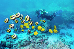
My art project does not seem as realistic as the photo. However, I tried to use a similar blue color and an array of fish to portray a Scuba Diver’s active moments. This fall break I am planning to go scuba diving with my friends. Scuba diving is an exhilarating and transformative experience for many people. The moment I descend beneath the surface, I can enter a completely different world filled with awe-inspiring marine life, vibrant colors, and a profound sense of weightlessness. The feeling of gliding through the water, exploring coral reefs or underwater caves, and encountering fascinating creatures can evoke a sense of wonder and adventure. The rhythmic sound of my own breathing through the regulator, the cool embrace of the water, and the importance of unity with the underwater environment can create a profound sense of peace and tranquility.

I created this art project to make people feel the same as me.

I wanted to make the fish look more realistic. So, I used arrays to store the points of the wavy background and objects (instances of the Fish class) to represent and control the behavior of fish in the underwater scene. Also, two images are preloaded using the preload() function: ‘scuba.png’ and ‘fish.png’. These images are used for the scuba diver and fish graphics in the sketch. Therefore, The scuba diver and fish move and are displayed on the canvas, creating an animated underwater environment.

// Create the blue wave
  let xOff = 0;
  for (let x = 0; x <= width + 10; x += 20) {
    let yOff = 0;
    let y = height - 100 + map(noise(xOff, yOff), 0, 1, -20, 20);
    wave.push(createVector(x, y));
    xOff += 0.1; // Adjust the noise detail for different wave patterns
  }

  // Create fish objects
  for (let i = 0; i < 5; i++) {
    fish.push(new Fish());
  }
function preload() {
  // Load the dolphin and fish images
  dolphinImg = loadImage('dolphin.png');
  fishImage = loadImage('fish.png');
}

To enhance my code for the underwater scene, there are several areas for improvement. It would be better to reorganize the code by dividing it into functions or classes to improve readability and maintainability. Additionally, defining constants or variables for parameters such as canvas dimensions, image sizes, and the number of fish can make it easier to experiment with different settings. Maybe next time, comprehensive comments and documentation can be added throughout the code to explain its various components and functions, aiding in understanding and collaboration. I would try to make more lively and aesthetic waves also!


NYC, The City That Never Sleeps

Concept

In this assignment, I used loops and basic functions to show the hectic, vibrant, and bustling nightlife of New York City. I wanted to express how I felt when I saw the night sky view of NYC.

21 Best Views In NYC At Night To Take In A Manhattan Skyline View

I was captured by NYC’s iconic skyline, which is illuminated by countless skyscrapers, billboards, and streetlights. The city’s streets and buildings are bathed in a sea of lights, creating a dazzling and energetic atmosphere. Times Square, in particular, is known for its vibrant, neon-lit signs and bustling nightlife.

Even the moon is vibrantly moving in NYC. The night view of NYC is indeed hectic, but it’s also a unique and exciting experience for visitors and residents alike. When I saw numerous buildings in the skyline, I felt that not only New Yorkers, but everything in NYC kept changing. The city’s energy and vibrancy come to life after dark, offering a wide range of activities and entertainment options to suit every taste.

The highlight of My Code

// Draw cityscape buildings
 fill(100); // Building color
 for (let x = 50; x < width; x += 100) {
   let buildingHeight = random(100, 300);
   rect(x, height - buildingHeight, 80, buildingHeight);
   // Windows in buildings
   for (let y = height - buildingHeight + 20; y < height - 20; y += 40) {
     for (let i = x + 10; i < x + 80; i += 20) {
       fill(random(0,200, 255), random(0,200, 255), 0); // Random yellowish lights
       rect(i, y, 10, 10);
     }
   }
 }

The code then enters a nested loop structure using two “for” loops:

  1. The outer loop, for (let x = 50; x < width; x += 100), iterates horizontally across the canvas starting at x = 50 and continuing until it reaches the canvas width. This loop defines the x-coordinate of the buildings, with a gap of 100 pixels between each building.
  2. Inside the outer loop, there’s an inner loop: for (let y = height - buildingHeight + 20; y < height - 20; y += 40). This inner loop iterates vertically within each building. It starts at a height just above the building’s base and ends just below the top edge of the building. It defines the y-coordinate for the windows, with a gap of 40 pixels between each row of windows.

Furthermore, fill(random(0,200, 255), random(0,200, 255), 0); this line sets the fill color for each window to a random yellowish color. The random() function is used to generate random values for the red (0-255), green (0-200), and blue (0) components of the color, creating a range of yellowish shades. The 0 in the fill() function is for the blue component, making the color closer to yellow.

The combination of these loops and drawing commands results in a cityscape with randomly sized buildings and rows of randomly colored windows, giving the appearance of city lights in the evening.

Reflection and Ideas for Future Work

There are several ways to enhance this artwork. For instance, I could add more complex building shapes, introduce different lighting effects, or simulate perspective to create a more three-dimensional look. Also, I will design a cityscape that can potentially convey a narrative or mood next time. I could add New Yorkers in these buildings, adjust the colors, or arrangement of windows to evoke specific emotions and tell a story about the city and its inhabitants.