Reading Reflection: Week 8

I have always questioned the relationship between aesthetics and usability/functionality. In many of the designs that exist, I feel like people value the appearance more than the functionality of the design. Therefore, some designs failed to fulfill the purpose they were supposed to serve. In this case, although the design adds color and taste to the environment, I feel like they are not useful since they do not satisfy the role they should.

Donald A. Norman in his writing said “Although poor design is never excusable, when people are in a relaxed situation, the pleasant pleasurable aspects of the design will make them more tolerant of difficulties and problems in the interface” (page 5-6). Although I prioritize functionality over aesthetics, I found myself agreeing with what the author said. When my emotions are chill and I am in a relaxed situation, I become more tolerant and easygoing about designs that do not satisfy my needs. Whether or not I am pleased with the usability of the design, if I am in a “good mood” I forget about the the poor design and am convinced that it is a good design. Therefore, the mood of a person plays a big role in determining the quality of the design.

Similarly, when I am in a bad mood, small issues with the design seem big and they irritate me. Just as the author said, good human-centered designs are especially important in stressful situations and designers must find ways to create designs that will not make the users want to stop using them.

In all, I realized that there are a lot of factors that we have to consider when designing. Following up with previous readings, human emotion is a factor that greatly affects the quality and usability of designs. Due to the fluctuation in human emotion, I found the designer’s job very difficult and I wonder what other factors designers consider before releasing the design to the public.

Midterm Project: Brick Breaker Game – Help the Wolf Break the House

Concept and Guide of the Game

The original story of three little pigs ends with the wolf failing to break into the brick house. The concept of my game is the opposite of this. The aim of the game is to help the wolf break the brick wall of the house and encounter the pigs. I wanted to give a twist to the original story and help the wolf win over the three little pigs. 

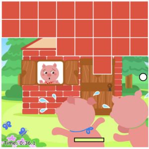
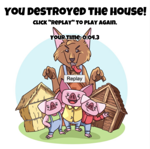
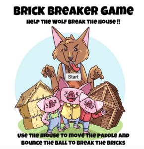
The game follows the same rules of the brick breaker game. But the idea is to break all the bricks using the bouncing ball so that the wolf can meet up with the pigs. Playing the game is simple. When the user clicks on the start button on the opening page, the game starts immediately. The user must use the mouse to move the paddle to bounce off the balls and break the bricks. Simultaneously, a timer runs to measure the time it takes the user to break all the bricks. The aim of this game is to break all the bricks in the shortest time possible. The timer is displayed throughout the game at the bottom left corner and the final time is displayed at the ending page that appears when the bricks are all gone. The user can replay the game by simply clicking on the replay button that navigates the user back to the opening page. 

Understanding the Overall Code

I created three classes for the game: ball, paddle, and brick. 

First, in the class Ball, I have three smaller functions: draw, move, and bounce. The functions instruct the ball to be drawn on the canvas, to animate across the canvas, and to change directions. 

Second, in the class Paddle, I drew the paddle and made it so that the ball bounces off the paddle when in contact. 

Lastly, in the class Brick, I drew the brick and used ‘if and else’ to detect the four edges of the brick. Also, I used ‘if and else’ to test if the ball and the brick collided. 

With these three classes, I called them in the main sketch and operated the game. In the main sketch, there are 9 other functions: preload, setup, startGame, draw, drawStartPage, allBricksGone, endGame, replayGame, and createTimer. There are specific instructions under each function that controls the behavior of the game. 

What I am Proud Of 

The first part of the code that I am proud of is the function for the timer. At first, I had no timer and hence the goal of the game was to simply break all the bricks. However, I realized that if there is no timer, the user is not put under any pressure to play the game well. Therefore, I decided to place a timer so that the user is pushed to play and finish the game faster. 

function createTimer() {
  //timer object with update and display methods
  let timerObject = {
    startTime: 0,
    elapsed: 0,

    update: function () {
      this.elapsed = millis() - this.startTime;
    },

    display: function () {
      textSize(13);
      textAlign(CENTER, CENTER);
      fill('black');
      stroke('white');
      textFont('Verdana');
      text('Time: ' + this.format(), width / 2 - 150, height - 10);
    },

    format: function () {
      //convert milliseconds to a readable time format (mm:ss)
      let minutes = Math.floor(this.elapsed / 60000);
      let seconds = ((this.elapsed % 60000) / 1000).toFixed(1);
      return minutes + ':' + (seconds < 10 ? '0' : '') + seconds;
    },
  };

  return timerObject;
}

Another part of the code that I am proud of is the function for endGame. Under this function, I created a button that allows the user to replay the game. So when the endButton, which is the button used to replay the game, is pressed, the function for replayGame is operated. When the endGame function runs, the time it took the user to finish the game is displayed for the user. 

function endGame() {
  //show the end page with replay button
  background(255);

  push();
  translate(10, 50);
  scale(0.4);
  image(startImg, 0, 0);
  pop();

  //create a replay button
  endButton.show();
  endButton.position(width / 2 - endButton.width / 2, height / 2);
  
  textSize(30);
  textAlign(CENTER, CENTER);
  fill(0);
  textFont(myFont);
  text('You destroyed the house!', width / 2, height / 4 - 70);
  textSize(16);
  text('Click "Replay" to play again.', width / 2, height / 2 - 140);
  
  endButton.mousePressed(replayGame);

  //display the final time
  textSize(16);
  text('Your Time: ' + timer.format(), width / 2, height / 2 - 100);
}

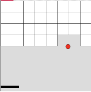
Also, I am very pleased with the look of the game. The theme or the design fits well into the concept of the game and adds to the experience of the user. The picture below is the the initial design of the game. From that design, I added colors and images to add aesthetics.
Difficulty & How I Overcame It 

The hardest part of coding was using the ‘if and else’ statement to change the pages of the game (opening, game, and ending). As shown below, the code itself is simple: I just have to call the classes and functions that I created previously and use the ‘if and else’ statement to create conditions. However, for some reason I could not navigate from one page to another. Through trial and error, I was able to get it to work. 

function draw() {
  //draw the start page if the game hasn't started or if it's replaying
  if ((!ball || allBricksGone())&& start== true ) {
    drawStartPage();
  } else {
    //draw the game elements
    push();
    translate(-15, 0);
    scale(0.34);
    image(backgroundImg, 0, 0);
    pop();

    paddle.x = mouseX;

    //nested loop for creating bricks when not collided with the ball
    for (let i = 0; i < cols; i++) {
      for (let j = 0; j < rows; j++) {
        if (bricks[i][j].val == 0) {
          bricks[i][j].drawBrick();
          bricks[i][j].collided(ball);
        }
      }
    }

    //check if all bricks are gone
    if (allBricksGone()) {
      endGame();
    } else {
      //update the timer
      timer.update();

      ball.moveBall();
      ball.bounceBall();
      ball.drawBall();

      paddle.hitPaddle(ball);
      paddle.drawPaddle();

      //display the timer
      timer.display();
    }
  }
}

These are the pages in the order of opening, game, and ending.
Improvement

For improvement, I would like to enable fullscreen. As of now, the game screen is too small and the game experience would be enhanced when the game screen is larger. 

Another improvement I would like to make is displaying the record of the 5 fastest times on the ending page. In this way, the user would be more motivated to play better and faster.

Lastly, it would be more entertaining if I create a losing condition. For instance, I could make the ball not bounce off the bottom wall so that when the ball passes through the bottom wall, the time increases by 3 seconds. In this way, it would take longer and be harder for the user to complete the game.

Midterm Project Progress: Brick Breaker Game

Concept

The concept of the game is breaking the brick wall of the house of three little pigs. As of the original story, the wolf fails to break into the house of the youngest pig because brick walls are too strong. However, through my game, the wolf is able to break into the house and meet the pigs. Therefore, as the user breaks the bricks, an image of three little pigs that were hiding behind the bricks will be visible.

Design

So far, I have worked on creating the code for the bricks, bouncing ball, and the paddle. Using classes and functions, I organized the code and tried to make it look “neat”. However, I have not added any details or aesthetic to the game. Therefore, as it is shown below, the outlook of the game is quite dull.

Regarding the aesthetics, I am planning to add color and use brick png in place of the rectangles. The background will be decorated to look like the house of the three little pigs. Also, I am going to add sound effects to make the game more interesting. For the home page, I will use text for the title and create a button to start the game. I will also create an end page that allows the user to replay the game.

Difficulty 

The most difficult part in the coding process was figuring out how to make the bricks in rows and columns and make them disappear when collided with the ball. I watched and referenced this video and it was confusing for me to use the “if statements” to create various conditions. The code I used to create class brick is shown below.

class Brick {
  constructor (x, y, w, h){
    this.x = x;
    this.y = y;
    this.w = w;
    this.h = h;
    this.collide = false;
    this.val = 0;
  }
  
  drawBrick(){
    if (this.collide){
      fill(255, 255, 0);
    } else {
      fill (255);
    }
    rect(this.x, this.y, this.w, this.h);
  }
  
  
  collided(ball){
    //x and y cordinate of the edges of the brick to detect when the ball collides with the bricks
    let closeX = ball.x;
    let closeY = ball.y;
    
    //detecting right and left side of the brick
    if (ball.x > this.x + this.w){
      closeX = this.x + this.w;
    } else if (ball.x < this.x){
      closeX = this.x;
    }
    
    //detecting top and bottom side of the brick
    if (ball.y > this.y + this.h){
      closeY = this.y + this.h;
    } else if (ball.y < this.y){
      closeY = this.y;
    }
    
    //testing if the ball and the brick collided
    let distance = dist(closeX, closeY, ball.x, ball.y);
    
    if (distance <= ball.r){
      this.collide = true;
      this.val = 1;
      ball.dy = ball.dy * -1;
    } else {
      this.collide = false;
    }
    
  }
  
}

This is the code in the main sketch that creates the bricks in rows and columns by using arrays.

function setup() {
  createCanvas(400, 400);

  //nested loop for creating rows and columns of bricks
  for (let i=0; i<cols; i++){
    bricks[i] = [];
    for (let j=0; j<rows; j++) {
      bricks[i][j] = new Brick(i*size, j*size, size, size);
    }
  }

This is the code in the main sketch that makes the bricks appear when not collided, hence making them disappear when collided.

function draw() {

 //nested loop for creating bricks when not collided with the ball
  for (let i=0; i<cols; i++){
    for (let j=0; j<rows; j++){
      if (bricks[i][j].val == 0){
        bricks[i][j].drawBrick();
        bricks[i][j].collided(ball);        
      }
    }
  }

Other parts of the project that I am concerned about is creating the buttons for “play” and “reset”.  I have never created a button for other assignments and I will be challenging myself to create several buttons to add user interaction.

The only user interaction that is possible so far is moving the paddle with mouseX function. This is why I want to add the buttons to add more interaction and user experience.

Reading Reflection: Week 5

I was surprised by the ways in which computer vision works with interactive art. Recently, I have been interested in public surveillance and curious about the use of technology in the field. The Suicide Box was the one I thought was meaningful and useful. Recognizing suicide attempts in the Golden Gate Bridge, humans devised a machine to detect the vertical motion of people and hence make a guess on whether or not the person is about to jump off the bridge.

The debate that arose around the Suicide Box was interesting as well. The question of “is it ethically okay to record suicides” and “are the recordings real” make us think if the invention of such technology is necessary or useful. As of I know, there are still a lot of questions regarding the topic of public surveillance and the use of technology for face recognition and video recording. While I think these tools are very useful, I also understand the ethical concerns that comes with the uses of the tools.

To continue, computer vision is quite difficult to use considering the setting in which it works best. For example, background subtraction and brightness thresholding could fail if the person in the scene have similar color or brightness to his surroundings. The fact that we have to design the physical conditions in which computer visions will be used is bothering. Although computer visions in their perfect setting works well and abstracts useful information, figuring out ways to use computer vision in any setting would be even more useful and beneficial to the society.

In short, the intersectional study and use of computer vision and interactive media seems to have great potential in the coming future. Computer vision and interactive media have areas in which they can be used and the developments made so far show how life in general can advance.

Reading Reflection: Week 4

As a user of many machines, I agree with what the author said about the two most important characteristics of good design: discoverability and understanding. The example the author gave with opening doors was the one I found myself relating to. There were many doors that I encountered that gave me difficulties in figuring out what I should do in order to open the door. This touches upon discoverability that the author discussed. Some doors challenged me to try various actions (push, pull, slide) to sucessfully open the door. 

Something I noticed about modern designs is that they are drawn for aesthetics. While the designs manage to perform all the functions that they are supposed to, users often struggle to figure out how to use the design and question why they are built the way they are. Aesthetics is important, especially in the current age where people care about the looks of things. However, when it comes to creating problem in using the design, I feel like it may be better to put aside the aesthetics and focus on the functionality and accessiblity of the designs. 

To move on, the author talked about engineers being too logical in creating the designs. Because engineers who build the designs are being too logical, the machines they built are eventually also too logical for non-engineers to use. Hence this creates difficulties for the users and prevents them for using the inventions that the engineers spent time building. To fix this, I think engineers have to have the mindset of “we are building designs for people according to their ability” and not “we are creating designs for people who think like we do”. In this way, instead of having the users fit into the designs, designs will fit into humans and meet their needs. 

Overall, the reading made me rethink about designs around me and their purpose. While there are many great designs already out there in the world, I believe people can create better designs by understanding the abilities and logic of humans or the target customers. 

Assignment 4: Displaying Text

The concept of this assignment is emotions. There are numerous ways to express one type of feeling. As I saw from this website, there are 5 main emotions (enjoyment, sadness, fear, anger, disgust). I have selected 5 words from each category and generated a code that randomly selects and displays the words on the canvas. Ultimately, my goal for this assignment was to show the many emotions humans feel.

In this assignment, I used the pause code to make the artwork interactive. When the user clicks on the canvas, the randomly selected words pause and the canvas freezes. When the user clicks on the canvas again, the random generation resumes. The code below shows how I implemented it.

//when mouse is pressed, random display of words pause/resume
function mousePressed(){
  
  if(pause == false){
    noLoop();
    pause=true;
  }
  
  else {
    loop();
    pause=false;
  }

For improvement, I would like to add a reset button. I’ve tried adding the button but was unsuccessful at it. Adding the reset button would allow the users to have a more interactive experience and also get a view of the image before it gets covered with words.

click on the canvas to pause/resume the display of words


Reading Reflection: Week 3

The way the author defined the term “interactivity” caught my attention. To me, interactivity simply means interactions between two things or people. However, the author defined it in terms of a conversation where two actors actively take turn listening, thinking, and speaking. To further the definition, the author mentioned the role of subtasks (thinking, listening, speaking) in determining the quality of the interaction. Interactivity is not only about the interaction itself but also the subtasks that need to be well-performed to result in a high-quality interaction.

The author made an argument on what things are considered not interactive. I found myself agreeing with what the author defined as not interactive and an example given was a printed book. Although it speaks the words to the readers, it does not listen or think. In other words, the book and the reader do not alternately listen, speak, and think. In this way, the book is not interactive and hence cannot collaborate with humans, who are considered interactive.

To add on, an example of dancing as a non-interactive activity was a surprise. I thought dancing was interactive because dancers move according to the music. However, according to the author, dancing is not interactive because music is not an actor that can think and listen. It speaks the melodies and lyrics of the song but is not able to interchange with the dancer. Similarly, the movie is another subject that humans cannot interact with. Although I felt like I was exchanging ideas with the movies I watched, in fact, I was not interacting with the movies or the actors displayed in the movies.

Overall, the author’s definition of interactivity was fascinating. The author’s definition made me rethink what I consider interactive and hence how to develop good designs. While great designs can result between interactive and non-interactive actors, harmony between two interactive actors can also create designs of high quality and interest. With this reading, I will be trying to create designs that show the conversation of several interactive actors.

Assignment 3: OOP

The product of this assignment is an extension of assignment 2: I wanted to further develop the code for bouncing ball by using class. The concept of this work is shooting star. Recently, the weather in Abu Dhabi has been so nice and I have been enjoying taking “sky-gaze”. Looking at the night sky and the stars, I thought I could use class to create several stars on P5.

This is the class named Star. Under this class, there is a constructor that determines the position and speed of the star. Also, there are three other instructions that guide the actions of the star (move, bounce, and show). I didn’t encounter any difficulty while constructing class and this process was easier than constructing the code under function draw.

class Star {
  constructor(x,y,xspeed,yspeed) {
    this.x = x;
    this.y = y;
    this.xspeed = xspeed;
    this.yspeed = yspeed;
  }

  move() {
    this.x = this.x + this.xspeed;
    this.y = this.y + this.yspeed;
  }

  bounce() {
    if (this.x > width || this.x < 0) {
      this.xspeed = this.xspeed * -1;
    }

    if (this.y > height || this.y < 0) {
      this.yspeed = this.yspeed * -1;
    }
  }

  show() {
    noStroke();
    fill('rgb(241,241,214)');
    ellipse(this.x, this.y, 15, 15);
  }
}

This is the section of code that I struggled with. Because I wasn’t familiar with some of the code such as interactive, new,  and push, I had to spend extra time to figure out how to use the code. However, once I grasped an understanding of the code by referencing class slide, I could use it to draw interactive stars.

function mousePressed(){
  
  //adding new star
  let interactiveStar = new Star(mouseX, mouseY, random(-5,5), random(-5,5));
  star.push(interactiveStar);

}

This is a portion of code that I am proud of. I learned how to animate objects in P5 using arrow keys by watching this video. The overall process of creating this code was easy but I had to go back and make global variables to be able to animate the object (rocket).

  //moving the rocket up and down
  if (keyIsPressed){
    if (keyCode == UP_ARROW){
      b--;
    } else if (keyCode == DOWN_ARROW){
      b++;
    }
  }
  
  //moving the rocket right and left
  if (keyIsPressed){
    if (keyCode == LEFT_ARROW){
      a--;
    } else if (keyCode == RIGHT_ARROW){
      a++;
    }
}

For improvement, I would like to actually create a star shaped shooting star and not use an ellipse. In this way, a shooting star would be more well-represented.

Reading Reflection: Week 2

The video made me realize how nature and code (or technology in a broader sense) can go together to create a work of art. Casey Reas gave several examples of using nature in technology to produce something that is unexpected or unusual.

The example of using sound to create an interactive art was eye opening. Depending on the sound or noise, the elements of the artwork moved in response. The artwork itself was, to my surprise, aesthetically pleasing and entertaining to look at.

Another example that caught my attention was the artwork that illustrated tissue cells. This artwork made me rethink about ways technology and coding can work with nature to produce art. I’ve always thought of coding as irrelevant to nature. However, with the examples and explanations Casey Reas gave, I was able to learn that the two concepts are not necessarily separate. When technology and nature work together, a great product of art can be obtained. Nature can be expressed and illustrated through media and it was interesting to look at works of creators that creatively incorporated nature into their works.

To move on, a concept that was mentioned various times during the video is randomness. While there are order and structure in coding, randomness adds a different taste and texture to the work.  However, I was brought up to the question “is randomness always good?” as I finished watching the video. The unexpectedness that comes from randomness may be delightful, but I sometimes feel like it’s better to have structure and order to enhance the users’ understanding and experience.

Assignment 2: Work of art

My inspiration came from ProgrammInformation21_PI21 particularly pages 14 and 15. I was impressed by the work of art that was created from lines and hence in my art, I tried to use lines. Along with lines, the concept of my work is black and white. When the user is not clicking on the mouse, the background remains black and the lines white which makes the black bouncing balls visible around the area where lines are drawn. When the mouse is clicked, the background turns white, the lines black, and the bouncing balls white which makes the bouncing balls visible around the area where lines are drawn. However, due to the transparency of the background, the paths of the ball remain visible throughout the interaction. By using black and white, I wanted to hide and show the bouncing balls.

The section of code below shows the ‘if/else’ and ‘for’ code that I used to create the work. I used ‘if/else’ command to change the color of the elements during the interaction and ‘for’ command to draw the repeated lines. I incorporated the ‘mouseIsPressed’ code to make the art interactive and more entertaining for the users.

For improvement, I would like to try using different colors other than black and white. Furthermore, I would like to make the balls change to different colors whenever they bounce off a wall. I tried to do this by using ‘random’ but wasn’t able to do it successfully. Also, adding more shapes is another way I could improve this work. By doing so, the users may see more various shapes under the areas of lines.

//change color of background 
if (mouseIsPressed){
  background(255,5);
}
else{
  background(0,5);
}


//change color of bouncing balls
if(mouseIsPressed){
  fill(255);
}
else{
fill(0);
}

//bouncing ball 1
noStroke();
ellipse(a, b, 20, 20);
a = a + speedA;
b = b + speedB;

if((a<0) || (a>width)) {
  speedA *=-1;
}

if((b<0) || (b>height)) {
  speedB *=-1;
}

//change color of lines
if (mouseIsPressed){
  stroke('black');
}
else{
  stroke("white");
    }

//lines on the right
for (let x=0; x<=500; x += 9){
 line(x, 0, 400, 500);
}