Emotion & Design: Attractive things work better
Norman’s article explains the often misunderstood relation between design, usability, and aesthetics. It’s a refreshing perspective that challenges the notion that usability and beauty are at odds with each other. Instead, he suggests they can and should coexist, creating products that are not only functional but also visually pleasing.
I found Norman’s personal examples, like his collection of teapots, to be relatable. It’s a reminder that the objects we use daily can be more than just tools; they can be sources of joy and satisfaction. The idea that an attractive design can make a product work better may sound unconventional, but it resonates with my experiences in web development. Often, web visitors experience better browsing and interactivity with a webpage if it is visually appealing.
The discussion about the impact of emotions on design is particularly interesting. Norman’s insights into how positive and negative affect can influence our cognitive processes and decision-making make me rethink the relationship between our emotions and the things we interact with daily.
Her Code Got Humans on the Moon
Margaret Hamilton’s story underscores the significance of gender diversity in the tech field. It prompts us to reflect on the ongoing gender disparity that still plagues the industry. While there has been some progress, we’re far from achieving true gender equality in tech. Indeed, some studies specifically focused on software developers suggest that as few as 8-10% of all software developers are female [1]. Hamilton’s journey from an era when women were discouraged from pursuing high-powered technical roles to becoming a pioneering figure in software engineering is incredibly inspiring.
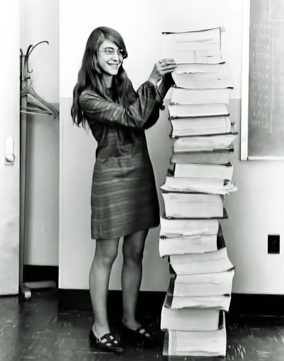
What strikes me most is Hamilton’s unwavering determination and resilience. Her ability to lead a team, make critical technical decisions, and solve complex problems during the Apollo project is a testament to her expertise and commitment. Her dedication to perfection and her diligence in addressing potential issues serve as a valuable lesson in the importance of rigorous testing and debugging in software development. Moreover, we need to keep in mind the time when she was working, especially in terms of technological progress. Just picture this: the thousands of lines of code we can effortlessly write, compile, and debug in a matter of seconds today were back then written and meticulously refined using the available technology of that era. Here is her photo [2] while standing next to listings of the Apollo Guidance Computer (AGC) source code.
Resources:
[1] https://jetrockets.com/blog/women-in-tech-why-are-only-10-of-software-developers-female
[2] https://www.wired.com/2015/10/margaret-hamilton-nasa-apollo/
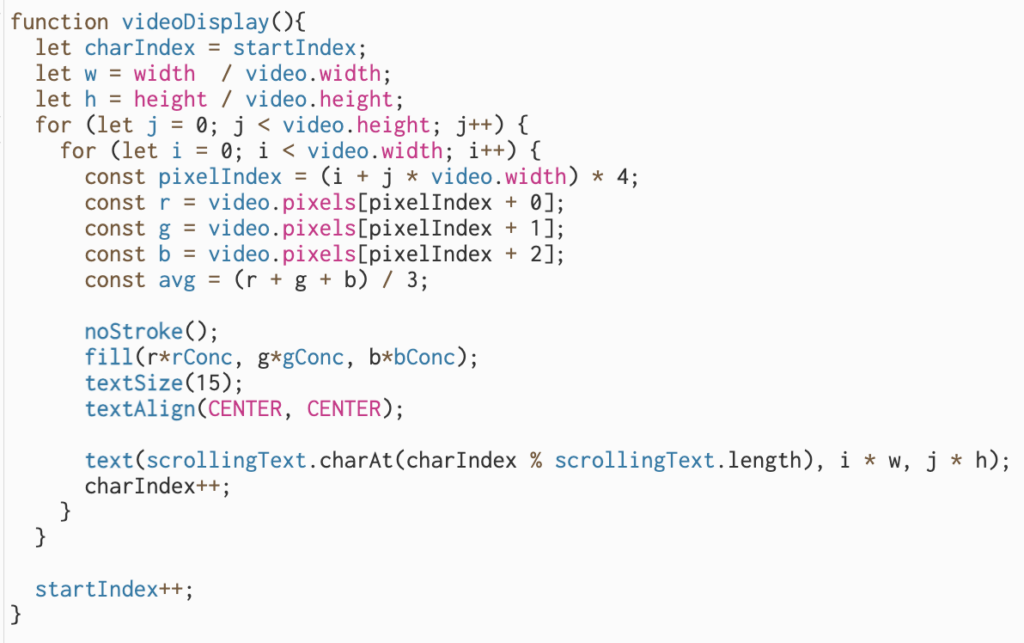


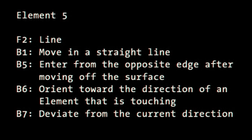
 Sketch:
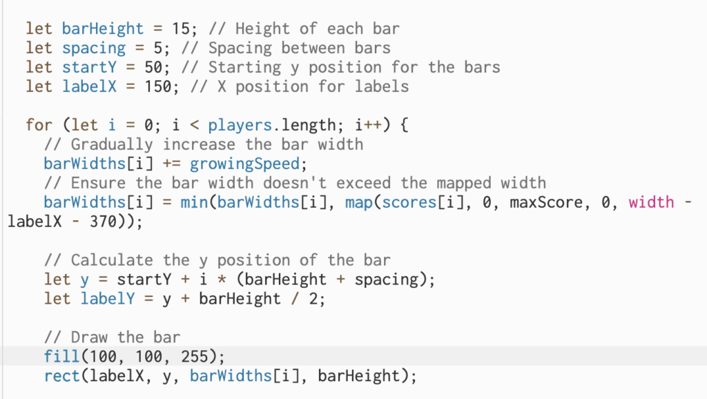
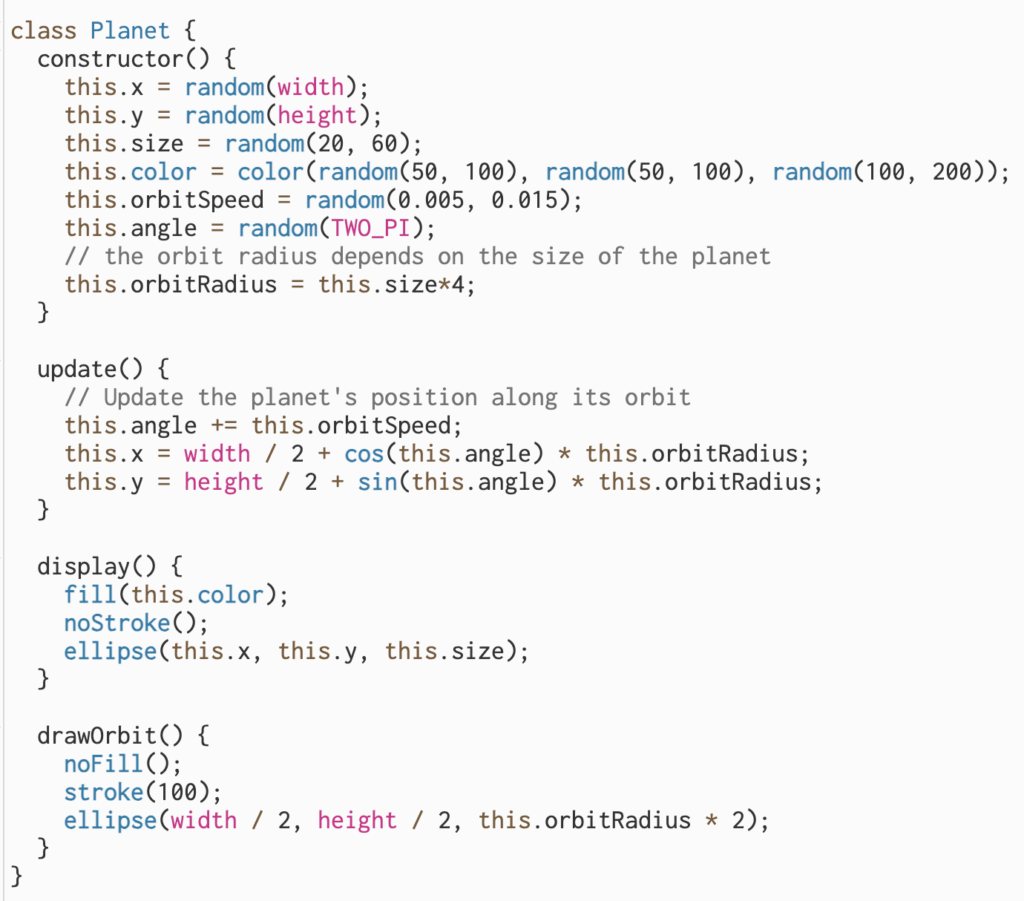
 Sketch:
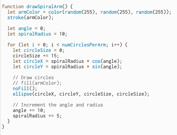