Week 8a: Attractive Things Work Better and Her Code Got Humans on the Moon

I remember when I first pledged my allegiance to the iOS subsystem, denouncing Android once and for all. I recall my uncle, a staunch supporter of Android, berating me for my lack of evidence supporting the superiority of iOS. All I had to say to defend myself was that iOS displays simply looked better. I was 13 at the time and I pondered whether I simply wasn’t tech-savvy enough. 10 years later, I still hold the same opinion and have never considered leaving the iOS cult. Aesthetics are, indeed, an important complement to usability, as Norman says. I am less likely to yell at my iPhone when it lags than I am at an Android. Its seamless design is enticing enough to suppress the negative affect of the anxiety of working through the occasional lags and confusion of working with technology.

This also reminded me of the invention of a GUI in place of the regular terminal. There is no inherent usability or advantage of using a GUI as an interface over the terminal. In fact, I would argue that for certain needs, the terminal may provide faster access to data and processes on the user’s computer in addition to greater control. To be fair, terminal commands do require a bit of learning but they could be easily learned by beginners. I would argue the attractiveness of the GUI makes the experience of interacting with a computer more pleasant, more seamless, and less stressful, potentially contributing to more productivity and, perhaps even, enhanced usability.

GUI Terminal Interface

I, especially, loved the second reading on the story of Margaret Hamilton’s contributions to the Apollo mission to the moon. What was exceptional about the story, in addition to highlighting an important female figure who has made critical contributions to one of the most important human achievements – all while being a mother, but also the meta-process of coding and creating code. To learn that the bare bones of what software is was formulated with the help of a powerful woman is also a great testament to the valuable contributions of women to technology and innovation – an insight to be considered in a time and age where the technology field is male-dominated and could oftentimes be hostile to women.

Raya Tabassum: Reading Response 5

The concept that “attractive things work better” suggests that when users find an object attractive, they tend to perceive it as more user-friendly, which can enhance their overall interaction with it. It argues for a balance between functionality and beauty in design, suggesting that products should not only be practical and easy to use but also evoke positive emotions to enhance user experience. The reflection on personal experiences with teapots suggests a deeper, perhaps unspoken critique: that the essence of design transcends its physical form or function, tapping into the user’s emotional and situational contexts. This perspective invites us to reconsider the role of affect in design, not as a secondary aspect but as a central component of usability.
The narrative around three distinct teapots illustrates varied design priorities — usability, aesthetics, and practicality — and how these elements impact user preference depending on context and mood. It raises implicit questions about the prevailing biases in design philosophy — do we undervalue the emotional impact of aesthetics due to a hyperfocus on functionality? This challenges us to think beyond traditional design paradigms, advocating for a more nuanced approach that incorporates affect as a fundamental aspect of design thinking.

The second reading of Margaret Hamilton’s journey from a young MIT programmer to a pioneer of software engineering for the Apollo missions encapsulates a story of groundbreaking achievement amidst societal and professional challenges. Her innovative work in developing flight software was pivotal in landing men on the moon, highlighting her role in transforming software development into a critical component of modern technological endeavors. Hamilton’s perseverance and ingenuity not only broke gender barriers in a male-dominated field but also laid the foundational principles of software engineering, influencing countless future innovations and establishing her legacy as a trailblazer in both technology and gender equality in STEM.

Week 8a Reading : Norman and the Nuances of Aesthetic Practicality

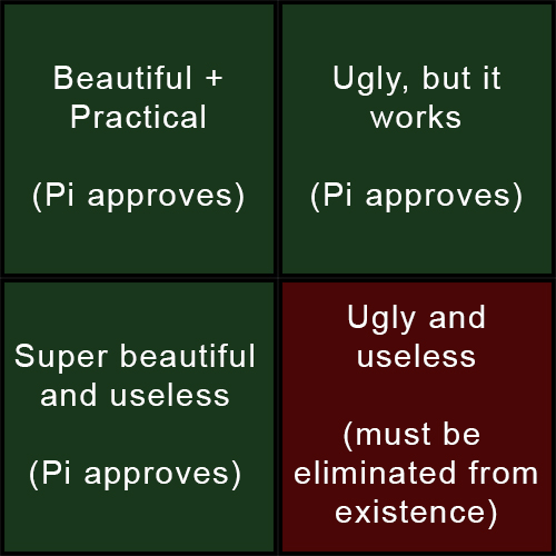
Written on my dorm wall, there is a manifesto that reads “Aesthetical Practicality Manifesto…There is no right or wrong, only what is practical and what is not…Anything which is not of utmost practicality, intense beauty, or ideally, a blend of both, is bullshit, and must be always avoided.”

Reading through Norman’s “Emotion & Design: Attractive things work better,” to me, was like I heard a harmonic echo of my thoughts. Juxtaposition by Norman to show the weaving of practicality and aesthetics in design, is what I so strongly support. In short, my life is super simple. I just follow the following with almost everything in my life.
First up, Norman’s opening on affect and design captures a simple truth: “Advances in our understanding of emotion and affect have implications for the science of design.” This one has always resonated with me. In my quest to blend the roles of a engineer with an artist, I understood that emotion is not a byproduct but the guiding force in the process. Norman words that nicely, “Positive affect can make complex tasks feel easier; negative affect does the opposite. His story of the color displays in computers, which was once thought to be superfluous but later turning out to be very necessary and practical, though not making any practical benefit at all, was absolutely representative of this principle. I still think about his words whenever I try to beautify my computer terminals with themes and eveything, while in reality, there is nothing of practical value… but having a Batman/Ironman like computer User Interface improves my motivation to work by hundredfold.

Norman’s teapot examples are a treasure trove of insights. The pot by Carelman, unus unusable teapot by Nanna, and a tilting pot by Ronnefeldt represent, in a nutshell, the whole spectrum of design philosophies: from functionally unpractical, through aesthetically awkward and unwieldy but serving its purpose, all the way to functional sophistication. Just the way Norman believes, I think form is function.

I do not see aesthetics and usability in opposition but as dance partners. One reinforces the other’s strength. When Norman poses, “Why not beauty and brains, pleasure and usability?” I find myself nodding in agreement. This mirrors the core tenet of my manifestoᅳthat of the achievement of practicality so palpable but in the most beautiful aesthetic way possible. Such is very key in my work at the intersection between technology and art. For example, take the development in software engineering for user interfaces. A visually appealing interface that confounds the user is as ineffective as a drab but functional one.

We really need interfaces that are pleasant to the eyes, at the same time taking the user around effectivelyᅳbasically, nice skeuomorphic designs that I have always admired.

Another very deep reflection I like is Norman’s argument about affect in design. He shows how our emotions and fears make us change our minds altogether about the difficulty of the task, using the example of the plank at different heights. In the professional world, I have seen firsthand that the right emotional design can make the use of even a complex piece of software feel approachableᅳor perhaps even actually fun. Norman’s statement, “Positive affect can make it easier to do difficult tasks,” exactly supports my belief in the attractive design improving the interaction with the product and hence letting the difficulty of the task be gone. But if anything, that’s a critique I might level against Norman: It would be how he treats the friction of usability against aesthetics. While he does fully grasp said friction, I think there’s leeway for a much more intricate exploration of how the two can be married together more cohesively in the design process.

My manifesto demands that once tangible practicality is demonstrated, achieving aesthetics is paramount.

This is where the art of design truly lies – in not just balancing but synthesizing function and form. Norman reflecting on the importance of good human-centered design in stressful situations is something I absolutely agree with. He underscores the importance of empathetic designs that take into account the emotional state of the user. This principle can be transferred from physical products to digital interfaces, where ease and clarity in navigation can do a lot not to stress users. In summary, the discourse of Norman reinstated to me what I had believed all along: aesthetic and practicality is basically a conglomeration.


Reading Response Week 8a – Stefania Petre

Before purchasing my current laptop, I spoke with a computer expert about which gadget I should purchase. He informed me that if I want it look nice, I should purchase a MacBook, but if I care about the “inside” of it, I should get something different. This is the same idea that the author discusses in this reading. Sometimes we choose things just for aesthetic purposes.

I think we can all remember the dispute between Android and iOS users. Even today I see people arguing about who can take the prettier picture of the moon and often times the android users are better at it. However, iOS still wins with most sales. Why? Because they have a prettier design .

This concept of design is called “Attractiveness Bias” which means that people tend to assume that people/objects who are physically attractive/ appealing, based on social beauty standards, also possess other desirable  traits.

Overall, I believe that design is truly a “make or breake” factor that influences the user experience a lot. I think that creators should think about that in advance in order for it to be successfull.

For me, as a design oriented person, I will always choose the aesthetically pleasing products.


(here I attached two pictures: the first one is an Asus ZenBook and the other one is a MacBook Pro)

Reading Reflection – Week#8

Both of the readings for this week have similarities and differences with each other, but one common thread among these readings that I tried to follow and extract was the role of human subjectivity in design. The first reading introduces psychological concepts in the form of affect and analyzes how they interact with design. The second reading shows the importance of it more subtly, by showing how a hazardous error was found by a kid playing around with the keyboard, and the same error was committed by an astronaut that was believed to be exceptionally professional. Unfortunately, nobody is perfect, and every human holds a different set of characteristics and, therefore, has a different perspective on the world and the tools they use. Hence, the one idea I would connect these readings with is the idea of personalization in design. Just like the three teapots in Norman’s text, different design has different form and functionality and can suit different people to accomplish a task. Even the same person in different moods or environments could desire a different design. If this idea is paired with the “beauty is subjective” discussion, we can see how personalization of design is important from Norman’s ideas about attractive things working better. As much as we like to think of ourselves as rational and intelligent creatures, humans are emotional at core and this should be reflected in good design, incorporating emotional choices along with functional choices.

Week 8 Response

The exploration of Margaret Hamilton’s contributions in “Her Code Got Humans on the Moon—And Invented Software Itself” and Donald A. Norman’s insights in “Emotion and Design” illuminate two profound yet interconnected realms of human ingenuity. Hamilton’s journey as a trailblazer in software engineering not only showcases the monumental role of software in space exploration but also reflects the broader implications of pioneering in technology. Her work, at a time when the term “software engineering” was not even coined, exemplifies the essence of innovation—venturing into the unknown with a blend of expertise, foresight, and courage. The narrative of Hamilton and her team meticulously crafting the software that would guide humans to the moon underlines the criticality of software in complex systems, a lesson that transcends industries and eras.

On the flip side, Norman’s discourse on the interplay between emotion and design serves as a philosophical counterpart to Hamilton’s empirical achievements. While Hamilton’s story underscores the technical precision and rigor necessary in engineering, Norman’s analysis delves into the subjective experience of interacting with technology. His argument that aesthetics and usability are not mutually exclusive but rather complementary forces offers a nuanced understanding of human interaction with technological products. Norman’s assertion that “attractive things work better” because they engender positive emotional responses, does not detract from usability but rather enhances it by acknowledging the human element in design.

In synthesizing insights from both readings, a critical reflection emerges on the symbiotic relationship between form and function, theory and practice, emotion and utility. Hamilton’s pioneering work in software engineering not only advanced our capabilities in space exploration but also laid the groundwork for considering how software interfaces—the very nexus between human and machine—need to be designed with both functionality and user experience in mind. This parallels Norman’s emphasis on the importance of emotional resonance in design, suggesting that the most effective designs are those that harmoniously blend aesthetic appeal with functional efficiency.

Furthermore, both narratives prompt a reflection on the role of diversity and interdisciplinary approaches in innovation. Hamilton, an outlier in her field, and Norman, bridging psychology and design, exemplify how bringing diverse perspectives to bear on challenges can lead to breakthrough solutions. This raises pertinent questions about how current and future innovations can benefit from integrating insights from seemingly disparate fields, fostering an environment where diversity of thought is not just encouraged but seen as essential to problem-solving.

Afra Binjerais – Week 8a reading response

In my reflection, when reading “attractive things work better” I understood how design is more than just about making things work well or look good. It’s about bringing these aspects together to enhance our experiences with technology, as our emotional reactions to a design are as important as its functionality. This broader view makes me appreciate how both practicality and our emotional responses matter in design.

When reading, I stumbled across a certain idea, where I was thinking that the color of a smartphone is a big deal when people decide what to buy. In general, black or white phones might look professional or classic, but a phone in a bright color like blue or red can make one feel excited or bold. These colors can attract customers who want to show their personality through their devices.

Personally, my phone is blue because that’s my favorite color. When I was choosing, the blue phone immediately stood out to me.

This experience shows how crucial emotional aspects, like color preferences, are in design. They can make technology more enjoyable and meaningful for us every day. By considering both function and emotion, design can really enrich our daily technology use, making it more satisfying and personal.

Margaret Hamilton’s journey – Week 8a

Reading about Margaret Hamilton’s journey in programming the Apollo mission and Don Norman’s thoughts on emotional design made me think deeply about how we blend innovation and design in technology. Hamilton was working on something as monumental as landing humans on the moon. She pioneered women in tech and the concept of software itself. It’s fascinating and a bit disheartening to see how, despite such trailblazers, we still grapple with gender equality in STEM. I wonder what more we must do to make the field more inclusive.

One passage that particularly resonated with me was Hamilton’s description of her work as “both a joy and a responsibility.” This encapsulates her passion and dedication to her work, recognizing its immense significance. It also highlights the pressure and burden she carried, knowing that the lives of astronauts depended on the code she and her team wrote. Even when others saw it as unnecessary, Hamilton’s insistence on adding error checks speaks volumes about foreseeing and mitigating human errors in tech. It’s a reminder of how vital it is to balance trust in technology with caution, especially as we lean more into AI and automation today.

On the flip side, Don Norman’s take on design brings a whole new layer to how we interact with technology. His story about the three teapots, each with a unique blend of aesthetics and functionality, shows that design has a deep meaning about how things look and make us feel and work for us. It got me thinking about how we design our digital tools and interfaces. Are we considering how they feel to use, or just how they function?

Both pieces highlight the importance of looking beyond the surface, whether breaking down gender barriers in tech or creating designs that delight and serve. They make me believe that innovation has more meanings and aspects to explore. Some people think it is only about the next big tech breakthrough, but it has hidden meanings, like making technology more human, accessible, and enjoyable for everyone.

Reading Response – Her Code Got Humans on the Moon—And Invented Software Itself

This piece blew my mind. I had no idea that one of the key pioneers of modern software and coding was a working mom from the 1960s! The fact that Margaret Hamilton was leading an MIT team writing the onboard flight software for the Apollo missions while also bringing her daughter to work makes her such an icon.

Just let that sink in for a moment. At a time when women were expected to stay home and support their husband’s career, Hamilton was leading an MIT team writing the critical onboard flight software that allowed NASA to accomplish the seemingly impossible – landing astronauts on the lunar surface and returning them safely.

What makes it even more incredible is that she was doing this boundary-pushing work while also bringing her young daughter to the lab. Little Lauren was napping under mommy’s desk as Hamilton and her team were inventing core programming concepts like error prioritisation and asynchronous processing from scratch. Techniques that are still fundamental today!

The part about the “Little Old Ladies” literally weaving the software into indestructible copper wires is so fascinating. It’s a stark contrast to our current world of seamless cloud computing and automatic updates. But it captures the blind ambition and faith in human ingenuity that powered that era’s space race.

My favorite anecdote from the reading though is Hamilton advocating to add extra fault protection to the code because her daughter had exposed a flaw in the simulator – and NASA dismissing it as impossible. Then that exact scenario happening on the critical Apollo 8 mission and Hamilton’s protocol saving the day! What foresight.

Stories like this are such great reminders that the technological marvels we now take for granted were once radical frontiers explored by true visionaries and pioneers like Hamilton. At a time when the concept of “software” was barely understood, she had the brilliance to blaze that trail through the unknown and invent an entirely new discipline.

This was such an inspiring read!!

Reading Response – Three Teapots

Don Norman’s “Three Teapots” piece really got me thinking about how design isn’t just about pure functionality. The part that stuck out to me was when he talked about his three very different teapots – the bizarrely unusable Carelman one, the plain but practical Nanna pot, and the cleverly designed Ronnefeldt tilting teapot. Despite their varying levels of usability, Norman admits to using all three regularly depending on his mood and the situation. 

This challenges the idea that good design has to be 100% focused on usability above all else. Norman makes the point that aesthetics, emotion, and personal preferences also play a huge role in how we perceive and enjoy designed objects. His teapot collection shows that design excellence isn’t a one-size-fits-all thing – it’s about striking the right balance between functionality, beauty, and generating an emotional connection for the user.

I totally relate to this from my own experiences with products and objects. There have been times when something was highly usable but felt soulless and uninspiring. On the flip side, I’ve been drawn to gorgeous pieces of design that maybe weren’t the most practical but just made me feel good owning and using them. Norman reminds us that great design caters to our practical needs as humans, but also our emotional and aesthetic desires.

His points about how emotions influence our thinking and decision-making were also fascinating. The idea that positive emotions can boost our creativity and tolerance for small design flaws, while negative emotions can make us laser-focused but closed-off, is pretty mind-blowing. It makes me think designers need to consider the emotional resonance of their work, not just tick boxes for usability.

Overall, “Three Teapots” challenges the usability-over-everything mentality in a really insightful way. It argues that design should harmonize utility, beauty, and generate an emotional response in users based on their subjective needs and experiences.