Assignment 3 (production 3) – Windows desktop!

The nostalgic interactive window displays and desktop backdrops that many of us cherish from our early years serve as the inspiration for this digital artwork assignment. My creative imagination has been deeply impacted by the joy and simplicity of those early interactive experiences, where one could lose hours exploring the graphical user interfaces of outdated operating systems and watching screensavers. This project started as an exercise in the classroom where we were to animate some balls and make them travel around the screen to look like they were bouncing off its edges. This exercise inspired me to create something new and dynamic that is similar to the old screens, while also bringing back fond memories of them.

I wanted to create an experience that would preserve the spirit of the effervescent Windows screensaver while adding contemporary interactive aspects. The idea was to design a dynamic canvas that, in response to human interaction, fills with bubbles, creating a lively and entertaining space evocative of a screensaver.


I wanted the bubbles to appear anytime the mouse was touched to make it more interactive. Therefore, I employed a mouse-press function that, based on the mouse’s position on the cavas, produced bubbles. Then, in order to make the entire piece more dynamic and creative—just as I was fascinated by the Windows screen when I was a youngster, so too would this pique kids’ interest in the labor of love that goes into creating it—I randomized a number of factors, including size, pace, and even the colors of the bubbles.

The code that I have is a lot similar to the one we had in class the only changes that I did is that I created an array to hold all the randomly generated bubbles in. This is the Bubbles file that has the class that generates the bubbles:

class Ball {
  // Constructor to initialize new Ball
  constructor(x, y, xspeed, yspeed, size) {
    this.x = x; // Ball x-coordinate
    this.y = y; // Ball y-coordinate
    this.xspeed = xspeed; // Ball speed in x-direction
    this.yspeed = yspeed; // Ball speed in y-direction
    this.size = size; // Diameter of ball
  }

  // Method to update ball position based on its speed
  move() {
    this.x += this.xspeed; // Update x-coordinate by x-speed
    this.y += this.yspeed; // Update y-coordinate by y-speed
  }

  // Method to change ball direction if it hits the canvas wall
  bounce() {
    // Checks if ball hits left or right edge of canvas
    if (this.x + this.size/2 > width || this.x - this.size/2 < 0) {
      this.xspeed *= -1; // Reverse x-direction speed
    }
    // Checks if ball hits top or bottom edge of canvas
    if (this.y + this.size/2 > height || this.y - this.size/2 < 0) {
      this.yspeed *= -1; // Reverse y-direction speed
    }
  }

  // Method to display ball on canvas
  display() {
    stroke(255); 
    strokeWeight(0); 
    fill(random(255), random(255), random(255)); // Sets fill color to random color
    ellipse(this.x, this.y, this.size, this.size); // Draws ellipse with specified size
  }
}

Then, I had the createBubble function in draw() so that every bubble that is created is randomized over and over again. This is the code for that:

// Initializes empty array to hold all Balls 
let balls = []; 


function setup() {
  createCanvas(600, 600); 
}


function draw() {
  background(0); 
  
  // Loops through each ball in balls array
  for (let ball of balls) {
    ball.move(); 
    ball.bounce(); 
    ball.display(); 
  }
}


function mousePressed() {
  createBall(); // Calls createBall function to create new Ball 
}


function createBall() {
  // Sets new ball's position to current mouse position
  let x = mouseX; 
  let y = mouseY;
  // Generates a random speed for new ball in both x and y directions
  let xspeed = random(-5, 5); 
  let yspeed = random(-5, 5);
  // Generates random size for new ball
  let size = random(10, 50); 

  // Creates new Ball object with specified parameters and adds it to balls array
  balls.push(new Ball(x, y, xspeed, yspeed, size));

I think a way to make this even better is to make the bubbles look more realistic like the bubbles in the windows server.

Assignment 3: UP! House by Sihyun Kim

As soon as I saw the instructions for this assignment that I have to utilize object-oriented programming and arrays, I thought of depicting balloons. More specifically, I reminded myself of the flying house of the Pixar movie called “Up” released in 2009. So, inspired by the flying house in this movie, I decided to recreate the flying house in this assignment. Attached below is the image of a flying house from “Up” which I was inspired by. 

For this assignment, I have created 3 classes, which were Balloon, House, and Cloud class. Each class contains attributes and functions needed for each object to be created.  

Balloon Class

class Balloon {
  constructor(x, y, height, colors) {
    this.balloonPosition = createVector(x, y); //position of the balloon saved as a vector for convinience
    
    this.balloonHeight = height; // height of the balloon
    
    this.balloonWidth = height * 0.8; //width of hte balloon; maintaining the balloon shape through making height is greater than the width
    
    this.balloonLift = createVector(0, -random(0.5, 1.5)); // random variable in between 0.5 to 1.5 for lifting the balloon
    
    this.balloonColor = random(colors); //picking the color of the balloon randomly from the color array
    
//determining the tilt factor of the ballon based on the x position of the balloon
    if (x < 180) {
      this.tilt = random(-PI / 8, -PI / 18); // tilting towards left
    } else if (x > 200) {
      this.tilt = random(PI / 18, PI / 8); //tilting towards right
    } else {
      this.tilt = 0;// does not tilt
    }
  }
  
  drawString(chimneyY){
    stroke(220);// color of the balloon string
    strokeWeight(1); //thickness of the string
    
    //setting up a reference point for rotation (bottom center)
    let x0=0; //x-coordinate of the bottom center relative to the (not tilted)balloon's center
    let y0=this.balloonHeight/2;// y-coordinate of the bottom center below the (not tilted) balloon's center
    
    //getting the rotated x and y coordinates of the center of the tilted balloon by applying the rotate formula 
    let rotatedX = x0 * cos(this.tilt) - y0 * sin(this.tilt);
    let rotatedY = x0 * sin(this.tilt) + y0 * cos(this.tilt);
    
    //Adding the rotatedX value to the original position of the balloon to obtain where to start the balloon's string
    let stringStartX= this.balloonPosition.x+rotatedX
    let stringStartY= this. balloonPosition.y+rotatedY
    
    //drawing the string
      line(stringStartX, stringStartY, 174,chimneyY-100)// the end of the string will be the same to show that the string is connected to the chimney 
    
    //  variables for drawing the knots(triangle)
    
    let baseSize= 50 // base size for the largest balloon
    let adjustment = (this.balloonHeight/baseSize)*5// changing the adjustments based on the size of the relative size of the balloon
    
    //calculating the triangle vertices by the balloon size 
    let vertexX1 = stringStartX - adjustment;
    let vertexY1 = stringStartY + adjustment;
    let vertexX2 = stringStartX + adjustment;
    let vertexY2 = stringStartY + adjustment;
    let vertexX0 = stringStartX; // Top vertex (string start point)
    let vertexY0 = stringStartY;

    // rotating vertices around the top vertex
    let rotatedVertexX1 = vertexX0 + (vertexX1 - vertexX0) * cos(this.tilt) - (vertexY1 - vertexY0) * sin(this.tilt);
    let rotatedVertexY1 = vertexY0 + (vertexX1 - vertexX0) * sin(this.tilt) + (vertexY1 - vertexY0) * cos(this.tilt);
    let rotatedVertexX2 = vertexX0 + (vertexX2 - vertexX0) * cos(this.tilt) - (vertexY2 - vertexY0) * sin(this.tilt);
    let rotatedVertexY2 = vertexY0 + (vertexX2 - vertexX0) * sin(this.tilt) + (vertexY2 - vertexY0) * cos(this.tilt);

    // drawing the rotated triangle (knot)
  noStroke();
  fill(this.balloonColor); // setting fill same color with the balloon for the triangle 
    triangle(rotatedVertexX1, rotatedVertexY1, rotatedVertexX2, rotatedVertexY2, vertexX0, vertexY0-3);
  }
  drawBalloon() {
    push();//saving the current drawinf style settings and transformations
    translate(this.balloonPosition.x,this.balloonPosition.y);// moving the origin to the balloon's position
    rotate(this.tilt);//rotating the canvas by the balloon's tilt angle
    fill(this.balloonColor);//setting the color to fill the balloon
    ellipse(0,0,this.balloonWidth,this.balloonHeight)//drawing the balloon at the new origin
    pop(); //restoring the previous drawing style settings and transformations
  }
  
update(){this.balloonPosition.add(this.balloonLift);// adding the lift vector to the balloon's position vector
}

}

As attached above, within the Balloon class, there are three functions: drawString(), drawBalloon(), and update(). The drawString() and drawBalloon() functions are functions that are responsible for drawing the string attached to the balloon and the balloon itself. I originally planned to draw a string within the drawBalloon() function as well. However, whenever I tried to do so, due to the order of the execution, the code’s output was not what I expected to see. Hence. I made the drawString to draw the string and the know of the balloon separately. 

For the drawBalloon() function, it was not particularly hard for me to code this part, as I just had to implement the ideas of rotating a shape and drawing a shape which we learned during one of our first lectures to code. 

However, for the drawString() function, it was quite challenging. It took me quite a while to figure out to ensure that the string and the knot of the balloon were located correctly on the bottom center of the balloon even after tilting the balloon itself. After struggling for a few minutes, I realized that I could use the sin() function and cos() function, which are built-in functions of p5, to figure out the “changed” bottom center of the balloon. More specifically, I was reminded of the coordination rotation formula, which I learned back in high school. Since we know the angle of rotation, through implementing coordination rotation formulas, I was able to easily figure out what is the changed x and y positions of the bottom center of the rotated balloon.  

For the update() function, which is responsible for raising the balloons, I have simply added the balloon lift vector to the balloon’s position vector. The update() function was one of the reasons why I decided to utilize the createVector() in the first part of the code. I wanted to make mine as concise as possible. Hence, to prevent making repetitive lengthy code, I decided to create the createVector(). As shown in the code snippet above, the lift factor is determined randomly between 0.5 and 1.5. I made the lift factor to be randomized because I wanted the balloons to have different speeds so that it would look more natural and it would help look like the balloons dragging the house above.

Cloud Class

drawCloud(){
  fill(255);//white color for the cloud
  noStroke();
  //creating several ellipses to form a cloud shape
  ellipse(this.cloudPosition.x, this.cloudPosition.y-10,70,50);
  ellipse(this.cloudPosition.x, this.cloudPosition.y-10, 70, 50);
  ellipse(this.cloudPosition.x + 10, this.cloudPosition.y + 10, 70, 50);
  ellipse(this.cloudPosition.x - 20, this.cloudPosition.y + 10, 70, 50);
  ellipse(this.cloudPosition.x+40, this.cloudPosition.y+10, 70,50);    
}


Within the cloud class, I have created the drawCloud() function to draw a cloud. As shown in the snippet above, I have illustrated the cloud by combining 4 ellipses. I have made the ellipse’s position to be random. So, every time we replay the code, the position of the cloud changes. 

House Class

update() {
  this.houseY -= 0.5; //liftingthe house
}

drawHouse() {
  
  // house body
  fill("#64b9dd")
  rectMode(CENTER);
  rect(this.houseX, this.houseY, 120, 60);

  // roof and other details
  fill("#84797b")
  quad(140, this.houseY - 90, 257, this.houseY - 90, 278, this.houseY - 30, 119, this.houseY - 30);
  fill("#fccc65")
  triangle(215, this.houseY - 110, 185, this.houseY- 30, 255, this.houseY - 30);

  // mini house body
  rectMode(CORNER);
  fill("#f3a07f")
  rect(200, this.houseY - 30, 40, 60);
  
  //door 
  fill(255)
  rect(154, this.houseY-10,30,40)
  stroke("#84797b")
  strokeWeight(8)
  point(175,this.houseY+10)
  strokeWeight(4)

  // windows
  noStroke()
  fill(255)
  rect(208,this.houseY-70,20,25)
  rect(207, this.houseY - 20, 25, 35);
  stroke( "#84797b")
  line(209,this.houseY-60,227,this.houseY-60)
  line(219, this.houseY - 19, 219, this.houseY + 14);
  line(207, this.houseY - 3, 232, this.houseY - 3);

  // chimney
  noStroke()
  fill("#84797b")
  rect(166, this.houseY-100, 20, 10);
}


There are 2 functions: drawHouse() and update(). As the names of the functions suggest, the drawHouse() function is responsible for drawing the house itself while the update() function is responsible for moving the house upward. For drawHouse(), I have utilized simple shape functions such as quad(), triangle(), rect(), and line() to draw the house. For the update() function, similar to the mechanism I used for the update() function of the Balloon class. I have deducted the lift factor of 0.5 to the y position of the instance of this class. 

In Main Sketch

In the main sketch, I have created the objects of the Balloon class, House class, and Cloud class. For Cloud class and Balloon Class, in which I had to create multiple objects, I created empty arrays and stored each object of the class to the respective array using the for loops. For the Balloon objects, I randomized the x and y positions of the object, the size of the balloon, and also the color of the balloon. But I’ve set a range when randomizing the x and y positions to ensure that the balloon is always created above the house. Also, for the Cloud class, I have randomized the x and y positions of the object and the size of the balloon. 

//function adding a new balloon when the mouse is pressed
function mousePressed() {
  //Checking if the mouse is pressed above a certain height relative to the house
  if (mouseY < house.houseY - 110) {
  // Add a new balloon at the mouse position with a random size and color
    balloons.push(new Balloon(mouseX, mouseY, random(20, 50), colors));
  }

One of the key parts of the main sketch-which I am particularly proud of- is the mousePressed. I have let a new Balloon be generated when the mouse is clicked. However, a new Balloon will be generated if and only if the y position of the mouse is above the house. I have set the initial number of balloons generated when the code is played to 90 balloons. After a few clicks of the mouse, when the number of balloons is more than 100, then the balloon and house will start rising. 

The Final Output

Mouse click above the house to add more balloons! Once there are more than 100 balloons, the house and balloons start rising 🙂

Reflection and Areas of Improvement.

Overall, I enjoyed working on this assignment. Although it was quite challenging to code as there were lots of things that I had to consider, it was very fun and interesting to apply arrays and classes together to create objects. I also loved how the usage of classes and arrays could make the code way simpler and more concise. For the areas of improvement, I think I can perhaps make the balloons pop when they reach the end and make the house fall when the number of balloons decreases. Also, I could make the house and balloons not only move up but also left and right using the keyboard arrows. 


Assignment 3 – Ramiel

In week 3, we learned arrays, functions, and object-oriented programming. Originally, I was trying to make Tetris because the concept was tied to using arrays and OOP. During practice, I encountered an error with my box() function, where the console referred to a built-in p5js box() function.

I became curious and decided to check out the reference pages. It turns out that the box() function generates a three-dimensional shape box using WEBGL. After some testing and playing around, I decided that I wanted to make a geometric shape using these simple shapes.

The concept is inspired by Ramiel from the popular show, Evangelion, a diamond-shaped being. Using rotation functions, I can achieve this look.

All Ramiel Scenes — EVANGELION:1.11 YOU ARE (NOT) ALONE. - YouTube

Ramiel. Evangelion 1.0 you are (not) alone.

I also experimented with sin and cosine functions that resulted in a particular pattern using texts for the background. I tried implementing a way to change the direction of the text wave, but it was more difficult than I imagined so I scraped the idea.

Mouse click to add more cubes, BACKSPACE to remove one.

The best part of the code that I liked is the pulsing effect for the cube using a very simple sin function. Overall, the project was fun and a challenging one that I enjoyed while experimenting with p5js.

display(){
    var pulse = this.size + sin(this.theta*1) * this.pulseAmplitude;  
    fill(0, this.objColor, 200);
    box(pulse);
    this.theta += 0.13;
  }

References & Tutorials

p5.js Web Editor | Circle Pulse (p5js.org)

p5.js Web Editor | Particle Waves (p5js.org)

reference | box() (p5js.org)

Reading Response to “The Art of Interactive Design”

Chris Crawford’s definition of interactivity in his book, “The Art of Interactive Design,” led me to rethink what is considered “interactive.” In the very first pages, Crawford mentions that he believes the term “interactive” has been overused and that “we’ve lost track of the word’s true meaning.” I very much agree with Crawford, as I also found myself frequently using the word “interactive” without a clear understanding of what interactivity really is. At the start of the reading, I realized that I had utilized the word “interactive” everywhere without having a clear idea of its meaning, as I could barely define “interactivity” by myself. Moreover, the reading’s mention of printed books and movies as instances where the term “interactivity” is misapplied made me think that the term is often oversimplified and misused in various domains. I questioned why the term “interactivity” had been so misapplied and oversimplified in various domains. Then, I thought that the reason behind these misapplications and oversimplifications was perhaps because “interactivity” was poorly defined in the first place. So, this reading also made me reflect on the importance of having a clearly structured definition.

In this reading, Crawford defines interactivity by making an analogy to a two-way conversation in which two actors alternately listen, think, and speak. I think the essence of his definition is the presence of giving back and forth. It should not be only one entity that is “reacting” to something or someone, but rather, there should be a reciprocal reaction. This made me think that the most important aspect of interactivity is the presence of a reciprocal process of listening, thinking, and speaking.

This reading also made me think about the key difference between user interface design and interactivity design. I believe that both are similar as they are both user-centric designs. However, I think it is the approach that makes them different. While user interface design is focused on “optimization” for efficiency, interactivity design focuses on the creation of a holistic interactive experience that incorporates both form and function. Also, one of the key aspects that makes interactivity design differ from user interface design is the “thinking” element that Crawford mentions while explaining his definition of interactivity. I think interactive design focuses on having an approach that considers the user’s cognitive engagement.

Assignment #3 – The Interactable and Unpredictable Portrait

For this assignment, once again, I proceeded with going abstract, but I tried to get inspired by Dan Croll’s Music Video “Tokyo”  which is animated by Simon Landrein (sadly, the video is blocked in the UAE). This video has a different approach to animating, as it contains all the visible elements inside a frame, which is also inside another frame (YouTube’s video player on this occasion). It is an interesting approach, and I wanted to try to replicate it.

Tokyo - EP - EP by Dan Croll | Spotify
Dan Croll’s Album Cover for “Tokyo EP”

Once I could replicate the frame borders with the use of line(), I noticed that it would not be enough for what I wanted to do, because if figures were drawn, they would also be displayed outside the frame. So to hide the rest of the figures, I employed rect() to cover all areas behind the drawn lines, and thus, the same technique as in the video is possible. I first started with the idea that I wanted to make the edges of each frame interactable and all the contents inside the portrait change, but soon it proved not only to be challenging, but very time-consuming, so I discarded the idea and thought about going for a different approach.

Since the assignment required me to create a “generative artwork,” I once again thought about the past week’s material, as it involved creating art with the use of algorithms and subsystems. And not only that, but I decided to once again go with the use of figures, which are, on this occasion, more interactable.

The user is free to use the mouse to interact with the canvas. If the mouse is pressed outside the frame borders, it will create new figures and a bit of an illusion; figures are emerging off the scene. And if the mouse is pressed inside the frame, two things will happen: the colors will change, and the figures will approach slowly, depending on where the mouse is. Furthermore, if the user clicks continuously inside the frame, the figures will disperse randomly.

The part of the code that I feel most proud of is where most of the interaction with the figures happens, which is this code block:

//This is to help with creating new figures, move and change color.
if (mouseIsPressed){
  
  //Collision detection outside portrait.
  if ((mouseX > 0 && mouseY > 0) && (mouseX < frame.w/8 && mouseY < frame.h) || (mouseX > frame.w/1.15 && mouseY > 0) && (mouseX < frame.w && mouseY < frame.h) || (mouseX > 0 && mouseY > 0) && (mouseX < frame.w && mouseY < frame.h/8) || (mouseX > 0 && mouseY > frame.h/1.15) && (mouseX < frame.w && mouseY < frame.h)){
    createfigure();
    } else {
      
    //Move figures to current mouse position if the cursor is inside the portrait.
    for (let i = 0; i < figure.length; i++){
      if (figure[i].x != mouseX || figure[i].y != mouseY){
        if (figure[i].x < mouseX){
          figure[i].x += 5;
        }
        if(figure[i].x > mouseX){
          figure[i].x -= 5;
        }
      
        if (figure[i].y < mouseY){
          figure[i].y += 5;
        }
      
        if(figure[i].y > mouseY){
          figure[i].y -= 5;
        }
        
      //Change color of items depending on mouse position.
      figure[i].color1 = mouseX;
      figure[i].color2 = mouseY;
      figure[i].color3 = mouseX+mouseY;
      }
    }
  }
}

In this code, an if statement is first used to ensure that the mouse is, indeed, outside the canvas to create figures with the function createfigure(). If the condition is not met, a for loop and many if statements are used to assure that the array is fully checked for each object (or figure) inside it and to then modify the attributes like X and Y position, and color. This is to be able to move them while also changing the color with the position of the mouse on the screen.

For future assignments, I will try to go for a more artistic approach and not that many uses of figures, since art can be employed in many ways rather than just going full abstract.

Assignment# 3 – 3D boxes

Concept:

The visual design that I created is reminiscent of waves moving. The inspiration for this design comes from the ‘Bees and Bomb’ design named cube wave . This effect is achieved by varying the height of each box according to a sine wave, with the wave’s phase offset by the box’s distance from the center of the canvas. This creates a harmonious, visually appealing pattern that continuously evolves. I came across this video on YouTube, that kind helped me with the basics of this design.

The choice to center the artwork, combined with the monochromatic color scheme (black boxes with white strokes), emphasizes the geometric shapes and the movement pattern, focusing the viewer’s attention on the fluidity of the motion rather than being distracted by color.

Code:

In this generative art project, I’ve merged Object-Oriented Programming (OOP) with arrays to manage dynamic 3D visualizations using p5.js. The core of the project is the Box class in box.js, which outlines the characteristics and behaviors of the 3D boxes, including their wave-like height adjustments and rendering on the canvas. Utilizing an array, I efficiently organize multiple Box instances, populating this structure in the setup function and iterating over it in the draw function to update and display each box according to a sine wave pattern. This setup leverages OOP for encapsulation and arrays for managing multiple objects, showcasing the project’s complexity through simple user interaction—a keypress initiates the animation, demonstrating a direct engagement with the artwork and highlighting the thoughtful integration of coding principles to bring interactive, dynamic art to life.

Box.js:

class Box {
    constructor(x, z, w, h) {
        this.x = x;
        this.z = z;
        this.w = w;
        this.h = h;
    }

    updateHeight(offset, offsetIncrement) {
        let d = dist(this.x, this.z, width / 2, height / 2);
        let a = offset + d * offsetIncrement;
        this.h = floor(map(sin(a), -1, 1, 100, 300));
    }

    show() {
        push();
        translate(this.x - width / 2, 0, this.z - height / 2);
        // stroke(255); // White stroke
        // noFill(); // No fill, or use fill(0) for a black fill
        // box(this.w, this.h, this.w); // Draw the 3D box with p5.js's box function
        // pop();
      
        fill(0); // Fill with black color
        stroke(255); // White stroke
        box(this.w, this.h, this.w); // Draw the 3D box with p5.js's box function
        pop();

    }
}

Sketch.js:

let boxes = []; // Array to store Box objects
let angle = 0;
let w = 24; // Width of the boxes
let ma; // Magic angle
let offsetIncrement;

function setup() {
  createCanvas(400, 400, WEBGL);
  ma = atan(1 / sqrt(2));
  offsetIncrement = TWO_PI / 30; // Adjust this for smoother or more rapid changes
  
  // Populate the array with Box objects
  for (let z = 0; z < height; z += w) {
    for (let x = 0; x < width; x += w) {
      // Adjust the initial height (h) as needed to fit your artistic vision
      boxes.push(new Box(x, z, w, 200)); // Using 200 as an example height
    }
  }
}

function draw() {
  background(0);
  ortho(-400, 400, 400, -400, 0, 1000);
  rotateX(-QUARTER_PI);
  rotateY(ma);

  // Update and display boxes from the array
  let offset = angle;
  boxes.forEach(box => {
    box.updateHeight(offset, 0.15); // Adjust the second parameter to change the wave's speed
    box.show();
    offset += offsetIncrement;
  });

  angle += 0.1; // Adjust this for faster or slower animation
}

Embedded Code:

Reflections and Improvement:

Reflecting on the project, I see several areas for improvement that could make the interactive experience and the visual complexity of the art much better. One immediate enhancement that I wanted to add was introducing varied color dynamics, where each box’s color changes in response to its height or position, adding another layer of depth and engagement, but I think I need to learn more about it as I was messing up my structure while to achieve it. Also experimenting with different geometric shapes or incorporating interactive elements that react to mouse movements could offer viewers a more immersive experience. These reflections seem to open up exciting possibilities for evolving the project, pushing the boundaries of what can be achieved with creative coding and interactive design.

Week 3 – Response The Art of Interactive Design

Reading chapter of ‘The Art of Interactive Design,’ made me think about my understanding of interactivity, where the author offered dynamic exchange of ideas to redefine what interactivity really is. This perspective pushes against the grain of conventional digital design, where interaction is often mistaken for simple user interface manipulations. Reflecting on this, one inference that came to my mind was the depth of our daily digital engagements—are we truly interacting, or just reacting? I believe that author’s argument that true interaction involves a meaningful exchange where both parties listen, think, and respond, gives us a different conceptual framework and also make us critically examine our roles as designers and users in the digital realm.

Another critique that’s presented in the reading stirs a debate of what we value in interactive experiences. Which also more seems to be like a call to action for creators and consumers alike to seek out and foster genuine connections within digital spaces. Reading through this chapter also has truly reshaped my understanding of what makes design genuinely impactful. It’s made me rethink my previous stance on what effective design truly means, guiding me towards valuing deeper, more meaningful interactions over just eye-catching or user-friendly interfaces. This new insight is quite enlightening; it opens up a whole new world of questions about how we can create digital experiences that foster real, two-way conversations with users. It’s not just about altering my viewpoint; it’s about sparking a curiosity to explore how these insights could revolutionize our interaction with technology, making it more immersive and interactive in truly meaningful ways.

Assignment 2 | Loops | Aadil

Concept 

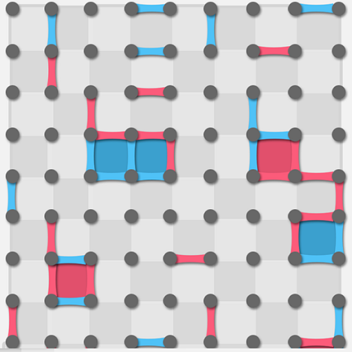
While watching Casey Reas’s talk, I realized that using looping to create grids is one powerful way to create generative art. I started off by generating a grid of points using loops and thinking about what I could do with it. I remembered the dots and boxes game from childhood-


I remember making patterns on these grids alone by drawing lines in a random fashion , I wanted to see whether I could use a program to do something similar with different colors that would look appealing to the audience .

I started by programming what I call a “seeker” . The seeker joins the points in a path such that :

  1. No point is visited more than once
  2. the points that can be chosen are either horizontally or vertically adjacent points (diagonals can’t be drawn)
  3. The seeker stops when all the points around it are joined

However, I found that to create something visually appealing , I would need multiple seekers of different colors . So, I used loops to create teams of seekers . The interaction of these seekers over time fill the grid and give a visually appealing effect as these grid paths are drawn .

Because the seekers can draw over each other, I wanted to mix the colors where this happens . Thus I defined colors in RGBA format and defined alpha value to be 150 so that the colors can be mixed to some extent when one is drawn over the other

Sketch

The sketch is embedded below :

Running the sketch again gives a different output every time that is based on the random properties of the Seeker object  . (namely the random point at which the seeker starts from + the random selection of the path).

Code that I am proud of 

I am proud of the code for the seeker class and especially the code for the getAdjacentPoints(points) function in this class  :

getAdjacentPoints(point) { //gets adjacent points in 4 directions
  let adjacent = [];
  //the following 3 lines are to make sure the argument point is a point on       an extended form of the grid (if the grid is extended forever)
  let currentIndex = grid.indexOf(point);
  let x = currentIndex % cols; // cols is initialized in setup()
  let y = floor(currentIndex / cols); 

  // Define the four cardinal directions
  const directions = [
    { dx: 0, dy: -1 }, // Up
    { dx: 0, dy: 1 },  // Down
    { dx: -1, dy: 0 }, // Left
    { dx: 1, dy: 0 }   // Right
  ];

  // Check each direction for valid adjacent points
  for (let dir of directions) {
    let newX = x + dir.dx;
    let newY = y + dir.dy;
    if (newX >= 0 && newX < cols && newY >= 0 && newY < rows) { //Check if this is withing the bounds of the grid
      let index = newY * cols + newX; // finds index in the array grid
      let adjacentPoint = grid[index]; //keep in mind grid is an array of coordinates (array of vectors))
       
        adjacent.push(adjacentPoint);//pushes the adjacent point to                                                 adjacent

    }
  }

  return adjacent; //returns an arry of possible adjacent points
}

Although I thought this would be simple , I had problems implementing this class in the beginning (especially about looking at the edge cases such as a point on the edge ) .

I am also proud of the idea of thinking about the seeker objects as ‘teams’ and realizing that the array containing each seeker had to be shuffled to display colors in equal proportion .

Challenges

The order in which the seekers are initiated matters because they can draw over each other. Thus, if we create a team of yellow seekers for example, and all of the team is appended at the end of the seekers array, the output will have a grid dominated by the yellow seekers (since yellow is drawn on top) . To fix this, I have implemented a method to shuffle the array called shuffleArray (which is an algorithm called Fisher-Yates Algorithm). This is applied to the array to shuffle all the teams of ‘seekers’, so the final output has the colors uniformly distributed.

Reflection and Scope for Future improvements

Since we had already learnt about classes in p5 when I created this project, I decided to use classes to simplify the code. However, loops remain a big part of the code both in generating the grid and in describing how the lines are chosen.  I am happy with the overall result of what I got. There is some scope of improving it – especially in exploring how seekers that consider joining points diagonally too would look like (I tried doing it, but it looked very messy – maybe it’s possible to figure out a way to make it cleaner). In addition, in my drawing the points are arranged in a grid (rectangular). However, it would be interesting to exploring different kinds of grids such as a circular grid of points and modify the seeker accordingly.


Assignment#3 – Nested Orbital Motion

For this project we had to use arrays and classes to generate an artwork. My initial idea was inspired by planetary motion, I thought about creating the solar system with the planets rotating around the sun. Then, I thought about the moon and how it revolves around the earth, resulting in an orbit determined by two circular motions – the moon’s orbit around the earth and the earth’s orbit around the sun. This idea of nested circular motion intrigued me to the extent that I decided to solely focus on creating an artwork with dots revolving around dots in a circular pattern – with each following dot rotating around the previous one, in a long chain of dots.

I created the basic circular motion of a dot based on this video (https://www.youtube.com/watch?v=ib_o5g7V8pc), but it was only sufficient in case of a fixed center point for an orbit. Hence, I created the appropriate classes and function to achieve the desired nested circular motion effect, which I would say was the hardest part of the assignment. Next, I connected the dots together using lines in attempt to make the chaotic movements of the dots easier to follow. The dots and the lines have different colors, which, after combining with a fading effect, resulted in unique patterns. The following snippet is the main part of the draw function used to display and move the dots and lines accordingly.
dotarr[i].show();
dotarr[i].move();
dotarr[i].drawline();
dotarr[i].setxcent(dotarr[i-1].getxcoord());
dotarr[i].setycent(dotarr[i-1].getycoord());

Changing the number of dots instantiated and the speed of their revolution results in different patterns: if the “speedCoef” variable is a positive number, the change of the speed with each subsequent dot decreases, which creates an effect of the dots rising outward and gives the pattern an impression of a something like a worm coming to life. If the “speedCoef” is a negative number, the pattern gains more of an “inward” quality, like collapsing into itself, but inevitably untangling itself and looping back to where it started. Additionally, giving the connecting lines more thickness than the dots results in a smooth, wave-like pattern (see the image below). For the future, I would like to analyze the movements of the dots from a more mathematical perspective to figure out when exactly the pattern will return to where it started, or will it return at all. I would also like to play around with the different variables and observe the emerging patterns, possibly for an inspiration to extend the initial scope of the project.

Changing the line thickness results in a smoother pattern.


The following part shows how the speed and radius, as well as the specific positioning of the dots are used to create the needed dots.

dotarr[i] = new Dot(dotarr[i-1].x, dotarr[i-1].y, (50+(speedCoef*i)), dotarr[i-1].radius);

Reading Reflection – Week #3

When I started reading the assigned material, I was entertained by the author’s voice, as it was not what I expected from a book. Not only that, but starting the chapter challenging the idea of what “interaction” means made me think, “What is that video games and productivity share?”. For example, we could argue that both of them require a certain level of concentration to be fully completed, but while one is applying all the degrees of interactivity (listening, thinking and speaking), the latter is very dependent on the activity being done. My homework can tell me what instructions to follow, but it cannot think on its own, although a video game will be able to give me feedback as its nature is more communicative; without this, video games would be unsatisfying.

Furthermore, I never imagined myself looking at a fridge as a medium of interactivity, since for me the concept of “interaction” was always applied in the medium of technology: the user does an action and the computer communicates. Regarding the design aspect of interactivity, it is complicated. While a Graphic Designer is important to ensure visual consistency throughout a project, as the author says, it is not all eye candy. Similarly to video games, there needs to be someone who can understand what steps to follow to have a good level of interaction and engagement. A video game designer would not put the hardest level at the start of the game as it would create a lot of frustration; likewise, a designer focused on intractability would not force users to write commands on a website to enter a page. All graphic and interactable elements need to coexist to allow the best user engagement possible.