RECREATION & CONCEPTUALIZATION
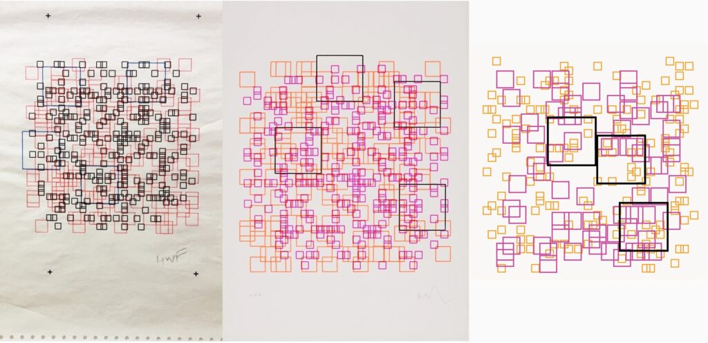
For this assignment, my goal was to recreate Herbert Franke’s artwork, “Random Square” from COMPUTER GRAPHICS AND ART May1976 (page 6), using p5.js as accurately as possible. Inspired by Franke’s collaboration with Georg Färber, where Färber utilized computer systems at the University of Munich to generate intricate plots based on dates provided by the artist, my goal was to capture the nature of the original piece by utilizing loops based on random coordinates within a specific range.
Code Highlight
function checkOverlap(x, y, rectangles) {
  for (let i = 0; i < rectangles.length; i++) {
    let { x: rectX, y: rectY, w: rectW, h: rectH } = rectangles[i];
    if (dist(x, y, rectX, rectY) < (rectW + rectH) / 2) {
      return true; //this means overlapping
    }
  }
  return false; //this means not overlapping
}
One aspect of the code that I take pride in is the implementation of a function that checks for (coordinate) overlaps using boolean statements. Initially, the large black rectangles were overlapping, which, to me, was distracting and not aesthetically pleasing, as they are naturally the first thing you see. This function is triggered every time the screen is clicked, causing the rectangles, both large and small, to rearrange themselves according to the specified conditions.
Challenges & Reflection
Initially, I generated black squares of different sizes at randomized locations, relying solely on the provided PDF link. However, with further research about the art piece, I realized it wasn’t a black & white piece but rather a colorful one, resembling the colors of a Starburst in my opinion! Once I came to the realization, I used the colors yellow, pink, and black and played with the opacity of the pink squares to achieve a similar effect when overlapped with yellow. Also, as I was randomizing the size of each square, I later noticed that each color had a specific size, with pink being the smallest and black the largest. You could see that every time I thought I was done, I noticed a slight detail that I had missed.
At first glance, the artwork didn’t seem to have much depth; it appeared like random squares on the screen. However, after looking into the artist’s background and understanding the process behind the artwork, I realized the significant time investment required to create such a piece. One aspect I would like to improve or explore in the next iteration of my attempt is to move away from the literal randomization of coordinates. Instead, I would like to make them dependent on meaningful factors such as dates, NETids, or other elements that can add more meaning.

