Week 8 – Response

Maragret Hamilton’s Story

I think it’s really empowering to see historical figures (that not much of the public knows about) having made impact that, again, we sometimes don’t know well about or take for granted in some way.

I think as a person studying computer science, the question of what fields will rise and fall, and what impact I will be able to make in different fields is always daunting as much as it is exciting. It might be because I am still a student, but the decision to go into a field that’s not perferred or considered prospective would not have been easy. I think the burden would have also come from the fact that once such big projects go wrong, they may lose both a lot of money and individuals. Becoming pioneers under these pressure, and leading future generations follow the way is definitely ( in my opinion) something all future programmers dream of.

Emotions & Design

I’m very excited that this topic has been raised again. I remember that in one of the readings from the first half of the course, there was a question of how designs need to consider both the funcitons and the attractiveness.

I remember this as the discussion I had with my group in class was really interesting. It is without doubt that finding the right balance between function and design is important. However, it also becomes a question whether this applies to all cases.

For instance, maybe if it’s something that’s not that frequently used. Maybe in that case, it’s more important for the product to merge into the design of its environment and not be considered as a hideous object.

Or, in other cases, it might be that something is for such private use that there is no need for it to be attractive. Maybe people don’t care about how something looks, if they are just going to use it at homes, on their own.

I think it really shows that yes, it’s important to find a balance, but this question is even harder as ‘the right balance’ differs by every situation.

Switches

Concept

When I thought about a LED lighting up, I wondered what connotations or messages it could give. The red and blue lights are commonly used to let people know if something’s good to go or not. With this, I thought about simple ways to connect LED lights and safety.


Approach

I found a safety vest that had velcros on them. When one wears the vest, they need to close the velcros, which means the two sides will meet. This is the exact concept of switches, so I decided to use this action.

When you wear the safety vest, the blue light will turn on, signalling that you’re good to go outside and have fun! (or work, to be realistic)

Expansion

I only used blue light to show that things are good to go. I think a good feature to add is the red light, that shows that the vest is not worn properly. This action would be eliminating contact, so I would need to think about how I would use this action as a switch (as it’ll be different from the blue light’s logic).

Week 8 – Reading Reflections

Norman,“Emotion & Design: Attractive things work better”

I agree with the author’s ideas on balancing design and practicability when designing objects. From my personal experience, I know how frustrating it is when I am in a hurry and something doesn’t work. I was doing a group assignment and the final step was to finalize everything and put our final elements together and format them. However, the formatting software was extremely difficult to use. It wasn’t until I almost finished everything that it told me I needed to use paid methods to finish the export. I was so stressed that I did what they wanted and paid a subscription because the deadline was getting near. In the end, the task was finished. But it was after that I realized I didn’t use the paid method at all. It was only advising me to pay the subscription because it thought I might need the method. That is how I realized that in stressful situations, certain designs can serve different purposes and lead the user to do certain stuff they might not have done without the pressure. If there had been no pressure when I was exporting the project, I would have read what it said more carefully and thought about whether I needed the subscription. Therefore from my perspective, I agree with the author’s idea that emotions affect design, and for a design to be easy to use in stressful situations, all functions should have clear implications on how they should be used.

Her Code Got Humans on the Moon

After reading the article, I have great respect for Margaret Hamilton. At a time when men dominated the tech industry, Mrs Hamilton, as a working mother, achieved much that other men could have never thought of. Also, at the crime, coding was much harder than it is today. These days coding can be done with languages that have syntax pretty close to human language that’s easy for people to understand. However, at that time, coding was “punching holes in punchcards”. The difficulty and the stress of being responsible for developing a manned spacecraft are insane and unthinkable. Her achievements were outstanding enough, and the environments in which she got those achievements added to the greatness of her work. I have nothing but respect and awe for this woman.

Creative Switch

Concept

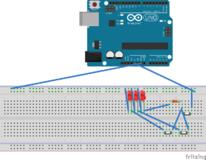
The main concept is to create a switch that isn’t necessarily a physical switch but a gate that returns true when a requirement is fulfilled. I created a switch that can provide an alert based on the water level of a specific environment. The circuit looks like this:

The two switches at the bottom part of the board indicate the water levels. Whatever the water level is, the rightmost LED always shines. If the water level is above a threshold, the second LED shines too. If another threshold is met, the third LED shines. This serves as an alert system for the water level of a specific environment. The actual functional circuit is shown below:This is what happens when there is no water in the cup.This is what happens when the water in the cup only reaches the first thresholdThis is what happens when the water level reaches the maximum value.This is what happens when I disconnect the second LED, because the power the red LED needs is more than the yellow one needs, so it might not be obvious that the red one is shining. This image is to show that the red one is shining when the water level is high.

Week #8: Unusual Switch- Colordentify

Concept:

Using the tools and knowledge I have learned in class regarding Arduino, I have created a kid’s educational game-Colordentify- that implements the idea of switches to power the circuit and produce a different outcome on every complete circuit. The main motivation behind this game is to teach children the different colours out there to distinguish between the three main colours: red, green, and blue.

Circuit Diagram:

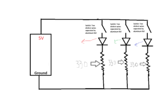
Three resistors are connected in parallel, each having a different colour. The switch is two wires separated by aluminium foil. As the switch closes, the light colour is emitted.

Project:

Video:


Reflection:

The game is quite simple and incorporates the main point of creating a switch connected through an aluminium foil. The reason that we used aluminium is because of its conductivity of electrons. As electrons are sent into the aluminium platform, another jumper wire touched on top will get in the electrons, ultimately opening the circuit. The game can be expanded with the addition of extra colours. The game can also be exchanged with a bunch of animal pictures on top of the aluminium foil, and instead of LED, there can be an LCD screen that can write the name of that animal according to the different output received by the jumper wire. As for future improvements, cardboard and aluminium- can be better aligned to look pleasing, and jumper wires could be placed under the cardboard connecting to the aluminium instead of being on the front to look better and safe for children.

Week 8 – BubbleSweeper

BubbleSweeper

While exploring various methods for devising an inventive switch, I transitioned from the concept of utilizing a door to open and close a switch to envisioning a scenario where a frisbee, upon striking a target, completes the circuit and illuminates a bulb. My mind was brimming with numerous concepts, yet the one that particularly delighted me was the idea of crafting a game. After contemplating various potential game options, I settled on Minesweeper, a universally recognized game that can be enjoyed by individuals or groups. The optimal platform for realizing this game, in my view, is a bubble fidget toy, which features numerous bubbles resembling the grid of squares in a traditional Minesweeper game. One bubble is equipped with two wires, and when this bubble is pressed during the game, it connects both wires, thereby closing the circuit and activating the light resembling a bomb.


below is the image of the project (thought of making it look a bit commercial :p )


anyways, here’s the demo:

VIDEO

I wanted to feature two people play the game to show how it’s a blast for a pair of players, but you get the idea. It was a bit of a tough nut to crack at the beginning, Getting those wires in the right spots and dealing with that stubborn tape not sticking properly to the rubbery toy body made things way trickier than they should’ve been. But you know what? After a few trial-and-error sessions, I finally got those wires snug and secure.

WEEK 8 REFLECTION (:

Norman,“Emotion & Design: Attractive things work better”

The main takeaways!

  • “Design matters, but which design…depends on the occasion, the context, and above all the mood.”
  • “Pleasing things work better, are easier to use, and produce a more harmonious result.”
  • “The design should not become a barrier, it should be carefully tailored for a task.”
  • “A product must be beautiful, have useful function, work well, and be usable and understandable.”

With these quotes, I took away the importance of balance in regards to great design. It is essential to make sure you are covering all aspects of the design process: 

  • Ensuring your product is providing some sort of benefit or fulfilling a certain purpose
  • Catches the user’s eyes with its attractive design, whether it be adding a combination of colors or cool features that ultimately enhance the likability of the product.
  • Making sure that there is a certain level of learnability. This is where the human centered design really comes through. A product should be pretty self explanatory to ensure that the user doesn’t become frustrated with the product, therefore halting the usage of it.

Her Code Got Humans On the Moon — And Invented Software Itself. 

I really appreciate how this article highlighted the female computer scientist Margaret Hamilton and her role in the Apollo Mission, as well as how her creations deeply impacted the future of computer science. It is refreshing to hear more about female contributions to the field of computer science since the field is so male dominated. 


The section of the article about Hamilton being under great pressure to be perfect while building the computer software for the mission was very relatable. I can understand her worries about not being perfect, because she was not only representing herself, but women (at the time) in computer science. The article writes, “I [Hamilton] was always imagining headlines in the newspapers and they would point back to how it happened, and it would point back to me.”. When she says this, she demonstrates how much pressure was placed on her to be flawless. This is something I believe many women, particularly in technical fields, experience. 

Week 8- Reading Reflection

Norman’s text:

In Norman’s text, “Emotion & Design: Attractive Things Work Better,” Norman describes how users’ overall experiences with a website are mainly derived from their first experience with the website- as in their first impression. The first impression comprises the website’s aesthetics, functionality, and simplicity. These factors ultimately influence our first impressions and determine whether we trust the website and what they’re selling or not. According to Norman’s explanation of the three cognitive stages—behavioral, reflective, and visceral—people often put more importance on a website’s overall aesthetic than its actual content. Reflective on how the website resembles similar-looking interfaces and our tendency to get accustomed to them and find comfort in them. Reflective and Visceral- aesthetics part- if not met, then our behavior, which is our response, would be more lenient on a lousy impression and our distrust in the website and its content. To gain users’ trust and respect, website creators should incorporate memories and experiences into the design, creating a nostalgic yet professional feel. Striking the right balance between functionality and aesthetics is crucial. I prefer websites with a simple yet profound interface over those crowded with information. For example, consider Google Chrome and Internet Explorer. Despite having similar functionality, most people choose Chrome. Why? Because Chrome offers an aesthetically pleasing and user-friendly interface, while Internet Explorer has an outdated look. While I mentioned the importance of nostalgia, in the case of Internet Explorer, it leans more towards appearing old rather than nostalgic.
Different cultures have unique preferences when it comes to aesthetics and first impressions. Take the Starbucks website, for instance. The American version has a clean, image-focused design with minimal text, presented in an easy-to-read format. It doesn’t overwhelm us with excessive information. In contrast, the Japanese Starbucks website features a dense arrangement of photos and text, which may need to be more aesthetically pleasing to most. This design is quite different from the standard Starbucks site. Japanese users may prefer these busier interfaces because they find it easier to absorb all the information without navigating to multiple pages. They see this as appealing and are more likely to stay on densely populated websites rather than simpler ones. Another reason for this preference could be, as Norman suggested, the influence of the reflective stage. Since Japanese individuals have grown accustomed to these dense websites from childhood, they now find comfort and beauty in them.

Hamilton’s text:

Margaret Hamilton, the mother of software engineering, has had quite a journey to get where she is now. Her contribution to the Apollo program and software engineering is quite impressive. During a period when traditional norms enforced specific stereotypical ideas on women, in addition to being a mother, Hamilton disproved preconceptions and showed a solid commitment to her career. Implementing the “do not touch P01” message within the astronauts’ tech is one of the great examples of how Hamilton’s attentiveness to detail contributed significantly to the astronauts’ successful trips. Even in the times of difficulties and challenges that astronauts go through, they can’t help but make small mistakes that can cost them considerably, which is why Hamilton’s contribution made a big difference to them.

Numerous astronauts’ lives were saved on multiple occasions due to Hamilton’s creative programming concepts and software contributions. Hamilton’s work created something so vast, even though it may have seemed simple and practical at first. Hamilton came up with the idea of relying on software, and billions of computers and other devices worldwide now use the concept of software in general. Her innovative strategy of giving consumers user-friendly interfaces was revolutionary and completely changed how we engage with technology.

Hamilton’s journey was not without its share of difficulties, filled with mistakes and challenging times. One thing to note is how those mistakes ultimately led Hamilton to success. By mistakingly clicking on the P01 button, for instance, she realized that there needed to be a mechanism in place to inform others about it. Therefore, mistakes are something natural, and the implementation of software into programs should also be a natural cure for some of the digital mistakes. Hamilton’s deep love for her job despite facing mistakes and society’s stereotypical ideas pushed her to success. This unwavering dedication and her outstanding accomplishments build a picture of a pioneer who made a lasting impression on the technological world. I have a deep appreciation of her work and the creation of the software engineering field. Her tale serves as an inspiration to everyone, demonstrating the seemingly endless opportunities that result from commitment, creativity, and a sincere love of one’s work.

 

Week 8: Reading response

Her Code Got Humans on the Moon—And Invented Software Itself:

I have heard about Margaret Hamilton several times before, but I have never actually read her story until now. I find it so inspiring how she managed to defeat all the stereotypes and the stigmas around her working in the field and managed to not only create a successful code that would allow people to go to the moon but she was also able to detect an error no one else had found and when she was told that it would never happen, she still didn’t give up on it and found a short term solution, telling astronauts not to choose P01, and a long term solution, the actual solution that saved the Apollo 8 when the astronaut chose P01. I believe that more people should take a page from her book and be persistent and consistent with their software projects and not brush off minor mistakes. Up until this reading most readings were focused on design and creativity, but I like that this reading invites us to think about the technical aspect of coding and interactive media, Additionally it highlights the fact that minor errors should be taken care of or else they might turn into major catastrophes.


Emotion & Design: Attractive things work better:

I have always underestimated the process of design, I have always thought of it as something very easy to master, but once again I have been proven wrong. I did not realize how complex design actually is. Having to understand how the human mind works so that you can design a product that would make the person feel better about themselves in positive situations and not induce extra stress and anxiety in extreme situations is a skill that unfortunately not all designers possess. At several points throughout the reading, I found myself nodding and agreeing with the author, i found myself thinking back to scenarios where an object that is poorly designed would annoy me more than i am already annoyed and ruin my whole day just because it wouldn’t function the way i want it to, or when I’m having a good day and everything just seems to make sense and work perfectly fine. I realize now that it is not a coincidence but rather a thing that designers take into account when designing everyday things to ensure that humans are satisfied with the product. The author described the concept of affect in such a way that makes it so clear and easy to understand without over complicating it. The example of walking, dancing and jumping on a plank got me wondering how our gut feeling and intuition have such a strong influence on our thoughts and our decisions which makes it even harder for designers to predict our feelings at a certain point and tailor their products accordingly.

Week 8: Reading reflection

As someone new to physical computing, finding inspiration in the idea that reusing existing concepts is a valuable part of the learning process is truly motivating. Throughout the works given, the work that inspired me the most is Scooby-doo paintings. The use of distance sensors and advanced camera technology in interactive art installations is captivating due to its ability to transform the viewer’s passive observation into an active and personalized experience. It blurs the lines between traditional artwork and audience participation, immersing viewers in the art’s narrative. As the artwork responds to the viewer’s presence or gaze, it becomes dynamic and engaging, fostering a deeper connection and sparking curiosity. Each interaction with the artwork is unique, creating a different emotional journey for every individual. This fusion of art and technology not only showcases creative expression but also represents a harmonious blend of the traditional and the contemporary, making it an innovative and intriguing form of artistic engagement.

In the blog “Making Interactive Art” by  TIGOE, he clearly mentions the task of a designer. I completely agree with that sentiment. During a recent exhibition, I attempted to engage with one of the games, but the artist overwhelmed me with a multitude of instructions that were challenging to grasp all at once. Instead of approaching or presenting an idea in this way, as TIGOE mentioned, when designing an interactive artwork, our primary objective is to provide the audience with essential context and then allow them to engage with the piece autonomously. Create the space, place objects for interaction, and hint at a sequence of events through their arrangement. Make interactive elements accessible by providing clear cues and handles. Ensure that objects meant to be untouched are not within reach. If you want the audience to uncover hidden elements, drop hints, but eliminate any unnecessary distractions or clutter from the environment to keep the focus on the intended experience. The audience plays a crucial role in completing the work through their actions. Guide them on how to engage, discover, and interpret the piece emotionally.