assignment 3: a cube party

concept:

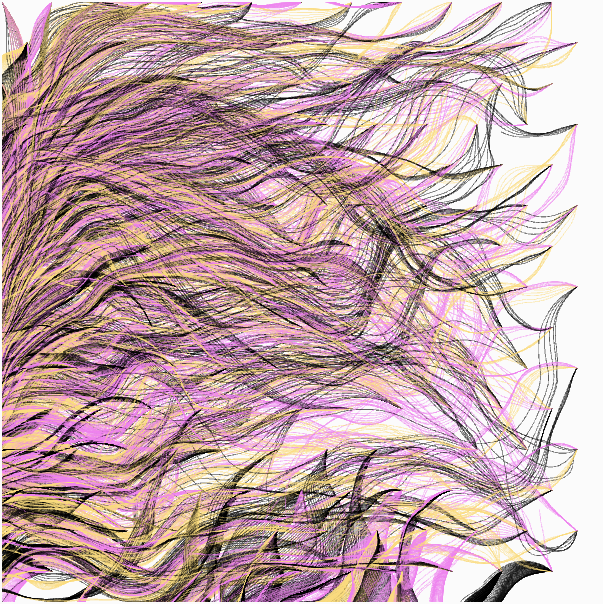
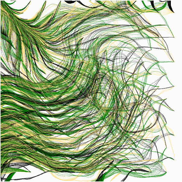
Because the last generative artwork piece I made was very 2D, this time I wanted to focus on making something that would give the illusion of being in 3D. I was very inspired by the examples and exercises that we saw/did in our last class, specifically the exercise with the randomized balls and the flock that we saw that moved according to the cursor. My assignment idea is a combination of that, where I wanted to make a group of rotating cubes follow a cursor and also scale according to it.

However, I unintentionally increased the difficulty of this project for myself. I came across this when googling examples for how to make cubes in p5.js, and following the code, I set the mode to WEBGL not realizing it would change a lot of the way I needed to approach things in my code. In addition, the mathematics of making the cubes was also a bit difficult for me to grasp initially (the last time I had to think about velocity and vectors this deeply was back when I was doing A-Level Physics, so saying I was quite rusty is a bit of an understatement).

Though the outcome is a bit different than what I hoped to get initially, I still believe I captured the essence of what I wanted.

code highlights and improvements

while the most complicated part of my code is the movement, I’m actually prouder of the scaling of the cubes because I personally feel it is much more intuitive and noticeable.

//get the scaling factor based on the cursor and where the cube is currently
const scaleFactor = map(dist(mouseX, mouseY, this.position.x, this.position.y), 0, width, 0.5, 2.0);
const scaledSize = this.size * scaleFactor;

I also like the subtle disco ball touch I added, because I think it helps convey the energy/vibe of the piece.

function discoBall(cursorPosition){
  let flashing = frameCount % 60
  push();
  strokeWeight(0.2)
  stroke(255)
  if (flashing < 20) {
    fill("#d2d0d2");
  }else if (flashing < 40){
    fill(color(255, 250, 199))
  }else {
    fill(color(0, 57, 163));
  }
  translate(cursorPosition);
  sphere(15, 10, 10);
  pop();
}

For future improvements, I’d like to fix the movement so that it follow the cursor more precisely, or at least that the movement of the cubes according to the cursor is much more intuitive. The mathematics in it is a bit messy, and i was constantly adding new aspects to fix problems that were arising in the movement (for example, I added the separate method after all the cubes began to be in exactly one point, but then had to add cohere after I saw that they were super far apart) and the end result is something else entirely. While I am happy with how it looks, I want to approach movement in my piece in a more organized manner.


Coding Assignment – Week #3

For this week’s assignment, I drew inspiration from the Impressionist art movement, specifically the post-impressionist Van Gogh and his famous Starry Night oil painting. I wanted to recreate the swirling pattern in the form of generative art.

Here is the sketch:

 This code generates its visual effect by simulating a dynamic movement of particles using object-oriented programming. Each particle’s position and movement are controlled by vectors that are affected by Perlin noise, creating smooth and organic trajectories. The particles transition in color as they move, smoothly blending between two predefined colors based on their angle of movement. The result is a gradual build-up of a visual pattern that also transitions harmoniously between colors.

There were two interesting things I learned with this code. The first was controlling the noise scale. By dividing the coordinates by a constant value (in this case, 100), I managed to influence the scale of the noise. Smaller divisors resulted in finer-grained noise, while larger divisors resulted in smoother noise. In other words, the divisor determines how quickly the noise changes as the particle moves across the canvas. By using a larger divisor I was able to create a more gradual variation.

update() {
  //Calculating the angle based on Perlin noise
  this.angle = noise(this.position.x/100 , this.position.y/100) * TWO_PI;
  // Move the particle's position based on its angle and speed
  this.position.x = this.position.x + cos(this.angle) * this.speed;
  this.position.y = this.position.y + sin(this.angle) * this.speed;

}

The second lesson regarded the transition of colors and the lerpColor() function. I began by defining two colors, ‘color1’ and ‘color2’. The ‘angleIndex’ is a result of mapping the particle’s angle to a value between 0 and 1. lerpColor() then assigns a color between the colors 1 and 2 based on the colorIndex, resulting in a gradient-like color change for each particle. Finally, it sets the stroke color to the blended color and draws a point at the particle’s position, creating a visually appealing color transition effect as the particles move. I wanted to focus more on the aesthetic appeal with this assignment, and the lerColor() assisted me a lot with that.

display() {
    strokeWeight(random(0.5, 1.5));

    // Define the two colors for the transition
    let color1 = color('#274df5'); 
    let color2 = color('#fafcfb');
    
    // map the color based on the angle for smooth transitions between colors
    let angleIndex = map(this.angle, 0, TWO_PI, 0, 1);

    // Interpolating between the two colors based on angleFactor
    let blend = lerpColor(color1, color2, angleIndex);
    
    stroke(blend);
    point(this.position.x, this.position.y);
}

As I was browsing on Pinterest for color and pattern inspiration, I came across Cameron Beccario’s near real-time visualization of global weather conditions. I found his project very interesting, interactive and somewhat connected to our last week’s reading (Casey Reas’ talk, especially the part about data visualization). Beccario’s choice of visuals and aesthetics also appeared similar to what I was going for with my sketch, thus I thought I would share:

https://earth.nullschool.net/#current/wind/surface/level/orthographic=-25.43,16.43,387


The Psychopathology of Everyday Things.

In the first chapter of “The Design of Everyday Things” by Donald A. Norman, he talks about how the design of everyday things can sometimes make us feel like we’re going crazy. It’s interesting how he points out that it’s not us who are the problem but the things we use. He calls this “the psychopathology of everyday things,” which is a fancy way of saying that sometimes everyday objects are just designed poorly.

I totally agree with Norman when he says that good design should be all about making things easy for us, regular people. It shouldn’t be about designers showing off how clever they are. Who wants to struggle with a door handle or a confusing remote control? It’s frustrating!

One big takeaway from the chapter is that designers need to think about how people actually use things in their daily lives. They can’t just dream up fancy ideas without considering how those ideas will work in the real world. Design should be all about making our lives easier and more convenient, not more complicated. This is emphasized in this passage where he mentions Human-Centered Design, that essentially takes into consideration the user. This type of design is made for the people by the people, and it enhances the lives of its users and produces positive results.

So, in a nutshell, I think Norman’s point about designing things for the way people are, not the way designers wish they were, is spot on. Good design is all about making our lives simpler, not adding unnecessary complexity. It’s a reminder that when things are hard to use, it’s not our fault – it’s bad design. And that’s something we can all relate to!

Assignment 4: The Psychopathology Reflection

Regarding the Bauhaus: “The basic teaching error of the academy was that of directing its attention towards genius rather than the average.” 

I am a naturally thoughtless person in that I lack situational awareness and forget to consider other people. My entire life is a Hanlon’s razor situation. People would call me selfish and I used to brush it off as thoughtlessness. It took my entire life to figure out that thoughtlessness is selfishness. That’s why design occupies a place in my head on par with Bob Dylan, Better Call Saul, and Jane Birkin–my gods, my idols. Design acknowledges that Average is the mother and judge of genius. Designers force thoughtfulness and direct attention towards the Average. Design is total empathy. Design is everything that I’m not. It’s all I want to be.

Your feelings are not arbitrary. There is a reason things are the way they are. I spent my entire teenage life working in restaurants. When I was fourteen, I realized for the first time that I had taken restaurants for granted my whole life. When you serve someone food, they don’t think about who designed the menu, about who picked the chair they’re sitting in, about who drew the art on the walls, about who cooked the food, chopped the spinach, weighed the beef, or wrapped the silverware. In short, they don’t think about anything. They only know what they feel. They don’t ask why. Most people go through all of life like this.

It only takes a little bit of paying attention to realize how malleable life is. To realize it’s really all up to you. Goffredo is the head of our design department. He told us a story related to him from a friend. The friend had workers come over to fix and repaint his living room. But he had a grand piano that was too heavy to move, so he wrapped it in paper. On the first day, the workers arrived and set all their tools on the piano. On the second day, the friend raised the piano lid and re-wrapped it, making it impossible for the workers to set their supplies on it. This was a matter of design: anticipating how people would act in a given setting, and arranging said setting to direct their natural movements. It’s endlessly fascinating.

The reading said poor design results in “frustration.” And it’s true. Life is a series of mini-frustrations. There are always too many things to carry. I take solace in the knowledge that even celebrities have too many things to  carry. See below:

Good design is a way to mitigate this. You’ll never be able to stop having big frustrations. But eliminate the small ones as much as you can.

Temperature Trends- Assignment 4

For this week’s assignment, I had to choose between creating data visualizations or generating text output. I decided to work on data visualization because I thought it was interesting to be able to represent data in any way I choose. My first challenge was finding the right dataset to work with. There were so many options, and I needed to make sure the data could be effectively represented. Eventually, I settled on using weather data from the United States, which I found interesting because it included dates spanning over two years, along with average, maximum, and minimum temperatures recorded each day, as well as historical record temperatures.

To visualize this data, I created a simple line graph. The graph had a title, a legend, and labels to represent the average maximum and minimum temperatures recorded over the years. The graph displayed two distinct lines, one in purple for minimum temperatures and one in pink for maximum temperatures. Below, you can see a sketch of my graph:

I faced several challenges while working on this project. First, I had to figure out how to smooth out the curves in the graph to make it look more polished. Without this adjustment, the graph had sharp and jagged edges that didn’t look right.

Another issue I encountered was related to the coloring of the graph lines. I initially set specific colors for the stroke lines but didn’t realize that the beginShape and endShape functions had built-in fill settings, causing the graph to be filled with black, which didn’t go well with the sharp edges.

Additionally, I struggled with setting the margins correctly. Initially, I used regular height and width functions and assumed the graph would fit within those parameters, but it extended beyond the canvas boundaries. By setting a standard margin value and subtracting it from the height and width, I was able to ensure the graph was drawn appropriately and to the scale of the canvas.

The part of my code that I’m most proud of is the function I created to draw the temperature lines. This function allowed me to input values from the CSV file and determine whether it was for maximum or minimum temperatures. Below is an insert of that code.

function drawTemperatureLine(temperatures, tempMin, tempMax, lineColor) {
  noFill();
  stroke(lineColor);
  strokeWeight(2);
  beginShape();
  
  // Loop through each data point (temperature)
  for (let i = 0; i < temperatures.length; i++) {
    // Map the data point's position to the canvas coordinates
    let x = map(i, 0, temperatures.length - 1, margin, width - margin);
    let y = map(temperatures[i], tempMin, tempMax, height - margin, margin);
    
    // Add a curve vertex at the mapped position
    curveVertex(x, y);
  }
  endShape();
}

I separated most of my code into functions. This code is responsible for drawing the temperature lines and looping through each data point in the csv file and mapping this point onto the canvas. This function is then called inside of the drawLineGraph function, that then draws the entire graph that is inclusive of labels, legend, and titles.

Overall, this project was a relatively simple generative art piece in terms of design, but it was also the most challenging one I’ve worked on. I had to apply a lot of theoretical knowledge and do some research to overcome various obstacles. For future improvements, I would like to create separate line graphs for each dataset or column. I also want to represent the highest and lowest record temperatures for each day and add interactivity so that when you hover over the lines, the corresponding date and temperature information appear. This assignment was both exciting and challenging, and it truly tested my Interactive Media skills.


Reading Reflection – Week 4

The first chapter of “Design of Everyday Things” emphasizes the importance of good design, discoverability, and understanding in creating user-friendly experiences. These key points have significant implications for computer programmers and designers, shaping their approach towards creating technology that aligns with human needs and behaviors.

One of the primary implications is the adoption of a user-centered design approach. This means placing the needs, capabilities, and behaviors of end-users at the forefront of the design process. Understanding user perspectives and involving them in the design feedback loop becomes crucial to ensure that the final product meets their expectations and requirements.

Modern technology often involves complex systems and devices. Computer programmers and designers should strive to simplify this complexity to make products and interfaces more intuitive and user-friendly. By eliminating unnecessary features and controls and focusing on providing clear signifiers (indicators of how to use an object) and instructions, they can create interfaces that match users’ mental models and reduce the learning curve associated with technology.

Discoverability, the ability for users to quickly understand what actions are possible and how to perform them, is a key aspect of effective design. Computer programmers and designers should prioritize creating intuitive interfaces with clear feedback mechanisms. Visual cues, affordances (perceived functionalities of an object), and informative feedback can guide users in their interactions and minimize confusion or frustration.

Acknowledging the role of emotions in user experiences is another important implication for computer programmers and designers. Beyond functionality, they should consider the emotional impact of their designs. By focusing on aesthetics, providing meaningful feedback, personalizing interactions, and addressing user desires and aspirations, they can create positive and enjoyable experiences that go beyond basic usability.

The book emphasizes the need to shift the focus from making humans adapt to machines to designing systems where machines serve the needs of humans. Computer programmers and designers should understand how humans naturally interact with technology and create interfaces and interactions that align with their cognitive abilities and behaviors. By considering the human element in human-machine interaction, they can create more intuitive and efficient systems.

Computer programmers and designers should also apply fundamental interaction design principles. Affordances, signifiers, constraints (limitations that guide usage), mappings (relationship between controls and their effects), and conceptual models (users’ understanding of how a system works) provide guidelines for creating effective and usable interfaces. By incorporating these principles, they can design interfaces and interactions that are intuitive, reducing the cognitive load on users and enhancing their overall experience.

Assignment 4 – Rhythm of Numbers

Concept

For this assignment, my inspiration came from Khaleeqa Garrett’s captivating work on her third assignment, specifically FlowFields. I invested time in studying her code to comprehend her approach and remix it to create something unique. Upon reviewing the prompt, I was initially uncertain about which data to visualize and how to do it. Eventually, I settled on using statistics from the music industry, focusing on three of my favorite rappers: Kendrick Lamar, J. Cole, and Drake. I gathered data from Google Trends and utilized it as parameters for Khaleeqa Garrett’s code.

During my initial attempt, the output looked nothing like my envisioned result. I only observed small dots clustered in the upper left corner of the canvas. It dawned on me that the range of values for the number of searches was limited, prompting me to employ the map() function to expand the range and cover the entire canvas.

Below, you can see some of the pieces I created by adjusting the colors representing the different artists.

Highlight of Code

The central modification I made to the existing code involved parsing data from the CSV file and linking it to the Point class. I utilized the hour component of the time for the x-coordinate of the particles and the minute component for the y-coordinate. The numerical value at the time was employed to manipulate the noiseScale within the Point class.

// goes over all entries and uses hours as x coordinate, minutes as y coordinate,
  // and the number of searches as an argument for the noiseScale
  for (let i = 0; i < artistes.getRowCount(); i++) {
    
    // time is split into hour (mapped from 0 - 24 to 0 - width) and minute
    // (mapped from 0 - 59 to 0 - height)
    particles[0].push(new Point(map(split(time[i], ':')[0], 0, 24, 0 ,width), 
                      map(split(time[i], ':')[1], 0, 59, 0, height), kendrick_lamar[i]));
    particles[1].push(new Point(map(split(time[i], ':')[0], 0, 24, 0 ,width), 
                      map(split(time[i], ':')[1], 0, 59, 0, height), j_cole[i]));
    particles[2].push(new Point(map(split(time[i], ':')[0], 0, 24, 0 ,width), 
                      map(split(time[i], ':')[1], 0, 59, 0, height), drake[i]));
    
  }

Additionally, I introduced a slider that influences how the particles move by adjusting the noiseScale within the Point class. This adds an extra layer of interactivity beyond mouse clicks.

// updating noiseScale based on value of slider
    this.noiseScale = slider.value()/map(sin(this.noiseScaleArg), -1, 1, 1, 2);

Reflection and Ideas for Future Work

I consider this piece one of my best creations in this course thus far. For future projects, I aim to enhance the interpretability of my work. Despite using data for this piece, I find it challenging to establish a direct relationship between the numbers and the data inputted into the program.

Reading Reflections – Week 3!

When I mention that I study Interactive Media, the response is often followed by a “What’s that?” To explain, I only give the example of the piano-ball piece in Professor Sherwood’s office, which produces different sounds when interacted with. After reading Crawford’s insights, I definitely have a better explanation to provide by talking about the dynamic two-way process, not one-sided reactions. This distinction makes me question my past experiences: did I truly interact, or did I merely react? What makes engagement meaningful, avoiding passivity and limitations?

Crawford’s views that speaking, thinking, and listening are fundamental to interaction makes perfect sense in human-human interactions. But what about human-computer interaction? Can an absence of one component, compensated by two others, make the interaction as unsatisfactory as he suggests?

Considering Crawford’s thoughts on user interface, interactive design and things that one should’t consider interactive, I recall a Netflix series I had seen, “You vs. Wild” with Bear Grylls. While it involves impressive design, filming, and conversations, its interactivity is scripted, lacking real-time interaction with Bear Grylls. This still provides users with an interactive experience, however, it might not be considered Interactive since it sways away from Crawford’s definition.

His final point, “Good interactivity design integrates form with function,” applies broadly, including to the Netflix series, where form (aesthetics and immersion) and function (user experience and purpose) merge quite well thus making it interactive.

In a nutshell, Crawford’s insights challenge conventional notions of interaction, prompting me to consider what truly constitutes interactivity. Whether in human-computer interaction or entertainment like “You vs. Wild,” the integration of form with function remains an important aspect of creating engaging and meaningful interactive experiences. It’s a reminder for me that in interactive design, aesthetics and functionality should move together to elevate the user’s overall experience.

OOP P5.js Artwork

Design Concept

This project portrays that in a box, there are various balls flying around and another rather distinctive ball floating inside. Every other ball experiences a force when approaching the yellow ball in the center. No matter how the yellow ball moves, other balls are driven away from it. My original intention is to remind people that there are bright spots in people, even if most reject or isolate them. However, it is also open to other interpretations since it only vaguely represents my intent.

Code I am Proud of

I am proud of the part where I implemented the particle effects of the balls traveling around. Originally, I wanted to implement an algorithm that makes the particles fly out in a certain cone range behind the ball. However, the effects are rather unsatisfactory. The particles fly out sequentially in an over-orderly manner. It was almost like the particles were in a line when the range of the cone was too narrow. Then I thought of the movements the balls are making. If the ball is moving, perhaps I could make the particles fly in all directions instead of only in a cone behind the ball. It will still form a coned trail as long as the particles have less velocity than the ball. The particles with the same direction as the ball will have less relative speed to the ball. Therefore, it will disappear close to the ball, and vice versa. This makes the trail look more chaotic and more like a trail instead of a projector.

class Particle{
  //xyz be the coordinates of the ball
  //dir is random plus direction of the ball
  constructor(x,y,z,dir){
    this.x=x;
    this.y=y;
    this.z=z;
    this.r=random(255);
    this.g=random(255);
    this.b=random(255);
    //Generate random cold color
    if(this.r>this.b){
      this.clr=color(this.b,this.g,this.r);
    }
    else{
      this.clr=color(this.r,this.g,this.b);
    }
    this.direction=p5.Vector.add(dir,p5.Vector.random3D());
    this.opacity=0.5;
  }
  
  //Displaying color
  display(){
    push();
    if(this.r>this.b){
      this.clr=color(this.b,this.g,this.r,this.opacity*255);
    }
    else{
      this.clr=color(this.r,this.g,this.b,this.opacity*255);
    }
    stroke(this.clr);
    translate(this.x,this.y,this.z);
    sphere(3);
    pop();
  }
  
  //Movement and change in opacity
  updateLocation(){
    this.x=this.x+0.5*this.direction.x;
    this.y=this.y+0.5*this.direction.y;
    this.z=this.z+0.5*this.direction.z;
    this.opacity-=0.015;
  }
}

Improvements

I wanted to do lighting on the balls, especially the central ball. However, I cannot understand the usage of shaders or other methods that can imitate lighting and light halos. Therefore, this project is not yet complete, and it should have lighting effects to indicate the size of the repulsion field of the central ball. Without the lighting, the theme that “even the most isolated people shine” becomes not obvious.

Week 3 – Reading Reflection

I find this reading very interesting because it was not until now I realized that interactivity is related to interaction. It never occurred to me that one-way interaction might not even count towards being interactive at all. When I actually think about it, I realize how reasonable the author’s claims are. If anything that moves when you interact with it is interactive, then anything could be interactive. You could potentially pick up a rock, throw it away, and say it is interactive. Then, there would be no meaning to the word “interactive.” The author’s definition of interactivity really gave me a lot of new insight into the term”interactive media.” This framework clearly separates and distinguishes interactive media from traditional media. Being interactive requires the media to somehow respond to the audience and improvise. Regarding media, it could only be done with algorithms and sensors, which traditional media doesn’t include.

Another thing I find interesting is the distinction between interactive design and traditional interface design. I always thought that interactive design is based on interface design and that there must be an interface basis to implement interactivity on top of it. It only occurred to me now that interactivity design could be much broader than interface design. There is much more to play with in interactive design, not just thinking about the aesthetics and alignment of elements on the page.