Coding Assignment – Week #4

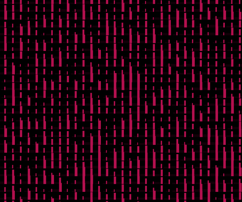
For this week’s assignment I wanted to create a sketch that would be responsive to audio. From the beginning, I knew that I wanted to use a piece of classical music and utilize amplitude to visualize the music. I wanted to recreate a low-fidelity feeling of something like this:

Here is my sketch (open in a separate tab for the sound):

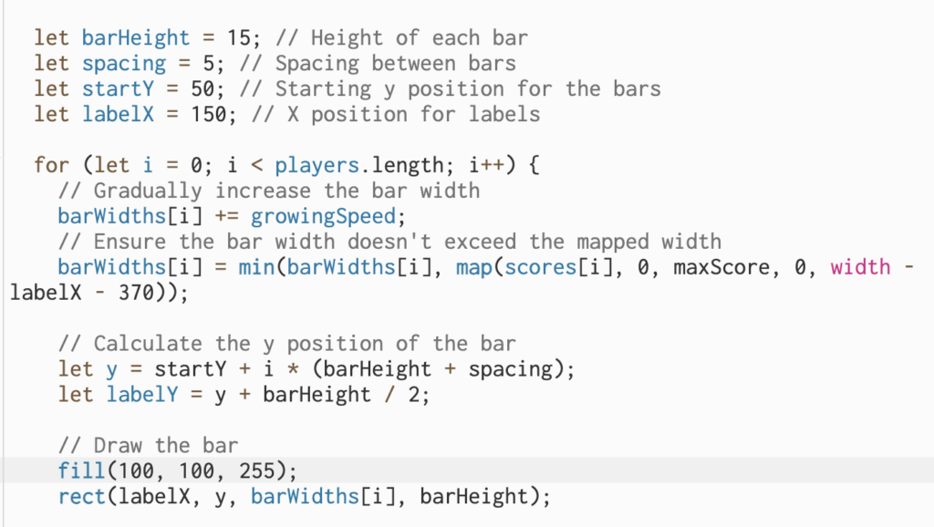
 The p5.js library is used in this project to build an audio-driven visual representation. The Particle class is in charge of creating particles with certain properties such as position, angle, speed, and radius. The amplitude of the Orchestral Suite by Johann Sebastian Bach is utilized to modify the speed and angle of the particle. When the audio amplitude exceeds a predetermined threshold, the particles vary their angle and radius, resulting in visually unique behavior. Furthermore, boundary checks are used to verify that particles do not bounce off the canvas’s edges. The primary program generates a grid of tiny particles and dynamically draws lines between them, resulting in a complicated, developing visual pattern.

This project was a good opportunity to learn about the sound library. Here some crucial lines:

this.amp = new p5.Amplitude();
// and
let vol = this.amp.getLevel();

The p5.Amplitude class is part of the p5.js sound package and allows to measure the amplitude or loudness of audio in real-time. By creating this instance, the sketch has the capacity to evaluate and respond to the dynamics of the audio. The getLevel() function of the p5.Amplitude object (this.amp) gets the current audio amplitude level.  This value changes while the audio plays, offering a dynamic indicator of the intensity of the song.

Another part of the code that I was proud of was the drawing of the lines between particles:

  // looping through all the particles
  for (let i = 0; i < particles.length; i++) {
    let particleA = particles[i];
    particleA.update();
    particleA.display();

    // initializing an inner loop to compare the current particle to other particles and calculating distances
    for (let j = i + 1; j < particles.length; j++) {
      let particleB = particles[j];
      let distance = dist(
        particleA.position.x,
        particleA.position.y,
        particleB.position.x,
        particleB.position.y
      );

      // drawing a line between particles that are closer than 100 pixels
      if (distance < 100) {
        line(
          particleA.position.x,
          particleA.position.y,
          particleB.position.x,
          particleB.position.y
        );
      }
    }
  }
}

This is a very simple principle, where basically every particle in the outer loop is compared to all the other particles by looping through them in the inner loop. It was quite a basic structure but it allowed for of the main effects in the sketch.

Ideas for future improvements would be performance optimization, especially when dealing with a large number of particles. The audio tended to become messy once I would initialize more particles (sometimes it can be heard even in the current sketch). I would also like to introduce different types of particles with varying behaviors, for example, some particles could respond to bass frequencies, while others react to treble.

Data Visualization Assignment

Overview:

I have an unhealthy obsessions with Postcards, specially those that carry a very Edgy-vintage design that looks like they were made using Paint 🙂 and since the 1st of October coincides with the World Postcard day I have decided to create a non commissioned postcards to my favorited museum ever the MoMA (Museum of Modern Arts). 

I went on Kaggle and found a dataset of with LITERALLY ( 67695 ) of MoMa artist so thought first of distinguishing the non American artist with the color grey to emphasize on the global domain of the MoMa and the scattered the name of the artist all over the screen, and then I printed at the Middle of the screen postcards from MoMA.

So the Data Visualization part is that this code distinguishes the American from the Non American Artist visually by color. which If I would have thought of creating this postcards by hand would have been a nightmare for me as a designer wen I have a dataset of 67695 artists 🙂

Embedded sketch:

Mockup Rendering:


Highlight of the code I am proud of:

This was my first time I work with Dataset and it wasn’t easy at all. So I guess I am proud of my logic of distinguishing the artists Nationality.

// Define the box parameters
 let boxX = 50;
 let boxY = 50;
 let boxWidth = width - 2 * boxX;
 let boxHeight = height - 2 * boxY;

 // Extract artist data from the CSV
 for (let i = 0; i < table.getRowCount(); i++) {
   let row = table.getRow(i);
   let artistName = row.get('Name');
   let nationality = row.get('Nationality');
   let status = row.get('Status');

   if (artistName && nationality) {
     artistData.push({ name: artistName, nationality, status, x: 0, y: 0 });
   }
 }

The above code defines the parameters for a rectangular “box” on a canvas, specifying its position and dimensions. It then iterates through rows of a CSV file, extracting artist data such as name, nationality, and status. If both the name and nationality exist, this data is stored in an object and added to the artistData array. This process prepares the artist data for subsequent display within the specified box on the canvas.

Reflection:

This was my hardest Assignment yet as that finding a dataset and thinking of an idea to model the dataset was not easy at all however, I am very happy with the end result as that If I found that on the shelf of the MoMA I would love to have that postcards that keeps all the names of the artist I was impressed by their work closer to me, so that I would take the opportunity to google the artist that my eye falls into. And I am writing an email to MoMA perhaps they are interested to take this into their postcards collection :0.

Future improvements: 

If I would have attempted this assignment once again I would:

  • Enhanced User Interaction: The inclusion of interactive elements, such as mouse-based actions or keyboard input, can empower users to explore the artist data interactively. This might involve enabling users to filter artists based on specific criteria or offering additional information upon clicking an artist’s name.
  • Responsive Design: Implementing a responsive design approach ensures that the project can adapt seamlessly to various screen dimensions and orientations, guaranteeing an optimal user experience across different devices.
  • Informational Overlays: Providing informative overlays or tooltips that furnish users with supplementary details about each artist when they hover over or click on an artist’s name can enhance the user’s understanding of the data.
  • Dynamic Animations: The addition of fluid animations for transitions, color alterations, and text movements injects dynamism into the visualization, thereby engaging users more effectively.
  • Search Functionality: Incorporating a search feature empowers users to search for particular artists or filter data based on various attributes, thereby enhancing usability.
  • Sorting Mechanisms: Offering sorting options for the artist list, permitting users to sort by attributes such as name, nationality, or status, enhances the user’s ability to explore and comprehend the data.
  • Data Updates: By enabling real-time data updates through either connecting to a live dataset or facilitating the upload of new CSV files, the project can remain current and relevant.

code:

//Batool Al Tameemi, Intro To Im 
//Assignment 5: Datasets and visualization 
let table; // Declare a variable to hold the CSV data
let artistData = []; // Initialize an array to store artist data

function preload() {
  // Load your CSV file
  table = loadTable('artists.csv', 'csv', 'header');
}

function setup() {
  createCanvas(800, 600);
  noLoop();

  // Define the box parameters
  let boxX = 50;
  let boxY = 50;
  let boxWidth = width - 2 * boxX;
  let boxHeight = height - 2 * boxY;

  // Extract artist data from the CSV
  for (let i = 0; i < table.getRowCount(); i++) {
    let row = table.getRow(i);
    let artistName = row.get('Name');
    let nationality = row.get('Nationality');
    let status = row.get('Status');

    if (artistName && nationality) {
      artistData.push({ name: artistName, nationality, status, x: 0, y: 0 });
    }
  }

  // Draw a box
  noFill();
  stroke(0);
  rect(boxX, boxY, boxWidth, boxHeight);

  // Display artist names with the specified conditions
  textSize(12);
  textAlign(LEFT, TOP);

  for (let artist of artistData) {
    let x = random(boxX, boxX + boxWidth - textWidth(artist.name));
    let y = random(boxY, boxY + boxHeight - textAscent());

    // Check for overlap with existing text
    let overlapping = false;
    for (let existing of artistData) {
      if (artist !== existing) {
        let d = dist(x, y, existing.x, existing.y);
        if (d < 20) {
          overlapping = true;
          break;
        }
      }
    }

    // Set text color based on conditions
    if (artist.nationality !== 'American') {
      fill(192, 192, 192); // Silver
    } else if (artist.status === 'Dead') {
      fill(255, 215, 0); // Gold
    } else {
      fill(0); // Default text color
    }

    // If not overlapping, display the text
    if (!overlapping) {
      text(artist.name, x, y);
      artist.x = x;
      artist.y = y;
    }
  }

}


function draw() {
 textSize(30);
  textAlign(CENTER, CENTER);
  fill(random(0,255)); // Set text color to black

  // Set the built-in font
  textFont("Georgia"); 
  stroke(color(255));
  // Calculate the center of the canvas
 let centerX = width / 2;
  let centerY = height / 2;

  // Use frameCount to create a continuously changing color
  let hue = (frameCount * 2) % 360; // Adjust the factor for color speed
  let textColor = color(0);
  fill(textColor);

  // Display the text at the center of the screen
  text("Postcards from ", centerX, centerY - 90);
  textSize(160);
  text("MoMA", centerX, centerY);


}


Week 5- Reading response

The reading sheds light on how computer vision has gone through a significant makeover. It used to be this fancy field only accessible to experts in signal processing and AI, mainly serving military and law enforcement needs. But now, thanks to better software tools, open-source communities, faster computers, and cheaper video hardware, even newbie programmers and artists can dive into computer vision experiments. This shift has sparked a creative boom across the board, from cool art projects to smart home gadgets. It’s clear that technology’s become a lot more user-friendly, opening up tons of exciting possibilities.

The reading doesn’t exactly take sides, but you can sense the author’s excitement about this change. They see it as a great thing, how more people can get in on the computer vision action and create new stuff. While it hasn’t changed my mind about things, it does make me wonder about the bigger picture. As computer vision gets even more common in everyday life, what about ethics and privacy? How do we make sure this tech benefits everyone while keeping any potential problems in check? So, this reading isn’t just about fun gadgets; it also makes us think about the bigger issues that come with them.

Week 4- Data Visualization

The World’s Best Countries For Women, 2021

My concept: While scrolling through Kaggle, I found an article with an interesting title “The World’s Best Countries For Women”. I wanted to know the ranking of the countries and on which categories they were assessed such as women’s employability, women’s rights, women’s literacy rate, etc. Although the article doesn’t exhaustively describe these aspects, the visualization of this data was particularly interesting for me. I have been inspired by the image attached below in Fig. 1, meaning that the circles representing the countries needed to align on a circular path. Additionally, the circles should demonstrate a visible differentiation of the score of the overall assessment of each country’s performance, which could be achieved by the different radius of circles corresponding to the specific countries: the higher the score, the bigger the radius. During the coding, I decided to give a more interesting shape for the data visualization, so the circles would be in a more spiral path. Last but not least, the array of the shades of the purple colors was created because it is believed that purple is a color of feminism. I wanted to raise awareness of women’s conditions and opportunities in different countries through this data visualization. 

Fig 1. The data visualization I was inspired by.

A highlight of the code I am proud of is the for loop because it incorporates many functions and steps such as naming each variable in the data set, giving the size of circles to corresponding countries based on score, and the path of the spiral path according to the ranking. More specifically, I am proud of the function of the x and y coordinates of each circle because the formula used for that creates a perfectly drawn 2D spiral path I was looking for. 

 for(let r=0; r<table.getRowCount();r++) {
    const name = table.getString(r, "Country");
    const rank= table.getNum(r, "Rank");
    const score = table.getNum(r, "Score");
//calculating the positions x, y of the ellipses based on the rank of each country.
    const x = 2*(180-rank)*cos(rank*5)+width/2;
    const y = 2*(180-rank)*sin(rank*5)+height/2;
//scaling the score range of (0,100) to fit the range of (0, 30) to control the size of the ellipses, so they could fit the canva.
    const scoremap = map(score, 0, 100, 0, 30);
    ellipse(x, y, scoremap);
    fill(0);

//calculating the positions of x, y of the names of the countries  based on the rank of each country.
    let xtext=2.5*(180-rank)*cos(rank*5)+width/2-19;
    let ytext=2.5*(180-rank)*sin(rank*5)+height/2;
//changing the x position of the names of the countries to specific countries in order to avoid overlapping of the names with the ellipses.
    if (rank>=97 && rank<=116){
      xtext = 2.5*(180-rank)*cos(rank*5)+width/2-35; 
    }
    if (rank>=136) {
      xtext = 2.5*(180-rank)*cos(rank*5)+width/2+5;
    }
//checking the distance between the mouse and the ellipse. 
    let d = dist(mouseX, mouseY, x, y);
//if the mouse is on the ellipse, the name of the country and the ellipse corresponding to that country is filled is orange color. 
  if (d < scoremap/2) {
    fill(255, 95, 31);
    text(name, xtext, ytext);
    ellipse(x, y, scoremap);
  } else {
    fill(0);
    text(name, xtext, ytext);
    fill(random(colors));
    ellipse(x, y, scoremap);
    }
  }

Embedded sketch

MOVE YOUR MOUSE OVER ANY CIRCLE TO SEE WHICH COUNTRY IS REPRESENTED

Reflection and ideas for future work or improvements: Because of the small distance between the countries, some of the names overlap. Hence, it is better to resize the canvas or make the changes in a space for each of the country names so that one is closer to the circle, while the other is a bit in a distance. Additionally, for aesthetic purposes, it would be great to add more details to the sketch such as Perlin noise which appears when the mouse is clicked, or the line of the small circles going from the country circles to the center.

Data Visualization Assignment


Diversity of International Students in UAEU

Concept:

Several of my close friends are enrolled at the United Arab Emirates University (UAEU), recognized as one of the top universities in the UAE and the Gulf region. Among them, one is an international student who frequently shares her challenges as a minority among predominantly local students, as well as her positive experiences. These conversations piqued my curiosity about the actual number of international students at UAEU. Consequently, I decided to create a visualization to gain insight into the diversity of the international student population, given the institution’s predominantly local student body. The visualization displays the total number of international undergraduate students in UAEU from Fall of 2019 to Spring 2023.


Code:

The following code represents the segment I find most fulfilling because it required significant adjustments and modifications, along with related code segments, to display only the country names and the respective number of students, while excluding dates and gender. Initially, there were issues with text changes and overlapping.

function startChangingText() {
  setInterval(() => {
    // Change the current country index and redraw
    countryIndex = (countryIndex + 1) % countryData.length;
  }, 2000); // Change the index every 2 seconds (adjust as needed)
}

function displayChangingText() {
  // Display the changing text at the top of the screen
  textStyle(BOLD);
  let currentCountry = countryData[countryIndex];
  let countryText = `${currentCountry.country} - Total Students: ${currentCountry.numStudents}`;
  fill(0); // Text color
  textSize(18);
  textAlign(CENTER, TOP);
  text(countryText, width / 2, 10); // Display text at the top
}


Reflection:

I underestimated the complexity of this assignment as it turned out to be quite time-consuming. I struggled with finding appropriate data that would be easy to work with which took me a lot of time to figure out. This assignment made me realize that achieving the desired outcome would require substantial effort on my part. I initially had high hopes of creating something more advanced since I’m eager to learn about data visualization and related aspects of big data. However, I’m pleased to have gained valuable experience in loading CSV files and employing techniques like “split,” which will be beneficial if I choose to delve deeper into data visualization in the near future.

References:

https://www.freepik.com/vectors/white-world-map

https://www.youtube.com/watch?v=y_UQdH3Zt2s

https://p5js.org/examples/advanced-data-load-saved-table.html

https://opendata.fcsc.gov.ae/@united-arab-emirates-university-uaeu/international-students-enrolled-in-degree-programs-at-uae-university-for-ay-2019-2023


Assignment 4 “World Airports”

CONCEPT

After the data visualization lecture, I had a lot of ideas about what data I would like to project on the map. I thought about oil dwellers in the GCC region, corn fields in Europe, and so on. But it turned out that finding a CSV file with data can be harder than writing the actual code for data visualization. After hours of searching, I decided to find something more obvious and chose to project the world’s airports on the map.

SKETCH

The sketch illustrates where the airports are located in the world. Through observations, we can see which parts of the world are more developed and which are not. This data can later be used in scientific research.

CODE

function draw() {
  for (let csvRowNumber = 1; csvRowNumber < strings.length; csvRowNumber++) {
    let singleRow = split(strings[csvRowNumber], ",");
    let longitude = float(singleRow[6]);
    let latitude = float(singleRow[7]);

    // Making sure that longitude and latitude coordinates exist

    if (!isNaN(longitude) && !isNaN(latitude)) {
      //Map function is used for calculating the coodinates x and y

      let x = map(longitude, minLong, maxLong, width, 0);

      // Invert y-axis to match typical map orientation

      let y = map(latitude, minLat, maxLat, height, 0);

      stroke(0);
      point(x, y);
    }
  }

A lot of used functions were covered during the lecture, but while writing a code for a sketch, I was facing different problems. For example, some .csv files with numeric values didn’t work with the float function. And this project helped me a lot with building confidence around doing data visualization code.

REFLECTIONS

Personally, this project was more technical for me than creative because the scope of my work was limited to the data I was able to find on the Internet. But I believe that technical skills are no less important than doing creative work; therefore, I’m glad I had an opportunity to get familiar with the new functions and opportunities P5 has, which I will use in my future works and projects.

Week 4 | Data Visualization Assignment

The Concept:
For this assignment, I want to do a data visualization sketch. After looking for various data sets and APIs, I decided to choose some data that relates to a personal interest. I decided to create a data visualization of 2016 world’s top 100 football players voting that chooses the best player of the world. It was really interesting to read some of this data as I never know these variations in voting and what makes it more interesting is that Ronaldo, my favorite player, was the best player in that year.

Code Highlight:
I am proud of this part of the code, mapping the voting values to the width o the bar corresponding to the value and increasing the width of the bar at the begging of the sketch display. The concept of mapping is very useful in many ways I have tried while figuring out how to draw the bars.

Sketch:
Reflection and ideas for future work or improvements:
I liked that he sketch effectively introduces a dynamic bar expansion effect, engaging viewers from the start. However, further improvements could involve adding smooth animations for a more visual transition. Additionally, considering user interactivity, such as mouse interactions for control, could enhance user engagement and exploration of the data.

week4.reading – The Design of Everyday Things

Chapter 1 of The Design of Everyday Things by Don Norman poses interesting and crucial observations about the design of our everyday objects, machines, and other utensils. When Norman described the example of bad design with the story about his friend being trapped between doors, I remembered of a similar experience I once faced. After moving to central Europe from Ukraine, I did yet realize that the design of doors in this area of Europe was significantly different than that in Ukraine. Here, doors had handles only on the inside and a dysfunctional knob on the outside. When I an apartment building in Slovakia, I was confused why do all the doors have useless knobs if they don’t even turn. I later learned that this design choice was mainly for ‘safety purposes.’ Still didn’t stop me from accidentally locking myself out of the apartment, even with the door unlocked.

I believe that the points Norman makes in the first chapter are precisely how poor design choice leads to many failures and mistakes. Even recently, I had bought swimming goggles, and accidentally ruined them by rubbing the inside surface. I later read the instructions where it said not to do so. I believe the design of everyday things can be so much better, exactly like Norman proposes, and that it is perhaps our human nature to assume other think like us to design things in a way that we might understand, but others might find challenging. Just like Norman’s example with how engineers think about the things they create, they assume things logically, which is not the case for all people, and thus poor design choices are made. They might not necessarily be poor in functionality, but it is often difficult for people to understand the exact functions if the design is unclear. Overall I believe Norman makes valid arguments as to why the design of everyday things could be so much better.

Assignment 4: A Data Story of Wind and Temperature

Approach and Concept:

Initially I intended to choose the generative text project, but due to a lack of ideas/direction I switched over to the data project. I personally have a strong background with data, so it was a surprise to me when I couldn’t come up with a direction with this either. Data visualizations should effectively communicate the data they are trying to visualize, however I couldn’t think of a way to cohesively do this, while applying the lessons I had learned with my projects in the past weeks.

At this point, I first attempted to find a dataset to visualize. I wanted to visualize air-pollution in New Delhi, the capital of India (where I spent a chunk of my childhood), but an appropriately formatted dataset was hard to find. So, I ended up settling on a weather dataset of the city that had hourly weather data for a period of ~50 years from the 1960s to 2010s. This dataset contained several fields, but I narrowed them down to ‘wind speed’, ‘wind direction’, and temperature.

To visualize the wind, I decided to use a simplified version of the particle generators from my previous assignment. My word would be simple enough if I could vary the color based on temperature, and vary the particle’s movements and orientations based on the wind speed and direction. However, this proved to be a bit more challenging. Removing the noise from the simulation, made it look extremely bland.

Following this, I had to strategically add noise to not disturb the visualization but still add interesting movement. But even this didn’t seem enough. Since I was borrowing ideas from my previous assignment, I felt I needed to do more. This led me to add the elements of interactivity to the project. First, clicking on the mouse, lets you move forward a day in the visualization (you only move forward an hour every 2-3 seconds otherwise). Additionally, you can navigate to any date you want using the input menu.

Lastly, I also added a visualization of the important cities in India as the starting screen. A continuation of this project could be finding and adding similar data for the other cities in the visualization.


Highlights:

My highlight for this project was certainly adding the elements of interactivity to the code. Creating the input box, and attempting to match the date by matching the string formatting was a bit challenging, even given my background. Moreover, generating the final effect was also fun it itself!

Additionally, I enjoyed the process of finding relevant data, and actually thinking of ways I could enhance the visualization.

function jumpToDate() {
let inputDate = dateInput.value();
let dateParts = inputDate.split('-');
let formattedInputDate = dateParts[2] + dateParts[1] + dateParts[0];

for (let i = 0; i < table.getRowCount(); i++) {
let rowDate = table.getString(i, 'datetime_utc').split("-")[0]; // Extract just the date part
if (rowDate === formattedInputDate) {
index = i; // Set the index to the found row
break;
}
}
}

Reflections and Future Work:

This project can still have several improvements. First of all, I would love to be able to increase the scale and include other cities/states/countries into the visualization. It would also be really cool if one could toggle between this mode, and a more ‘bird’s eye view’ to see changes both across time and geographies.

Regarding the aesthetics themselves, I believe there are several more optimizations needed especially with some of the direction-based motion. For example, the switches in direction when the next row of the dataset is accessed can be made smoother.

Lastly, as stated earlier, an obvious continuation would be to increase the scope of the visualization by adding data for other cities.

Resources:

Using Data:


Input Text:

From last week:

I realized at a later stage that this video does what I attempt to do, and took reference towards the last part of my coding:
https://youtu.be/BjoM9oKOAKY?si=tIbnzH-ndMvgCB2R

Another resource I used to understand the concept of vectors in p5.js:

https://www.youtube.com/watch?v=bKEaK7WNLzM&pp=ygUUY29kaW5nIHRyYWluIHZlY3RvcnM%3D

(Also, some other videos in the playlist)

week4.assignment – Europe_McDonalds;

Concept

After our lecture, where we learned about how to visualize large amounts of data within p5, I remembered one popular image regarding the subject. This was the visualization of all McDonald’s locations in the USA. The map was nearly full of points representing the large amounts of fast-food chain restaurants, however, I realized that I had never seen a similar map for Europe. This inspired me to search for a file containing the locations of all McDonald’s restaurants in Europe, and consequently, visualize the data to see what the map of Europe will look like through McDonalds locations. I was able to find a .csv file with exactly what I was looking for published by a user on GitHub.

Implementation / Code

Since the project I am working on is very similar to the data visualization example we looked at in class, a lot of my code is very similar, including checking if the file loaded, checking if there are errors within the file, and so on. I also realized that it is unnecessary to run through the file again in order to plot the points onto the canvas. Or perhaps it might be… As I was trying to create the data visualization, I frequently used the example in the lecture notes as a template. However, even though the code seemed good, the mapping of the points did not resemble a map to me. The minimum and maximum Lat and Long coordinates were all correct and accurate after I checked them on Google Maps, however, the visualization itself did not resemble the map of Europe. This set me back, and I took a few hours off to come back later and think what might be causing this issue.

Something that was initially confusing to me, was determining the minmaxLatLong coordinates. The method of adding 10 and subtracting 10 from the variables “latitude” and “longitude” themselves seemed odd to me. I decided to try and instead use an extreme value for the initialization of the variables minLat, maxLat, minLong, and maxLong. To my surprise, this actually produced a visualization that seemed way more accurate, however, it was not scaled properly to the canvas. After playing around with the values, I was able to get a good scale on the canvas. I am yet to figure out why this worked out the way it did.

function getMinMaxLatLong() {
  let singleRow = [];
  for (let mcdRowNumber = 0; mcdRowNumber < strings.length; mcdRowNumber++) {
    singleRow = split(strings[mcdRowNumber], ",");
    let latitude = float(singleRow[0]); // first is latitude
    let longitude = float(singleRow[1]); // second is longitude

    if (isNaN(longitude) || isNaN(latitude)) {
      // make sure they are numbers
      print("Conversion to float failed; Skipping row " + mcdRowNumber);
    } else {
      if (mcdRowNumber == 0) {
        // very interesting observation, by changing the initial values of min and max of the lat and long, the entire visualization shifts, why?
        minLat = -20;
        maxLat = 30;
        minLong = 20;
        maxLong = 70;
      }
      minLat = min(minLat, latitude);
      maxLat = max(maxLat, latitude);
      minLong = min(minLong, longitude);
      maxLong = max(maxLong, longitude);
    }
    let xpos = map(longitude, minLong, maxLong, 0, width);
    let ypos = map(latitude, minLat, maxLat, height, 0);
    stroke(3);
    point(xpos, ypos);
  } // end of for loop

  //inaccurate with the extreme values
  //print("Latitude (min, max) = (" + minLat + "," + maxLat + ") ");
  //print("Longitude (min, max) = (" + minLong + "," + maxLong + ")");

  print("Finished.");
} // end of findMinMaxLatLong

Final Product

Above is the final data visualization. The black points represent the McDonalds fast food restaurants in most of Europe.
Reflection
Even though the coding was mostly understandable, I am still questioning why the initial methods of determining the minimum and maximum Latitude and Longitude did not work out. I will be looking into this more thoroughly in the future, and I enjoyed working on this project.