Assingment 3: Seven Lives /ᐠ。ꞈ。ᐟ\

Concept:

In this project I wanted to create something cute and there’s nothing cuter than cats! So, adding the saying “cats have seven lives” I implemented it by adding my very own drawing of a cat that appears within seven clicks. After clicking seven times the background restarts.

Cat speedDraw

Highlight of Code: 

Using this class code I have set the randomness of my images to follow a certain pattern within a limited sized canvas.

class Cat {
  constructor(x, y, img) {
    this.x = x;
    this.y = y;
    this.img = img;
    this.angle = random(TWO_PI);
    this.speedX = random(1, 3);
    this.speedY = random(1, 3);
  }

  update() {
    this.x += this.speedX * cos(this.angle);
    this.y += this.speedY * sin(this.angle);

    if (this.x < 0 || this.x > width) {
      this.angle = PI - this.angle;
    }

    if (this.y < 0 || this.y > height) {
      this.angle = -this.angle;
    }
  }

  display() {
    imageMode(CENTER);
    image(this.img, this.x, this.y);
  }
}

In this set of codes I was able to put together the idea of clicking the screen seven times to make the program alternate between a random image of both my drawings. When making the eighth click the program restarts.

function mouseClicked() {
  if (numClicks < maxClicks) {
    let catImage = catImages[numClicks % 2]; // Alternate between cat images
    let cat = new Cat(mouseX, mouseY, catImage);
    cats.push(cat);
    numClicks++;
  } else {
    // Reset after 7 clicks
    cats = [];
    numClicks = 0;
  }
}

Reflection and Ideas for Future Work:

This work took me so long and probably the ones with the most errors. I keep forgetting to add my class codes. I also had a problem with uploading my images without adding any additional local programs as suggested in different websites. After resizing my images and going through my code multiple times I finally got it running.

Edit: https://editor.p5js.org/mariamalkhoori/sketches/6hPD6jbgn

Reading Reflection: Interactivity in “The Art of Interactive Design”

Chris Crawford’s exploration of interactivity in “The Art of Interactive Design” challenges us to rethink our understanding of this fundamental concept in design. By emphasizing interactivity as a two-way conversation, critiquing its misuse, and highlighting its subjectivity, Crawford underscores the importance of user-centric design principles. In a world saturated with technology and digital interfaces, prioritizing active involvement and meaningful engagement is paramount. Ultimately, the essence of interactivity lies in its ability to empower users, giving them a voice and agency in their digital interactions, and this perspective should guide our approach to interactive design.

Crawford’s emphasis on interactivity as active involvement aligns seamlessly with the principles of user-centric design. In user-centric design, the user’s experience takes precedence, and the goal is to empower users by giving them the ability to make meaningful choices and feel a sense of agency. Interactivity, as defined by Crawford, becomes a means to achieve this empowerment.

I believe that user-centric design, while valuable, can face several challenges. It can inadvertently assume homogeneity among users, overlooking diverse needs. Overreliance on user preferences may inhibit innovation and encourage a short-term focus, potentially neglecting long-term considerations. Balancing user wants with genuine needs can be tricky, and accommodating constant user feedback can lead to scope creep and project delays. Biased or limited user research data can result in designs that cater to specific subsets of users, and resistance to change from users may impede progress. Additionally, striving to please all users can lead to a design-by-committee approach. To address these challenges, user-centric design should be part of a holistic approach that considers innovation, business goals, ethics, and sustainability, while maintaining flexibility to adapt to evolving user needs and technology.

Scuba Diver

This is my first sketch of a “Scuba Diver”.

My art project does not seem as realistic as the photo. However, I tried to use a similar blue color and an array of fish to portray a Scuba Diver’s active moments. This fall break I am planning to go scuba diving with my friends. Scuba diving is an exhilarating and transformative experience for many people. The moment I descend beneath the surface, I can enter a completely different world filled with awe-inspiring marine life, vibrant colors, and a profound sense of weightlessness. The feeling of gliding through the water, exploring coral reefs or underwater caves, and encountering fascinating creatures can evoke a sense of wonder and adventure. The rhythmic sound of my own breathing through the regulator, the cool embrace of the water, and the importance of unity with the underwater environment can create a profound sense of peace and tranquility.

I created this art project to make people feel the same as me.

I wanted to make the fish look more realistic. So, I used arrays to store the points of the wavy background and objects (instances of the Fish class) to represent and control the behavior of fish in the underwater scene. Also, two images are preloaded using the preload() function: ‘scuba.png’ and ‘fish.png’. These images are used for the scuba diver and fish graphics in the sketch. Therefore, The scuba diver and fish move and are displayed on the canvas, creating an animated underwater environment.

// Create the blue wave
  let xOff = 0;
  for (let x = 0; x <= width + 10; x += 20) {
    let yOff = 0;
    let y = height - 100 + map(noise(xOff, yOff), 0, 1, -20, 20);
    wave.push(createVector(x, y));
    xOff += 0.1; // Adjust the noise detail for different wave patterns
  }

  // Create fish objects
  for (let i = 0; i < 5; i++) {
    fish.push(new Fish());
  }
function preload() {
  // Load the dolphin and fish images
  dolphinImg = loadImage('dolphin.png');
  fishImage = loadImage('fish.png');
}

To enhance my code for the underwater scene, there are several areas for improvement. It would be better to reorganize the code by dividing it into functions or classes to improve readability and maintainability. Additionally, defining constants or variables for parameters such as canvas dimensions, image sizes, and the number of fish can make it easier to experiment with different settings. Maybe next time, comprehensive comments and documentation can be added throughout the code to explain its various components and functions, aiding in understanding and collaboration. I would try to make more lively and aesthetic waves also!


“Lights of journey” (Assignment 3)

COMING UP WITH THE IDEA

I had a hard time coming up with the project I would like to create. I tried drawing bouncing random lines made from points, but I wasn’t satisfied with the result. The idea of implementing points as the main objects of artwork wasn’t leaving my head, and finally I came up with this:

SKETCH || MEANING || DESCRIPTION

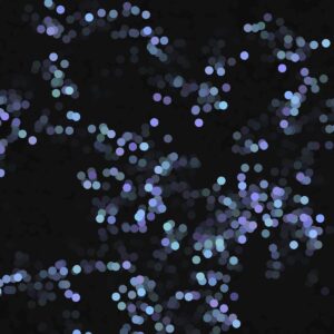
The artwork reminds me of different things. Firstly, it reminds me of a picture of out-of-focus lights you may see at night when your eyes get tired. Another association I have is more philosophical. All the people have different paths in life, and while trying to figure out the path, they get to meet other people who are on the same journey. As time passes, there are fewer and fewer people around them, as they’re getting closer to figuring out their own unique path.

In my project, I combined different concepts I wanted to implement. The first one was background transparency, which gives a feel of points’ traces. Additionally, I decided to make the sketch more interactive; therefore, I added an opportunity to change color modes with a mouse click and an opportunity to stop a function with a click of the up arrow on the keyboard.

{CODE}

// Creating a model for generating points

class RandomPoints {
  constructor () {
    
      // Setting up random starting position on canvas
    
      this.xPos = random(0,600);
      this.yPos = random(0,600);}
  
  // The function generating the dots
  
  pointdraw (strokeWeightnumber, RGBcolor) {
      strokeWeight(strokeWeightnumber);
    
      // Offset is used to make the change of y coordinate more smooth
    
      let offset = 0.0;
      offset = offset + .01;
      let n = noise(offset) * random(-55,55);
    
      // Change of x and y coordinates
    
      let xChange = random(-25,25);
      let yChange = random(- n - 15, n + 15);
      
      this.xPos += xChange;
      this.yPos += yChange;
    
      // Setting up different color modes
      
      if (RGBcolor == 'red'){
        stroke( 50 * random(4, 5), random(70,90),  random(80,150));
      }

      if (RGBcolor == 'green'){
        stroke( random(100,200), 50 * random(3, 5),  random(100,200));
      }

      if (RGBcolor == 'blue'){
        stroke( random(130,150), random(130,200), 50 * random(4,5));
      }
      
      //The generation of points
    
      point(this.xPos, this.yPos);
    }
  }

In this part of the code, the class describes an object (a point) and controls its movements. Furthermore, in class, I described the color-changing modes. I thought about creating a palette of random colors, but decided to stop with three color modes. It enabled me to create a mouse click function that considers the current color option.

THOUGHTS ABOUT FUTURE PROJECTS

I feel that I’m getting more confident with coding and have more freedom in translating concepts from my head to P5. In the future, I would like to make my projects more interactive and give users a broader range of options and control over the things on Canvas.


Week 3- Reading Reflection


In the initial chapter of Chris Crawford’s book, “The Art of Interactive Design,” titled “What Exactly is Interactivity?” the author delves into the concept of interactivity and attempts to provide a comprehensive definition.

Reading this text, I find myself nodding in agreement with the author’s perspective on the term “interactivity.” It’s evident that the author is critical of how the term is used and misused in contemporary discourse. The comparison of interactivity to a conversation, where two actors alternate between listening, thinking, and speaking, is thought-provoking. This made me question: How well does this metaphor hold up when we apply it to different contexts, especially in the digital realm where human-computer interactions can be vastly different from human-human conversations?

The author’s critique of the misuse and overuse of the term “interactivity” in various contexts, from marketing to technology, is a valid point. The example of a laundry detergent labeled as “specialized terminology” humorously illustrates this point and serves as a reminder of the potential for specialized language to lose its meaning.

The discussion about the subjectivity of interactivity is thought-provoking. The idea that interactivity might exist in the eye of the interactor raises questions about how we define and measure it, especially in various contexts where it might manifest differently.

The author’s exploration of what isn’t interactive, such as printed books and movies, challenges traditional definitions and prompts me to reconsider what truly constitutes interactivity. It’s a reminder that not all forms of communication or media can be classified as interactive.

Assignment 3: The Blue Hour

The world grows most quiet during the Blue Hour, that sliver of time right before night. So short as to almost not have existed. During the Blue Hour, babies stop crying. So mothers gaze out their windows. Candles burn a bit dimmer. The Blue Hour is the world heaving one last sigh before going to sleep. I’ve always maintained that poets write from the Blue Hour of their brains.

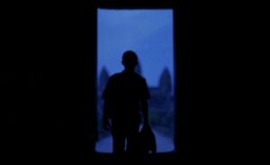
I look for the Blue Hour in every movie. It’s in Moonlight. When Chiron’s staring into the ocean, it goes, “In the moonlight, black boys look blue.” It’s in The Act of Killing, a documentary about Indonesian genocide. I don’t think there’s a word in the English language to describe the action of sharply taking in a breath, out of breathlessness. The kind of breath that moves you into an almost-cry. It’s not a gasp. But whatever you call it, that’s what I did when I saw that blue picture. All the night birds taking flight. It’s in Wong Kar Wai’s In the Mood for Love. I’ve inserted a picture below:

It’s in Babel. I’ll never forget those two boys laughing against the wind on the mountain, before they knew their lives were over. The sound cut out with all the blue. Like the blue was in your head. In their heads. I noticed that Past Lives did the same thing with its own Blue Hour shot. Cut out all the sound. The Blue Hour is Eternal. It is quiet. It is sad. Profoundly so. I exist in the Blue Hour in the cave of my head and the trench of my heart. It’s the best time to smoke a cigarette. Hence my assignment. I wanted to capture the spirit:

https://editor.p5js.org/EloraTrotter/sketches/GX1kLdNr6

You can take a look at the code above. I’m very glad that I was able to implement loops, classes, and constructors. I wanted to increase the frame rate but P5Js kept crashing. With help from Professor Riad and the ever-reliable Coding Train (Youtube video linked here: https://www.youtube.com/watch?v=UcdigVaIYAk), I was able to fully understand what I was writing. I tried tweaking the the particles so that they became different sizes, or less opaque, but I scrapped all that in the end. Simplicity suited this piece, just like simplicity suits the Blue Hour. I would like to continue working on this piece because I have an unfinished vision of the smoke being huge Van Gogh-like swirls. But that’s a task for future Elora. Carpe the noctem. You learn.

Also- you know on second thought. I’d also like to learn how to integrate music and coding. One song that captures Blue Hour for me is “Midnight Blues” by Pavel Milyakov (Bryan Waterman rec). I’d like people to listen to that while viewing this.

Reading Reflection – Week 3

What exactly is interactivity?

Chris Crawfords chapter on “What is Interactivity” was interesting because I had never thought about formally defining interactivity before. Since Crawford was trying to do so, I approached the reading as if I were a skeptic, trying to think of a counter argument to anything that Crawford proposed.

Crawford insists that interaction is the name of the exchange between two actors as they listen, think, and reply to one another. I was about to ask what exactly an “actor” is to Crawford, but he replied not soon after. For him an actor is a “purposeful creature”.  This is still a bit unclear to me. Right then he mentions that a fridge that is programmed to “react” to someone opening the door by turning on its light is not what he is considering as an actor, but rather what he wants is “interactivity that has some blood in its veins.” To me this just means that he does not want include entities whose decision-making is too simplistic in his notion of interactivity. Humans are one type of actors that Crawford would accept, and the replies that they can generate are on a spectrum when compared to the refrigerator that can only turn on or off as a reply to an input. As such, Crawford’s definition of interactivity required the actors to have a certain degree of complexity.

Thinking about this for a little bit, I did not find myself disagreeing with this notion. He insists that interaction is different from reaction, and even though I’m taking the skeptic’s position, I will have to agree with him on that. So far, I’ve accepted the notion that interaction needs two actors to listen, think, and reply to one another. However, I thought of moments when I’ve had small talk and conversations without purpose. By this definition, it would seem that such conversations would not be interactive. It seemed a bit counterintuitive that a conversation is non-interactive, but as I thought of this I read through Crawford’s position on the subjectivity of interaction, and his proposed solution to it. He insists that interaction can vary on a spectrum, and that interactivity is just a measure of how much thinking, listening, and replying occurs during an exchange. As if he had read my mind, the example of trivial conversations was one that Crawford used to explain the spectrum of interactivity.

Was the book interactive then? It certainly felt like it. However, by Crawford’s proposed definition it was definitely lower on the scale than an engaging conversation. Although it felt like I was conversing with someone who had just read my mind, the ideas in the chapter were stagnant, unchanging to my thoughts. For a moment they seemed to be a reply to my thoughts, but I know better than that. Still, this gave Crawfords definition a merit in my books.

After going through the entire chapter, I wonder what the epitome of interactivity would look like. One technology that comes to mind is artificial intelligence. I think the reason AI fascinates us is because it is a technology that is much higher on the interactivity scale. When interacting with AI technology it feels as if there is more complex thinking involved in the interaction between us humans and technology. If interactivity is one measure of how good a program is, then is a perfect program one that uses some AI algorithms to tailor its function and form to our needs?  If such tailoring is done, then what is the need of specialized programs. When I imagine the peak of interactivity, I think of something without a predetermined form. A single program that is an amalgamation of every possible program but does not have form until it is interacted with.

week#2 – “for” loop assignment

My aim for this assignment was to produce an Andy-Warhol(esque), visually abstract art with a pronounced focus on colour portrayal. This is because some of Andy Warhol’s more iconic features of pop art was his use of distinctive arrays of colour. Through this ever prominent display of colours, which was made especially overt by the black background, coupled with the illusion of depth that is added within each square, I was able to generate an unintended yet desirable end-result.

This assignment punctuated the fact that my brain is not hardwired for coding, especially p5.js – javascript coding, and to some extremes, it even made me reconsider my major (interactive media). Whilst I had ambitious ideas and concepts I wished to bloom into fruition, my abilities and understanding of coding severely restricted this. As a result, I am incredibly proud of every single code that I produced with the for() loop since it took me an unbelievable amount of time to perfect(?) it. Initially I had wanted some form of dynamic physical change of shapes e.g., squares transitioning into ellipses, circles alternating in size, but again, with my incredibly limited knowledge it was hard to replicate it.

let cols = 10; // Number of columns
  let rows = 10; // Number of rows
  let gap = 10; // Gap size between squares
  let squareSize = (width - (cols - 1) * gap) / cols; //calculating square size
  
  for (let r = 0; r < rows; r++) {
    for (let c = 0; c < cols; c++) {
      let x = c * (squareSize + gap); //x+y position of squares
      let y = r * (squareSize + gap); 
      
    //generating a random colour
    let randomColor = color(random(255), random(255), random(255));
      
      noFill(); 
      stroke(randomColor);
      rect(x, y, squareSize); // Draw the square
      
        //creating transition between square and ellipse
        for (let size = squareSize; size >= 20; size -= 2) {
          rect(x, y, size); // Draw a square
          ellipse(x + size / 2, y + size / 2, size - 10, size - 10); // Draw a circle in the middle of the square

Creating a spaced grid with randomly iterating colours was definitely doable although I can’t deny that it was a mind-twister but trying to create this transition from square to ellipse was almost impossible. I’m still not entirely sure how to adjust the coding to produce my desired result but, though not intended, this outcome was equally wonderful. I was very pleased with how it displayed on screen. For further improvements, as I have previously mentioned, I would love to first of all solidify my coding knowledge so that I can produce more dynamic and animated works. Perhaps an interesting idea could be that these squares randomly swap positions to occupy a new coordinate.

Art of Interactive Design

I have always viewed interactivity as a simple “switch” where something is either interactive or not, with no middle ground. However, Crawford’s nuanced exploration of the concept as a spectrum rather than a binary has opened my mind to a more complex understanding of the concept.

Crawford believes there can be varying levels of interactivity and his use of conversations as a metaphor to illustrate his idea struck me the most. He views interactivity as having 3 essential components.

First, there’s the “listening” component, representing the user’s input or actions. This marks the point where users engage with the system or content. It’s where users contribute their choices, commands, or interactions to an ongoing conversation.

Following that, there is the “speaking” component, where the system responds to the user’s input. Here, the system acknowledges the user’s actions and provides feedback, making users feel heard and valued within the interaction.

Finally, there is the “reacting” component, which encapsulates the user’s response to the system’s feedback. This is where users assess whether the system’s response aligns with their expectations and intentions. It’s intriguing because it underscores the user’s agency and their role in shaping the direction of the interactive experience.

I think this more nuanced approach to understanding interactivity can have a significant impact on design in the sense that it encourages a more thoughtful and user-centric approach. By recognizing that interactivity exists along a spectrum, designers can tailor their creations to align with the specific goals and preferences of their audience. For example, when it comes to designing mobile apps, with the realization that interactivity isn’t a binary on-off switch, designers can employ a variety of interactive elements to enhance the user experience. They might incorporate features that range from simple taps and swipes for quick interactions to more complex decision points and branching narratives for deeper engagement. This flexibility allows designers to cater to a broader audience, accommodating both users who prefer a streamlined, efficient experience and those who seek a more immersive and participatory one.

Rain Forest

Concept

Initially, I had an idea to create rainfall and falling shaky leaves to show the windy and rainy weather, which I greatly enjoy and which we cannot encounter in Abu Dhabi. In an attempt to create the initial idea, I discovered some new, surprising outcomes, which changed my concept but made it even better than was planned. I was able to create an animated painting, which reminds me of famous Chinese ink paintings. Now my work is very pleasing and attractive!

Approach and Code Highlight

With this work, I had to experiment a lot. Using the trial-error method, I came to the outcome I enjoy. I created two classes and two arrays, set up a beautiful subtle color palette, and made some features, e.g. rainfall and drawing of the leaves.

I am happy with how leaves are drawn in this program. I used this video to understand how classes and arrays work and saw a nice method of how to create a shaky movement. I believe this is what makes my code interesting.

shake() {
  // movement of leaves
  this.leafX = this.leafX + random(-5, 5);
  this.leafY = this.leafY + random(-5, 5);
  this.leafX1 = this.leafX1 + random(-5, 5);
  this.leafY1 = this.leafY1 + random(-5, 5);
  this.leafX2 = this.leafX2 + random(-5, 5);
  this.leafY2 = this.leafY1 + random(-5, 5);
}

Another interesting action was experimentation with transparency alpha value in the background. I noticed that setting the value closer to zero would produce semi-transparent traces, which brings some charm to my work. Specifically, the movement of the leaves leaves traces in the form of a crown of a tree, and falling drops leaves traces that look like the trunk of a tree.

Reflection and Future Thoughts

I have an issue with this code, which doesn’t crash my program and it works fine, however, I would like to understand what I did wrong and to learn how to code variables accordingly.

Nevertheless, I am proud of the outcome because it was my first time doing object-oriented programming. I now understand all the benefits of coding in classes rather than hardcoding every single point and object in my program.