
For week 4 assignment with data visualization, I take my inspiration from the class demo with Google Trends data and the breakout room session in which Simran and I came up with an idea for data visualization but ended up not being able to finish it. The goal was to show the data in a more general fashion, only going into details upon request. That is, the idea is to aggregate interests by months instead of displaying them in weeks.
The particular set of data that I chose was the Google Trends data for the term “quarantine” recorded within the year 2020.
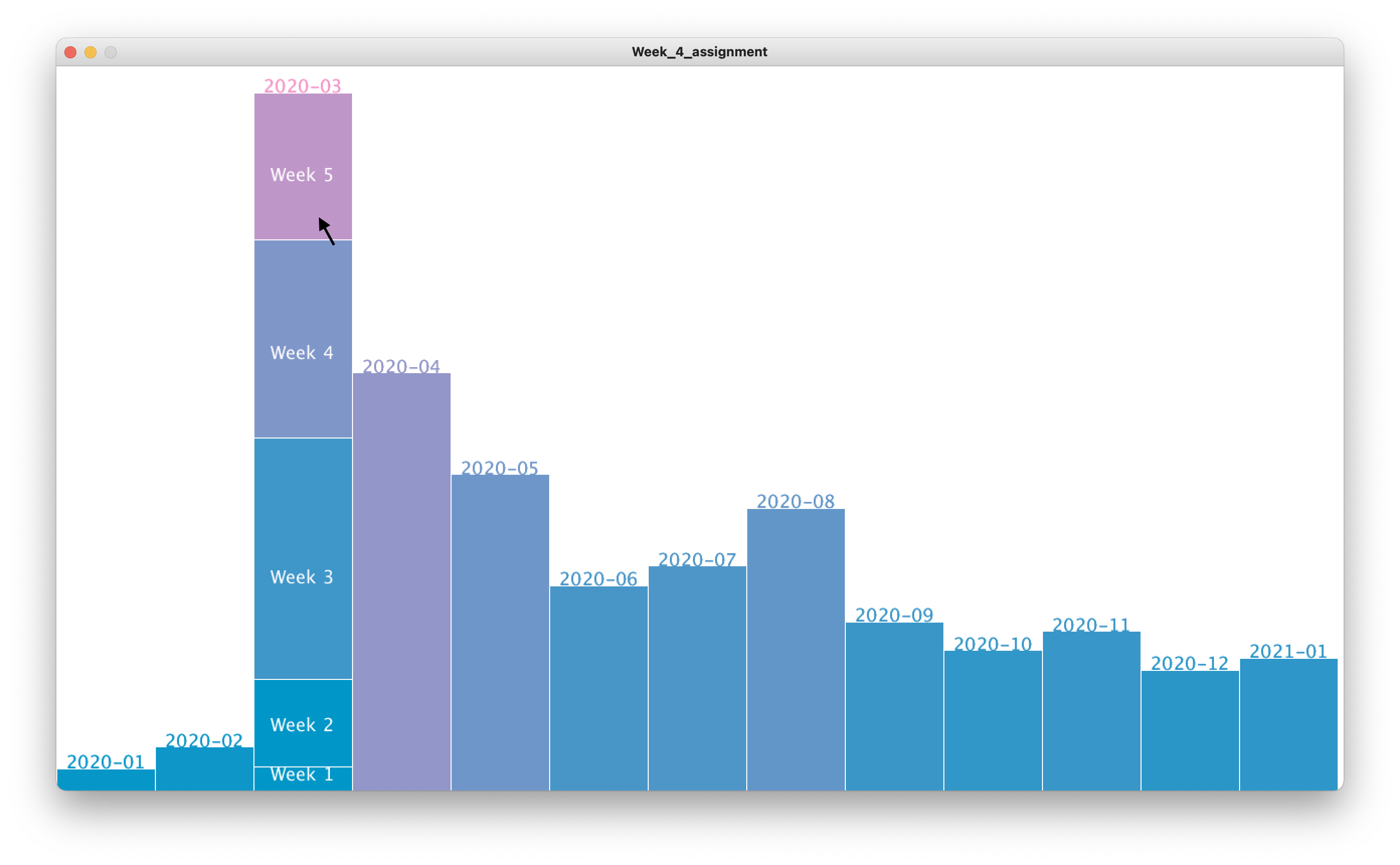
Here is a quick shot of my final product. When hovered on, a particular month column will show stacked columns of its weeks and their respective contributions to the month’s interest. (The black arrow represents the current position of my mouse. Apologies for this substitution; my actual mouse is not showing up in the screenshot.)
The code and the csv file can be found at the end of the post.
Processes
The data is easy to obtain and is already in relatively neat form, the only further cleaning necessary was to delete the first and last few unrelated rows. The next step was to break down the data into months, since it was originally divided into weeks. Since the time column of the .csv file was of the form "YYYY-MM-DD", I could use the String.substring() function to filter out the month, and add interests of the same month together. From this, drawing columns for months was relatively straightforward.
With the individual week data, first I was thinking along the line of having them also in column form that it would make the width of the week columns inconsistent, since some months have more weeks than others, and since month width was kept constant, the months with 5 weeks would appear to look more packed than those with only 4. For this reason, I decided to make the weeks into stacked columns instead, with the heights of all weeks in the same month adding up to the height of the respective month column.
Pitfalls
From a data perspective, in hindsight, I’m not sure if the form I chose for the graphs is a suitable one to visualize this particular set of data. When aggregated into months, some months became disproportionally higher than others (for instance, March vs. January). Because of this, months like January became so ‘short’ that the week names could not be properly and visibly displayed.
What I learned
I made extensive use of HashMaps since I found them particularly useful for looking up data using an index, especially if the index is not of type int (in this case, my HashMaps are searchable by names of months). I also found that they accept a wide range of data type, for instance, one HashMap I used has keys of type String and values of type ArrayList<Integer>.
Code
import java.util.Map;

Table table;
int numRow;
float monthWidth;
HashMap<String, Integer> interestByMonth = new HashMap<String, Integer>();
HashMap<String, ArrayList<Integer>> weekStacked = new HashMap<String, ArrayList<Integer>>();
ArrayList<String> nameOfMonths = new ArrayList<String>();
int maxInterest = 0;

void setup() {
  size(1280, 720);
  loadData();
  breakData();
  monthWidth = width/nameOfMonths.size();
}

void draw() {
  background(255);
  noStroke();
  drawMonths();
}

void loadData() {
  table = loadTable("multiTimeline.csv", "csv");
  numRow = table.getRowCount();
}

void breakData() {
  for (int i=0; i<numRow; i++) {
    TableRow row = table.getRow(i);
    String time = row.getString(0);
    // date in the form of "YYYY-MM-DD"
    //                     -0123456789-
    String month = time.substring(0, 7);
    int interest = row.getInt(1);
    if (interest > maxInterest) {
      maxInterest = interest;
    }
    if (!interestByMonth.containsKey(month)) {
      interestByMonth.put(month, 0);
      ArrayList<Integer> listOfWeeks = new ArrayList<Integer>();
      weekStacked.put(month, listOfWeeks);
      nameOfMonths.add(month);
    }
    int oldValue = interestByMonth.get(month);
    interestByMonth.put(month, oldValue+interest);

    ArrayList<Integer> listOfWeeks = weekStacked.get(month);
    listOfWeeks.add(interest);
  }
}

float drawEachMonth(String month, int order) {
  int interest = interestByMonth.get(month);
  float monthHeight = map(interest, 0, 300, 0, height); // the 300 is hardcoded
  float colorFactor = map(interest, 0, 300, 0, 255);
  int alpha = 255;
  stroke(255);
  if (int(mouseX / monthWidth) == order) {
    stroke(255);
    alpha = 0;
  }
  fill(colorFactor, 150, 200, alpha);
  rect(order*monthWidth, height-monthHeight, monthWidth, monthHeight);
  textAlign(CENTER);
  textSize(18);
  fill(colorFactor, 150, 200);
  text(month, (order+0.5)*monthWidth, height-monthHeight);
  return monthHeight;
}

void drawMonths() {
  for (int i=0; i<nameOfMonths.size(); i++) {
    String month = nameOfMonths.get(i);
    float monthHeight = drawEachMonth(month, i);
    drawWeeks(month, i, monthHeight);
    float throwaway = drawEachMonth(month, i);
  }
}

void drawWeeks(String month, int order, float monthHeight) {
  ArrayList<Integer> weekList = weekStacked.get(month);
  ArrayList<Float> weekHeights = new ArrayList<Float>();
  int numWeek = weekList.size();

  // Populate array of week heights w.r.t month height
  int monthInterest = interestByMonth.get(month);
  for (int i=0; i<numWeek; i++) {
    int curInterest = weekList.get(i);
    float ratio = float(curInterest)/float(monthInterest);
    float weekHeight = monthHeight * ratio;
    weekHeights.add(weekHeight);
  }

  for (int i=0; i<numWeek; i++) {
    float aggHeight = 0;
    for (int j=0; j<=i; j++) {
      aggHeight += weekHeights.get(j);
    }
    String weekLabel = "Week " + str(i+1);
    fill(map(i, 1, numWeek, 0, 255), 150, 200);
    stroke(255);
    rect(order*monthWidth, height-aggHeight, monthWidth, weekHeights.get(i));
    fill(255);
    textAlign(CENTER);
    text(weekLabel, (order+0.5)*monthWidth, height-aggHeight+weekHeights.get(i)*.6);
  }
}
Data
Great job making use of the has map Ngoc. Well designed too!