
Inspiration and Initial Implementation
This week’s project was data Visualization. My work today was built upon the class example of plotting a line graph and inspired by Google Trends data representation of a line graph to make it more advanced and also interactive!
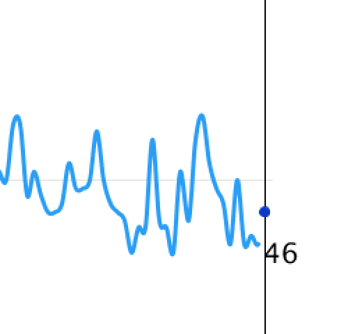
In the class example, we downloaded a .csv file of the number of cupcakes sold worldwide from January 2004 to February 2021. This is what we worked on when just learning how to read files and manipulate data on the screen :
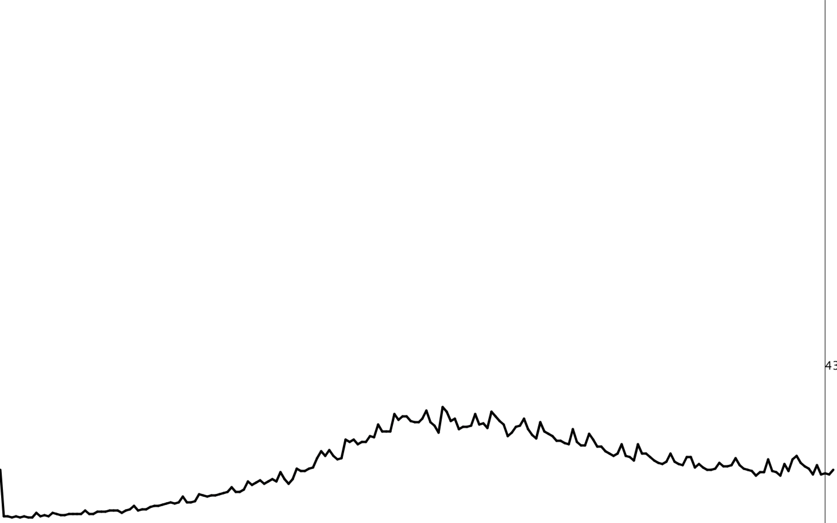
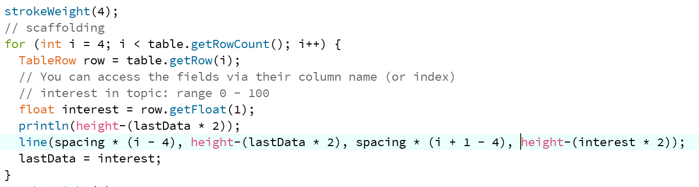
There was a plotting problem in this code because we used the line() function to draw the line between 2 data points (see below). We had to keep track of the previous point in this case which gave an error in the beginning for the initial point and did not plot the last point. I managed to fix this by shifting the indices but the method was not very efficient. Using the vertex() function inside beginShape() and endShape() function proved to be more logical.
After I got the plotting correct, I positioned my line graph properly in the center of the page (a little off-centered from the top to leave space for the heading) and drew the axes and border.
This was crucial for what I was going to do next – The most challenging part of this Data Visualization.
THE TASK!
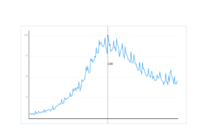
Inspired by how Google represents its line graphs, I wanted to make my line graph interactive – display the value of y-axis whenever the user hovers over a data point.
Now, there were several things to keep in mind here:
- Since the line graph only plots the data points and joins them together, it is crucial that we display only the data available to us represented by the points and not the intermediate values. For this, I had to first locate find peaks and locate which peaks are closest to the mouse pointer (because I should not display a random intermediate value if a mouse pointer is in between two consecutive data points). I did integer division for this and then compared if the previous or the latter peak was greater.
- Once the closest peak was determined, I need a vertical line through it and I have to display the corresponding x and y values for this data point. To get the data values for a certain peak, I actually had to reverse the code for how I got peak values to create the vertical line. This took quite a bit of time to figure out and understand how to implement.
- Where to display the text? I decided to display the year and month on the top right corner as it looked neat and compact. But faced more dilemma as to where to display the number of cupcakes. It should be close to the peak value but not close to other points (to avoid confusion). Displaying this text with respect to MouseX and MouseY proved to be a great idea! The vertical line passing through the point clearly indicates which point corresponded to the data and also gives the user flexibility as to where they want it to be displayed – giving them a sense of control (and it’s honestly fun too to see it move that way!).
Now one major problem I faced here was a mismatch of the line graph, the vertical line, and the text that was being displayed. None of them were matching. After a lot of trial and errors and printing ample println() statements, I was able to make all 3 coincide.
Yet, another problem awaited me. Since I was retrieving the data from the .csv file based on where the mouse pointer was, I often ran outside the bounds of the rows in the table which kept on giving the error.
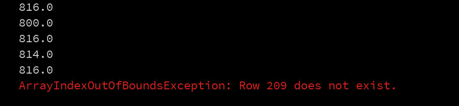
Even when I restricted the value to be shown only when the mouse was in the range, there was a sight range in which I still got an error. In an attempt to fix this, I discovered something new about the curveVertex() function (which I used before vertex() to draw my line graph). curveVertex does not draw the first and last point. So, when my mouse pointer was with the first 2 and last 2 points, I was still getting an error. I managed to fix this by switching to vertex() function which draws all points.
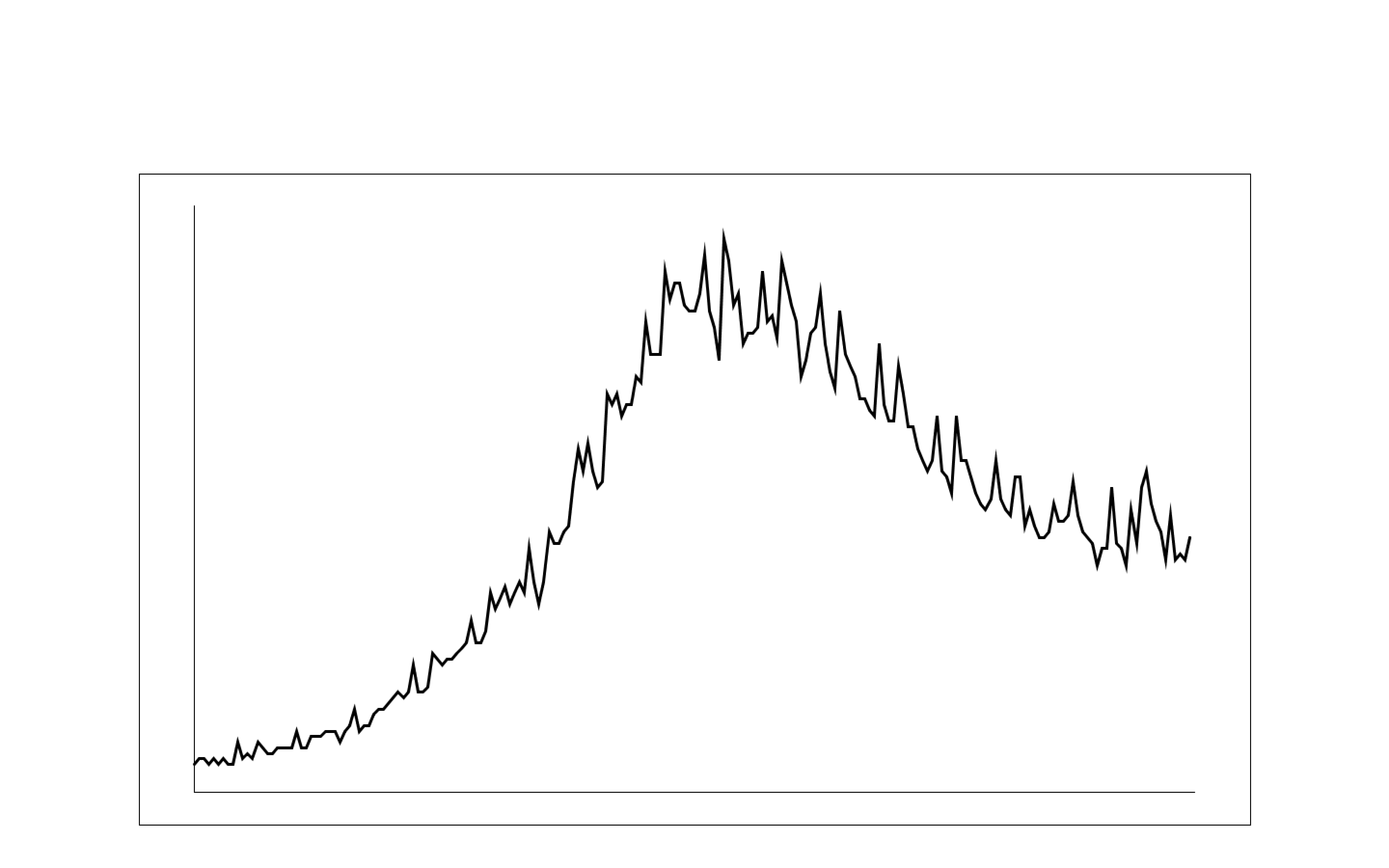
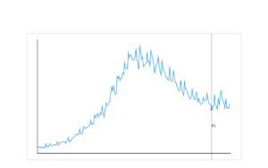
Once I finally managed to get the line graph as desired, I labeled the axes, made grid lines, etc. to make it look more professional. I also added color to break the monotony. The process looks like below:

What more can my data say?
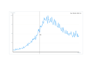
Once I was satisfied with my line graph, I wanted to add some additional information about the data by using another representation method. I decided to show the number of cupcakes sold as a percentage of the maximum number of cupcakes sold in the entire data collected. This would tell me how the cupcakes in a particular month performed as compared to the others. A pie chart seemed just the right fit for this! I used the arc() function in which I made the arc as complete as the percentage of cupcakes sold.
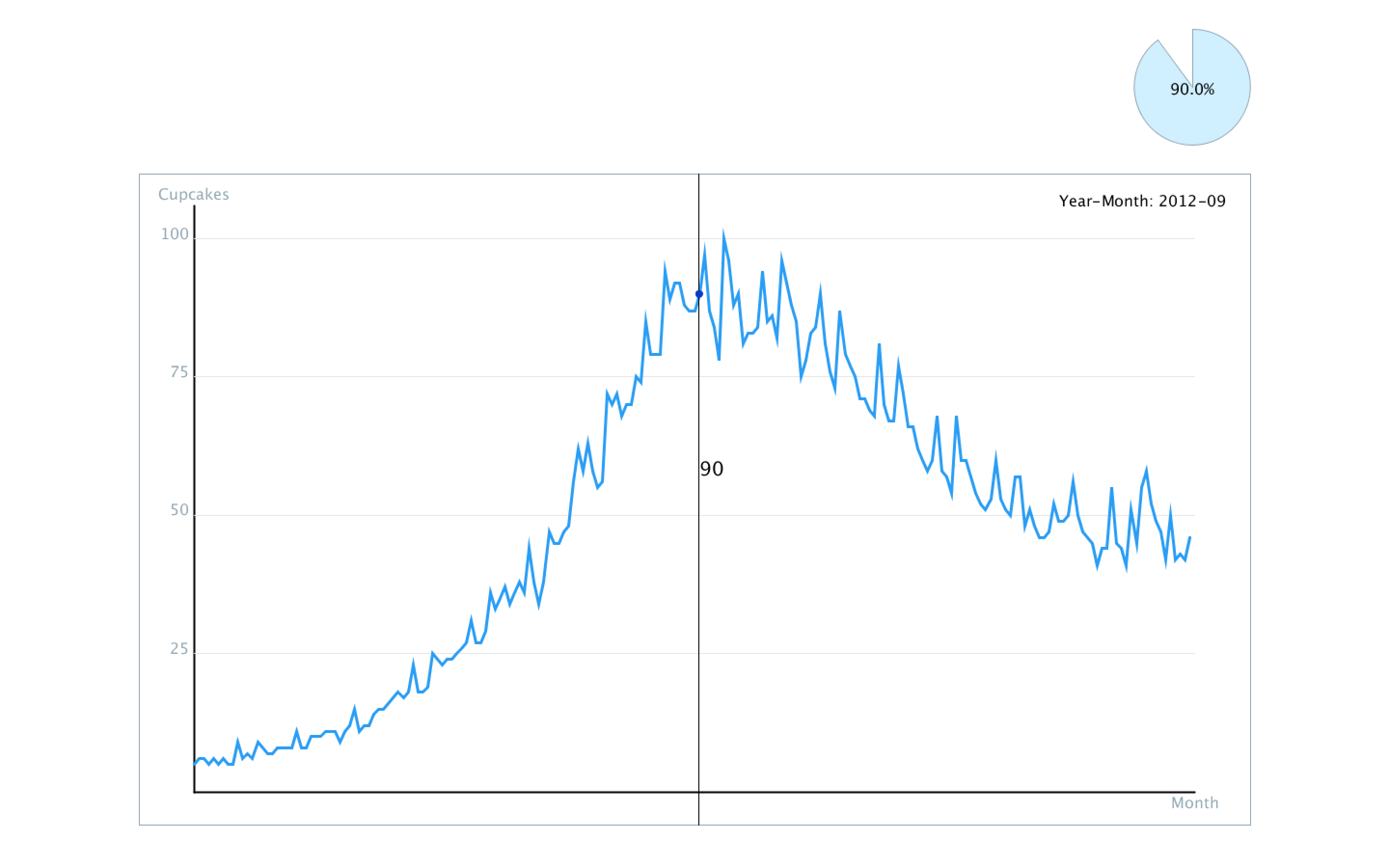
Lastly, I added the heading, gave a background color and I was done! This is what my final outcome looks like:
CODE
Table table;
float spacing;
float marginT, marginB, marginL, marginR; // of the rectandle
float h, w; // height and width of the display
float innerBorderX, innerBorderY; // for the line graph
int peakX; // to display value of cupcakes
int maxVal = 100; //found the max num of cupcakes sold in any month by using max() function in excel
int arcW;
float arcX, arcY; // for pie chart
String s1 = "Number of Cupcakes Sold Worldwide", s2 = "From January 2004 to February 2021"; //for my heading

//defining colors
color blue1 = color(42, 157, 244);
color blue2 = color(10, 57, 200);
color greyblue = color(208, 239, 255);
color grey1 = color(146, 167, 179);
color grey2 = color(231, 230, 225);

void setup() {
  fullScreen();
  //size(1280, 720);
  loadData();
  marginT = 0.2*height;
  marginB = height - 0.05*height;
  marginL = 0.1*width;
  marginR = width - 0.1*width;
  h = marginB - marginT;
  w = marginR - marginL;
  innerBorderX = 0.05*w;
  innerBorderY = 0.05*h;
  arcW = 120;
  arcX = marginR-arcW/2;
  arcY = marginT/2;
  println(w);
  loadData();
}

void loadData() {
  // Load CSV file into a Table object
  table = loadTable("multiTimeline.csv", "csv");
  // spacing is rowcount - 4 since the first three rows and the last row are superfluous
  spacing = (w-2*innerBorderX)/(table.getRowCount()-3);
}

void draw() {
  background(grey2);

  //draw display rectangle
  pushStyle();
  stroke(grey1);
  rect(marginL, marginT, w, h);
  popStyle();

  //to display x and y axis
  pushStyle();
  strokeWeight(2);
  line(marginL+innerBorderX, marginT+innerBorderY, marginL+innerBorderX, marginB-innerBorderY);
  line(marginL+innerBorderX, marginB-innerBorderY, marginR-innerBorderX, marginB-innerBorderY);
  //label the axes
  textSize(16);
  textAlign(CENTER);
  fill(grey1);
  text("Cupcakes", marginL+innerBorderX, marginT + innerBorderY - 7);
  text("Month", marginR-innerBorderX, marginB - innerBorderY + 17);
  popStyle();

  //grid lines
  pushStyle();
  stroke(grey2);
  fill(grey1);
  textSize(16);
  textAlign(RIGHT);
  //line1
  float yline = map(25, 0, 100, marginB-innerBorderY, marginT+2*innerBorderY);
  line(marginL+innerBorderX, yline, marginR-innerBorderX, yline);
  text("25", marginL+innerBorderX-5, yline);
  //line 2
  yline = map(50, 0, 100, marginB-innerBorderY, marginT+2*innerBorderY);
  line(marginL+innerBorderX, yline, marginR-innerBorderX, yline);
  text("50", marginL+innerBorderX-5, yline);
  //line 3
  yline = map(75, 0, 100, marginB-innerBorderY, marginT+2*innerBorderY);
  line(marginL+innerBorderX, yline, marginR-innerBorderX, yline);
  text("75", marginL+innerBorderX-5, yline);
  //line 4
  yline = map(100, 0, 100, marginB-innerBorderY, marginT+2*innerBorderY);
  line(marginL+innerBorderX, yline, marginR-innerBorderX, yline);
  text("100", marginL+innerBorderX-5, yline);
  popStyle();

  //draw the line graph first
  pushStyle();
  strokeWeight(3);
  stroke(blue1);
  noFill();
  beginShape();
  // start at row 3 since the first few rows are filler
  for (int i = 3; i < table.getRowCount(); i++) {
    TableRow row0 = table.getRow(i);
    float interest = row0.getFloat(1);
    float x = (i-3)*spacing ;
    float y = map(interest, 0, 100, marginB-innerBorderY, marginT+2*innerBorderY); //map the data values to my display area
    vertex(marginL+innerBorderX+x, y);
  }
  endShape();
  popStyle();

  //Draw line and circle on line with mouseX
  //Choose closest peak

  //if mouse is inside the inner box
  if (mouseX<marginR-innerBorderX && mouseX>marginL+innerBorderX && mouseY<marginB-innerBorderY && mouseY>marginT+innerBorderY)
  {
    //See if it is closer to prior peak
    if ((mouseX % spacing) < spacing/2 ) {
      peakX = int(mouseX / spacing);
      //println("condition1");
      //println(mouseX);
      //println("spacing = " + spacing);
      //println("mouseX % spacing = " + mouseX % spacing);
      //println("peakX = " + peakX);
    } else {
      //otherwise closer to next peak
      peakX = int(mouseX / spacing) + 1;
    }

    //Print text at mouse of the peak value
    pushStyle();
    fill(0);
    textSize(20);
    if (int(peakX-int((marginL+innerBorderX)/spacing))+3 < 209) //to avoid out of bounds error
    {
      //draw the vertical line
      line(peakX * spacing, marginT, peakX * spacing, marginB);

      //write value of peak
      String val = nf(table.getRow(int(peakX-int((marginL+innerBorderX)/spacing))+3).getFloat(1), 0, 0);
      text(val, mouseX, mouseY);

      //display month
      pushStyle();
      textAlign(RIGHT);
      String mon = table.getRow(int(peakX-int((marginL+innerBorderX)/spacing))+3).getString(0);
      textSize(16);
      text("Year-Month: " + mon, marginR - 25, marginT + innerBorderY);
      popStyle();

      //draw circle at peakX at height using map function
      TableRow r0 = table.getRow(int(peakX-int((marginL+innerBorderX)/spacing)+3));
      float value = r0.getFloat(1);
      float cirY = map(value, 0, 100, marginB-innerBorderY, marginT+2*innerBorderY);
      pushStyle();
      fill(blue2);
      stroke(blue2);
      circle(peakX*spacing, cirY, 7);
      popStyle();

      //draw piechart for number of cupcakes sold as a percentage of max value
      pushStyle();
      fill(greyblue);
      stroke(grey1);
      arc(arcX-20, 0+arcY, arcW, arcW, 3*PI/2, 3*PI/2+value/maxVal*TWO_PI, PIE);
      textAlign(CENTER, CENTER);
      textSize(16);
      fill(0);
      text(nf(value/maxVal*100, 0, 1) + "%", arcX-20, arcY);
      popStyle();
    }
    popStyle();
  }

  //heading
  pushStyle();
  fill(blue2);
  textSize(40);
  textAlign(LEFT, TOP);
  text(s1, marginL+20, 0+40);
  textSize(20);
  fill(blue1);
  text(s2, marginL+20, 0+90);
  popStyle();
}
Great job Shreya. I like the final design. One thing that would be cool is to add some smoothing to the movement of the pie chart (and the point on the line graph too possibly). This would make the pie chart flow to the next position instead of jumping. An easy way of doing this is to have a global variable: smoothedPieAngle (or something like that). Then the algorithm for smoothing is: smoothedValue += (destVal – smoothedVal) * scalar; smoothedValue is your smoothedPieAngle, destVal is the place where the pie chart is supposed to be, and scalar is some decimal value (like 0.1) to scale the subtraction value down.